Ben & Jerry’s, an American ice cream company known for its creative flavors, is now a subsidiary of Unilever. Its products are globally available, with significant presence in the U.S. and Europe. The brand is recognized for its commitment to social causes and sustainability.
Meaning and history
Ben & Jerry’s began in 1978 when Ben Cohen and Jerry Greenfield opened their first scoop shop in a renovated Vermont gas station. Known for their whimsical ice cream flavors, they emphasized natural ingredients and local sourcing. By 1980, they were packaging pints for grocery stores.
In 1985, the Ben & Jerry’s Foundation was established, solidifying their dedication to social causes, a trait that became as signature as their Chunky Monkey flavor. The 1990s saw massive growth, with distribution expanding and the company going public.
Unilever acquired Ben & Jerry’s in 2000. The deal was unique: Ben & Jerry’s retained a degree of independence, maintaining its social mission and brand integrity. Unilever’s resources helped scale up production and distribution, catapulting the brand into global markets.
Despite corporate changes, Ben & Jerry’s has remained committed to social activism, environmental causes, and crafting ice cream that stands for something more than just indulgence. Their journey from a local parlor to a global icon is a testament to their brand’s resilience and the enduring appeal of their values and velvety scoops.
1978 – 1979
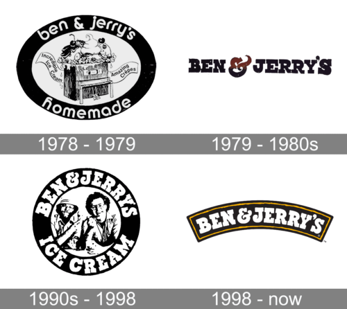
Originally crafted to epitomize the art of ice cream creation, Ben & Jerry’s emblem harkened back to its founders’ roots as free-spirited music aficionados. The emblem encased within an elliptical border featured a whimsical grand piano. Atop this piano’s raised lid, a cavalcade of ice cream seemed to burst forth, while a ticker of receipts unfurled along the instrument’s sides, symbolic of the melodious blend of commerce and creativity.
As keys were pressed, akin to notes in a symphony, out would pop the selected frozen treat, be it a luscious popsicle or a sumptuous serving of crème brûlée. Atop the piano, trio mounds of ice cream lavished with a cornucopia of fruits and nuts, all cloaked in a rich chocolate cascade, showcased the wealth of gustatory delights available.
1979 – 1980s
The label swiftly became a sensation, drawing crowds eager for a scoop of their unique blends. The entrepreneurs, buoyed by their venture’s warm reception, doubled down on their dream. To commemorate their ascent, they instituted an annual tradition: Free Cone Day. Every anniversary, the store would offer their scoops on the house, a gesture that became a hallmark of their gratitude and community spirit.
As the brand’s renown grew, the visual identity was streamlined to its essence. The vibrant imagery gave way to a sleek, more minimalist emblem. Now, the mere mention of “Ben & Jerry’s” conjured the full spectrum of their offering; the logo’s overhaul was a nod to their evolved status – a brand so iconic, it stood unaided.
Yet, whimsy wasn’t wholly forsaken. Infusing a dash of playfulness into their moniker’s typographic elegance, they introduced a lively twist: the colorful “&.” Its striations were a nod to their heritage – a red summit fading to a sunny yellow, cascading into a cool blue base, echoing the indulgent journey from the first creamy taste to the refreshing finish.
This reinvented “&” took on a dual semblance – at once, a steaming cup signaling warmth and comfort, and alternatively, a bowl brimming with velvety ice cream accompanied by a spoon, beckoning one to a cozy corner where treats and refreshments abound. It was more than a symbol; it was an invitation to a realm of delectable desserts and convivial moments.
1990s – 1998
The scale of ice cream craftmanship underwent a remarkable transformation, witnessing the birth of franchise locations and the facility for nationwide distribution, now encased in signature round containers. These vessels bore the imprint of a vinyl disc emblem, a homage to retro classics with a jet-black backdrop circumscribed by the founders’ portrait and encased by a halo of white script proclaiming, “Ice Cream by Ben & Jerry’s.”
This emblem celebrated the human touch, narrowing the gap between consumer and creator. It was a testament to the dedication and personal investment of the founders, instilling confidence and warmth with their approachable smiles, thus fostering trust and underlining the company’s amicable ethos.
Echoing a classical aesthetic, the monochrome design was a subtle tribute to enduring excellence and the brand’s commitment to timeless principles. In tandem with their culinary ventures, the pair championed eco-conscious initiatives, opposed genetically modified milk hormones, and advocated for children’s welfare. This evolution transcended the culinary arena, positioning Ben & Jerry’s not just as purveyors of delightful treats but as vanguards for societal and environmental stewardship.
1998 – Today
Marking two decades of crafting frozen delights, the company embarked on a transformative rebranding journey. The quintessential pint packages received a fresh design, and the brand’s insignia experienced a metamorphosis.
The reimagined logo features the company’s moniker emblazoned in a stark white typeface, cradled within an ebony crescent, edged with a vibrant sunflower hue. This emblematic curve is redolent of the very containers that safeguard the delectable contents, symbolizing the shelter and care the company extends to its entire line of produce.
An azure illustration of a bovine often accompanies the design, a nod to the brand’s commitment to the welfare of dairy herds and the sustenance of pastoral farm legacies.
A mere two years post this milestone, the founders relinquished their helm of the business. Post-sale, the enterprise’s trajectory plateaued, lingering in the legacy of its established reputation and halting further brand evolution.


