BC Hydro is the name of a Canadian electric utility, which was established in the 1890s as BC Electric, and has turned into its current state in 1961. The company is specialized in the production of power by the use of hydro and thermal sources, operates in the Canadian British Columbia, and is owned by the population and government of the region.
Meaning and history
BC Hydro is one of the three largest electric utilities in Canada, with 32 hydroelectric and 3 thermal facilities across British Columbia. The company serves most of the region, covering a network of more than 78 thousand kilometers.
The history of the company, which turned governmental and got its current name at the beginning of the 1960s, dates back to the end of the 19th century when in 1897 the BC Electric company was established. Before the foundation, the company was preceded by various utility companies that produced power, lit streets, heated homes, and ran streetcars. For the first decades, the company was privately owned and operated on a non-profit basis.
The electric utility was expropriated by the government in 1961, merging with the BC Power Commission and creating the BCHPA, or British Columbia Hydro and Power Authority. And this is when the modern history of the company started.
What is BC Hydro?
BC Hydro is the 3rd largest electric utility in Canada. The company was established at the end of the 19th century, and operates in the British Columbia region, producing electricity from hydro and thermal sources. BC Hydro serves almost 2 million customers.
In terms of visual identity, the current BC Hydro logo is fully based on the badge, created for the electric utility in the early 1990s. And it already was quite bright and progressive for its times, although now it looks balanced and serious, perfectly reflecting the purpose of the company.
199? – 2016
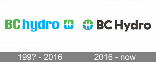
The BC Hydro badge, designed in the 1990s, featured a bold custom logotype in green and blue, followed by a small stylized emblem in the same color palette. The lettering was visually divided into two parts, which didn’t have any extra space between them. The first capitalized part of the wordmark was set in light green and followed by the lowercase “Hydro” in sky-blue. As for the graphical part of the logo, it features a softened square with the upper half in green, and the bottom — in blue, the square was divided horizontally but a white power line.
2016 – Today
With the redesign of 2016, the concept of the BC Hydro visual identity remained the same, but the typeface and color palette of the logo was slightly modified. The emblem is now set on the left of the wordmark and features a circular shape instead of the softened square, while its colors and pattern remained unchanged.
As for the lettering, it was fully rewritten, and now the inscription is set in the bold and heavy sans-serif with more traditional shapes of the letters, then the previous version, the logotype use a dark gray shade for its characters.
Font and color
The bold and stable BC Hydro lettering from the official logo of the electric utility is set in a modern geometric sans-serif typeface, which is very close to such fonts as Gopher Text Heavy and FF Neuwelt Black, but with the contours of some letters slightly refined.
The color palette of the BC Hydro visual identity is based on light shades of green and blue, balanced by a powerful and strict dark gray of the inscription. The bright shades of the emblem here stand for the natural sources of energy the company is for providing the British Columbia citizens with electricity. And the light vivid hues make the badge look very friendly and trustworthy.


