Bayer is a German multinational pharmaceutical company, one of the largest in the world. The company was founded in Barmen in 1863 as a dyestuffs factory. Aspirin was the first and best-known product of Bayer.
Meaning and history
Bayer is a German chemical and pharmaceutical company, which was founded in Barmen in 1863. Today company has three main subsidiaries: Bayer HealthCare, Bayer CropScience, and Bayer MaterialScience, but for the world, it is most famous for its pharmaceutical activities.
One of the first inventions of Bayer AG, founded in 1863 in Wuppertal, Germany, was acetylsalicylic acid, patented as Aspirin over a century ago.Aspirin has been on the World Health Organization’s list of essential medicines since 1977. You can find a package of this painkiller in every medicine cabinet anywhere in the world. According to statistics, more than 80 billion aspirin tablets are taken worldwide each year.
The discovery of one of the first antibiotics also belongs to Bayer. In the 1930s German bacteriologist, Gerhard Domagk was the first to prove the efficacy of the sulfonamide-based drug Prontosil against Streptococcus.
What is Bayer?
Bayer is a German chemical and pharmaceutical company founded in Barmen in 1863.Its main lines of business are health care and agriculture. Today the company, headquartered in Leverkusen, North Rhine-Westphalia, has almost 400 subsidiaries in more than 80 countries across the globe.
1881 – 1886
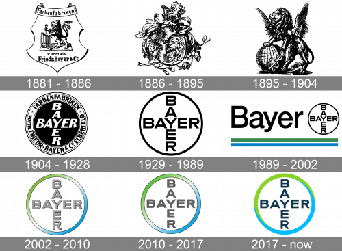
Bayer did not develop a logo until 1881. The first Bayer logo centered around an illustration of a lion and was based off of the coat of arms of Elberfeld, the city where the company was headquartered at the time.
1886 – 1895
The 1886 logo is an engraving of many various things. It’s a ball of illustrative elements, including the city’s coat of arms, a standalone lion from that image, leaves, branches and other foliage.
1895 – 1904

The 1985 emblem was a simpler, more elegant drawing: a winged lion with one paw put onto a globe, and other clutching the scepter with snakes – a symbol of medicine.
1904 – 1928
The new Bayer logo was first introduced in 1904 and consisted of a horizontal “BAYER” crossed with a vertical “BAYER”, both sharing the “Y” letter, and enclosed in a circle.
The logo is one of the world’s best-known trademarks. It was registered in the patent register in 1904 for use for “medications for people and animals, disinfectants, preservatives, tar dyes, and chemical preparations for dyeing and photographic purposes.” Since 1914 it has also been used for the company’s crop protection products.
A milestone in the popularity of the logo and a smart marketing idea was the decision to stamp the new logo on tablets, especially Aspirin. From 1910 this protected the company’s pharmaceutical products from counterfeiting and soon became familiar to consumers as a symbol of premium quality.
The Bayer logo has remained almost exactly the same for over a century, and works equally well at both large and small sizes, with or without color.
1929 – 1989

For many decades, this logo was the foundation for other versions of Bayer emblems. It’s the iconic ring with two words ‘Bayer’ written vertically and horizontally and arranged in a form of a cross. Many later logotypes use this structure, but with various other color schemes.
1989 – 2002
This logo used the same emblem, except here it was placed on the right of the central piece – a big ‘Bayer’ wordmark in a different, mundane sans-serif font. Beneath the both elements, there were two lines of dark green and blue – the colors that soon become typical for Bayer.
2002 – 2010
Bayer’s trademark has been updated several times since it was created. In 2002 the cross got a new coat. It was the first colored version of the Bayer Cross in the company colors of blue and green and symbolized brand’s modernity and freshness.
2010 – 2017
Compared to the 2002 emblem, this symbol is almost identical. The only difference is the color of letters in this version – dark grey with no shading or illumination.
2017 – Today
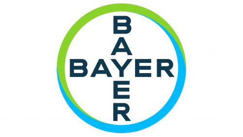
After a modification in 2010 the Bayer Cross was slightly redesigned in 2017. With this graphic evolution it is now ready for the digital age. As there is not a huge change the different lies in the detail. The color gradients in the circle are gone and the colors were modified. This makes it easier to use the logo in the digital media and gives the trademark a more modern and up-to-date look.
Font and color
The lettering, which forms the iconic Bayer cross, is set in the uppercase of a modern and clean sans-serif typeface, which is pretty close to such fonts as Bristone Bold or Tapas Sans. The clean straight lines of the logotype’s characters make the whole badge look professional and balanced.
As for the color palette of the Bayer visual identity, it is set in bright green and blue, balanced by a dark and deep blue of the wordmark. The color scheme stands for wellbeing, growth, and progress, with the dark inscription adding a touch of reliability and expertise.


