Bayer 04 Leverkusen is the name of a German professional football club, established in 1904, and competing in the Bundesliga, confidently occupying a place in the first third of the standings. The club was founded by the workers of the Bauer company at the beginning of the 20th century, and today is still owned by a pharmaceutical corporation.
Meaning and history
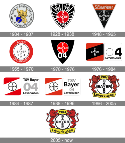
The Bayer Sports Union was founded in July 1904 in the German city of Leverkusen. But the history of the soccer team dates back to 1903 when employees of the Bayer pharmaceutical and chemical company turned to the management with a request to create a club for sports at the plant. Initially, a gymnastics section was founded, later in 1907 a soccer club and a department of sections. So the official birth year of Bayer 04 Leverkusen should be considered 1907.
For a long time, the Bayer soccer club wandered between the fourth and third German football leagues, but in 1936 the Leverkusen team entered the Fußball-Regionalliga West, which is the second most important German league. In the middle of the 1970s, the Bauer team played in Bundesliga II, and in the 1978-79 season a historic event for the club happened — they finally won the right to play in the Bundesliga I. Since then the team simply stayed in the top division, winning numerous victories.
What is Bayer 04 Leverkusen?
Bayer 04 Leverkusen is a German professional soccer club that represents the city of Leverkusen in the country’s top division, the Bundesliga. The team got its name after the chemical-pharmaceutical giant Bayer, as it was created by its employees in 1904.
In terms of visual identity, all but the very first logos of the club were built around the corporate Bayer logo, a clean circle with the iconic lettering cross. The logo was redesigned several times throughout the history of the football club, but the Bayer medallion has always been there, as well as the black, red, and white color palette, which got a yellow addition only in the middle of the 1990s.
1904 — 1907
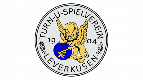
As we mentioned above, the first logo did not have the iconic Bayer-cross badge in it, but that’s only because the corporate logo has not been designed in 1904 yet. Although the sports club used the badge, which was used by the pharmaceutical corporation: a circular medallion with an image of a yellow lion leaning on a bright blue globe and holding a staff of Mercury. The name of the sports club was written in sans-serif capitals around the perimeter of the badge.
1928 — 1938
In the middle of the 1920s, the Bayer Sports Club split into separate sporting communities. The football team was now in “one boat” with boxers and athletes. They called themselves Sportvereinigung Bayer 04 Leverkusen and decided to have a new logo.
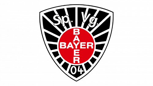
The image of a lion with the globe was changed to the iconic Bayer Cross. It was whole white lettering on a solid red circle with a white outline, placed on a triangular crest with a black and white pattern. The thin white straight line was coming out of the red circle to the frame of the crest, making it look like the sun. Above the circle, there was a white arched “Sp. Vg.” In white outlined letters, and under it — the white “04”.
1948 — 1965
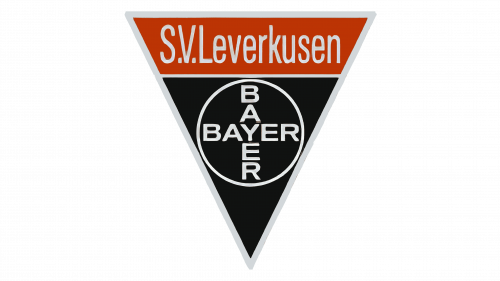
After the end of World War II, the logo of the Bauer club has changed its shape and was simplified. It was still the same Bayer Cross, but in black and white, and it was set on a narrow and sharp triangular shield with a plain black background and a red trapezoidal banner on top. The “S.V. Leverkusen” inscription was written over the banner in narrow sans-serif letters, and the “04” part was completely removed. This emblem was in force until 1965.
1965 — 1970
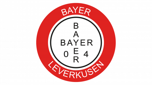
The redesign of 1965 changed the triangular shape of the logo to circular, with the white medallion and black inscription on it enclosed into a thick red frame. The frame featured a white “Bayer Leverkusen” inscription written in white sans-serif capitals around its perimeter. As for the “04”, it came back and was written in black on the sides from the vertical “Bayer” of the Bayer Cross.
1970 — 1976
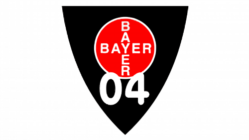
In 1970 the club changed its symbol again, bringing back the familiar black and red palette and keeping the traditional Bayer Cross as the central element. It was a classic crest with a plain black background and a solid red circle in the center. The Bauer logotype was written in white over the circle, balanced by its thin white outline. The bold and enlarged “04” in thick rounded lines was set on the bottom of the crest, slightly overlapping the circle, and celebrating the year of the club’s establishment, 1904.
1976 — 1984
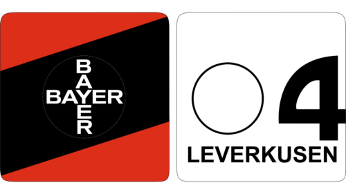
The badge, introduced in 1976, was somewhat completely different. It was not the crest, nor circle, but the composition of two squares with rounded angles set one above another. The upper square showed the black and white Bayer Cross on a background composed of three wide diagonal lines, red and black. The square under it was plain white, in a thin black outline and with the bold enlarged numbers 04 and the inscription Leverkusen in black. With this emblem, the team achieved its first significant success, reaching the First Division of Bundesliga.
1984 — 1987
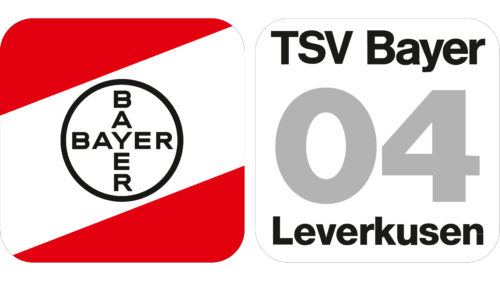
Bayer Football Club and the Gymnastics Union settled their differences in 1984 and jointly changed the logo. The composition remained the same, but the color palette was changed. Instead of black and red, the upper square became white and red, becoming a symbol of the merger of the two teams. As for the bottom square, it was still white, but with four levels of lettering. The first and third lines were in gray, while the second and the fourth were colored black. The inscription was saying: “ TSV Bayer 04 Leverkusen”.
1988 — 1996
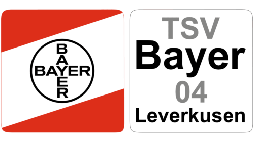
The Bayer logo looked almost exactly the same and only the letters were slightly enlarged, making the spacing between each smaller. The logo on the right side, though, changed a lot more. The “TSV Bayer” at the very top was split into two lines. The first line was done in gray and smaller font, which brought more attention to the “Bayer” part in black. The number had to be made smaller to give space to the inscription above. The logo still had “Leverkusen” printed across the bottom, only with a bit more spacing between the letters.
1996 — 2005
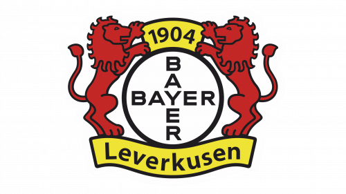
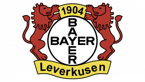
The first version of the modern Bayer 04 Leverkusen club logo was introduced in 1996. It depicts two heraldic lions in terracotta-orange, placed on the sides of the Bayer Cross emblem, executed in white with black lettering and outline. At the top of the emblem there is a small yellow banner with the date of the club’s foundation, 1904, set in black, and at the bottom the waving yellow ribbon with the black sans-serif “Leverkusen” lettering in a title case.
2005 — Today
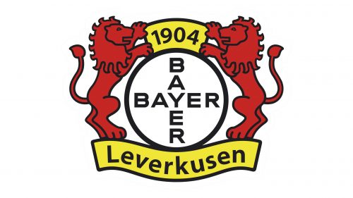
The redesign of 2005 was all about minor changes to the badge, created in 1996. The colors of the logo became brighter and more intense; with the lions gaining more red shades. Another thing was about the typeface of the lettering, which became more modern and geometric. The letters became shorter, but a little wider, which made the whole composition look strong and contemporary, despite the use of the traditional heraldic symbols and bright colors.


