Bastille is a pop-rock band from London, England. It was started in 2010 as a solo project by Dan Smith. As of late 2020, the group includes four members.
Meaning and history
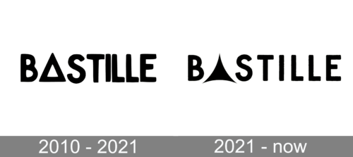
Bastille has been loyal to its original visual brand identity. We cannot notice any modifications in the way the wordmark has looked from one album to another.
If you try to find an exact match among the “ready-made” fonts, you will probably fail. On their official website, the band states that they are using a so-called BastilleFont. In other words, they have had it drawn specifically for them.
However, we cannot say that it is a highly unique type. It belongs to the group of sans serif fonts. The glyphs are perfectly legible, moderately bold. They are based on a rectangular shape standing on its narrower side, so the glyphs have an elegant elongated structure.
2010 – 2021

The only exception is the “A” stylized as an isosceles triangle. Its two upper sides are longer than the narrow basis. Yet, on the whole, the glyph is wider than all the other letters in the name of the band.
On the one hand, the unusual “A” adds a unique touch making the design recognizable and memorable. On the other hand, it looks somewhat too heavy in comparison with the right part of the emblem, where the multiple vertical bars create a visual rhythm. The two rounded letters on both sides of the “A” (the “B” and “S”) only reinforce this effect making the left part of the wordmark much heavier than the right part.
While this can be regarded as a mere incidental disproportion, we can also interpret it as a meaningful detail emphasizing the word “bas” (for “bass”). Due to this “trick,” the logo becomes more relevant for the band. We should say that although the word “Bastille” was taken from “Bastille Day” (it is celebrated on Dan Smith’s birthday), the “bass” accord in it has been more than relevant.
Although you will not find the BastilleFont for download, you may try Century Gothic Bold or Futura Medium if you’re looking for a somewhat similar font.
2021 – Today
Album covers
The names of the albums have always featured the same typeface as the Bastille logo. Due to this, the two parts of the text have always seamlessly merged.
Interestingly, even the names of the albums have been chosen with their appearance in mind. The repeated initials in the phrases Bad Blood (2013), Wild World (2016), and Doom Days (2019) create a certain visual rhythm (in addition to the phonetic rhythm, of course) adding a pictorial quality to the text.


