Barco is the name of a European company, which was established in 1934 in Belgium and specialized in the production of displays and projectors, which are mainly used in the entertainment industry. The company also manufactures technological devices for healthcare and is considered to be one of the most reliable producers of image processing and projecting techs in the world.
Meaning and history
The Barco visual identity can definitely be called Iconic, as its symbol, created in 2004, stayed with the company even after the redesign of 2017, and this is what makes its logo instantly recognizable across the globe, being at the same time a very precise reflection of the brand’s purpose.
What is Barco?
Barco is a Belgian company manufacturer of projectors, displays, and accessories, which was established at the beginning of the 1930s. Today the company operates all over the globe, providing entertaining businesses from different countries with its products.
2004 – 2017
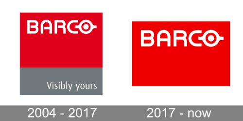
The Barco logo, introduced in 2004, consisted of a red square with its bottom part featuring a wide gray rectangle, and two wordmark’s — the main one in white capitals placed on the upper part of the square, and additional lettering, written in the title case on the gray part of the emblem.
The main inscription in bold sans-serif typeface has its solid and smooth letters with stencils and the “O” replaced by a symbol, resembling an “eye” of a projector. The circular symbol had two horizontal lines coming out of it to both sides and a solid white dot inside.
As for the tagline, “Visibly yours”, it was written in a light and delicate sans-serif, in a title case, and also featured a white color of the letters.
2017 – Today
The redesign of 2017 simplified and refined the iconic emblem. Today the white smooth lettering is placed on the upper part of the horizontally oriented red rectangle. The capital letters are executed in a smooth sans-serif typeface with rounded angles and straight edges. The projector “eye” is still there, replacing the “O” in “Barco”, but it’s contouring has been modified and slightly softened.
Font and Color
The stylized uppercase lettering from the primary Barco badge is set in a futuristic and bold sans-serif stencil typeface. The closest font to the one, used in this insignia, is, probably, Altria Bold, and all the type of the Barco logo has a slight resemblance to The depressant TS Semi Bold, but with stencils added to the contours, and the lines a bit modified.
As for the color palette of the Barco visual identity, it is based on an intense shade of red; a color of passion and dynamics, the shade, which stands for confidence and expertise.


