Banque Populaire is a co-operative financial organization, which was established in France in 1878. One of the largest banking groups in Europe, Banque Populaire has almost 40 thousand employees and operates in more than 70 countries.
Meaning and history
One of the oldest banks in France was established at the end of the 19th century as Credit Populaire de France and changed its name only in 1966. For the first era of the bank’s history, it’s been using a cock as its symbol, as the bird is a world-recognized mascot of Frances
1918 – 1948
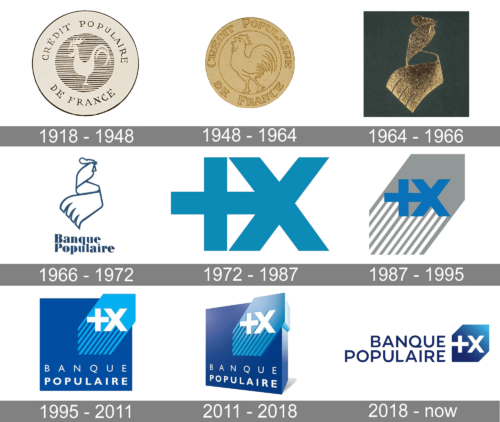
The logo, created for Credit Populaire Fe France in 1918 featured a circular badge executed in thin black lines. In the middle of a light circle in a black outline, there was a smaller circle with a horizontal-striped pattern, where the contour of the cock was placed. The wordmark was placed inside a big circle around the stripped part perimeter.
1948 – 1964
In 1948 the logo was redrawn, and the color palette was changed to gold. The striped pattern was gone, and the cocci were now placed on a plain background in the middle of the badge.
1964 – 1966
A stylized image of the cock, with a curved ribbon replacing its body was designed in 1964. The logo featured a dark gold color palette with gradient shades for the bird symbol and black for the background.
1966 – 1972
In 1966 the color palette of the stylized bird emblem was changed to blue and white and the wordmark appeared under it. The “Banque Populaire” lettering was executed in a bold serif typeface with smooth rounded lines and thin distinct serifs.
1972 – 1987
The completely new logo was introduced in 1972. The badge, which became iconic pretty fast, was composed of two sums, “+” and “x”, which stood for “the addition of each other’s strengths multiplies the effectiveness of the whole”. The image in blue was usually placed on a white background without any additional lettering.
1987 – 1995
In 1987 the symbol was placed on a gray background which resembled an arrow pointing upright with its bottom parts featuring a diagonally striped gray and white pattern, symbolizing movement and growth.
1995 – 2011
The color palette of the logo was changed in 1995 — the white “+x” symbol was placed on a light blue “arrow”, which was located on the upper right part of a solid blue square with white lettering at the bottom. The lettering was set in two levels, with “Banque” in light sans-serif, and “Populaire” in its bolder version.
2011 – 2018
The bank decides to add some volume to its visual identity in 2011, and makes the square blue and white logo three-dimensional, by adding some gradients and turning the figure in ¾.
2018 – Today
The redesign of 2018 simplified the Banque Populaire visual identity by removing the solid square and flattening the image. The bank’s logo we all know today is a gradient blue square with the upper left and bottom right corners cut diagonally, a white “+x” symbol on it, and a blue wordmark on the left.
Font and color
The modern and elegant typeface of the Banque Populaire visual identity is very close to such fonts as Kamerik 205 Text Bold and Draft A Semi Bold but with the tail of the letter “Q” modified. It looks stylish yet modest and confident.
The blue and white color palette fit the logo stands for trustworthiness and reliability of the financial institution, it also points to excellence and experience in banking and shows the bank’s loyalty to its customers.


