Established in 1917, the Bank of Montreal (BMO) is the fourth-largest bank in Canada by market capitalization and assets. It is also among the ten largest banks in North America. The company’s history can be traced back to a summer day in 1817, when nine merchants led by Austin Cuvillier signed a document creating the so-called Montreal Bank.
What is the symbol of the Bank of Montreal?
The symbol of the Bank of Montreal is the M-Bar, an iconic emblem, created by Hans Kleefeld in 1967. It is a bold stylized letter “M”, featuring a zig-zag shape, placed above a thick horizontal bar inside a solid red circle. The composition represents “vitality and service”.
Meaning and history
The BMO logo has preserved its core, the iconic M-Bar and blue color, since 1967. This is not to say the visual brand identity has remained totally unchanged.
What is BMO
The Bank of Montreal is one of the Big Five banks in Canada and is also the country’s oldest bank. It was only in 1822, five years after it was established, that the bank adopted its current name.
1817 – 1920
In 1822, the bank was turned from a private company with several owners into a public company with more than 140 owners. This, in its turn, set off a chain of events that led the bank to its current status.
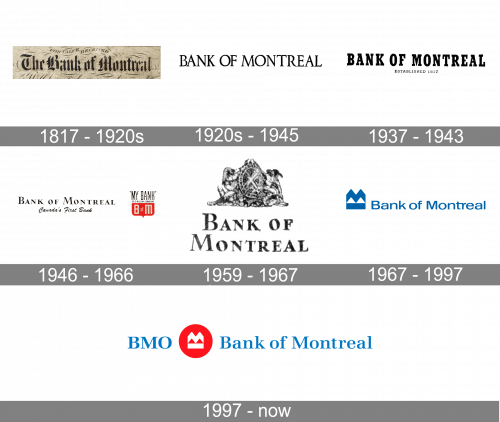
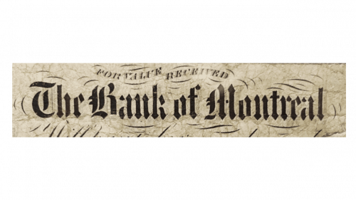
Claiming that during its first 150 years BMO had a real logo would be a gross exaggeration. A logo suggests a kind of uniformity, and this wasn’t in place back then. For instance, if you compare the way the name of the bank was written on a 5-dollar note issued in 1942, you’ll have a hard time finding similarities with the way it looked on the sign above the entrance of the headquarters or regional branches.
We can only acknowledge that there were no pictorial emblems and that the wordmark was often set in a traditional serif typeface. Using such fonts was a fairly commonplace practice during this era, so there was nothing special about it.
1920 – 1945
The second emblem updated the wordmark into a simpler style. It uses a strict serif font made fully in uppercase letters.
1937 – 1943
The 1937 design used a blockier, bolder serif style for these letters, although the approach stayed largely the same. These letters were now taller and narrower, though. Below, they also wrote ‘established 1817’ in smaller, strict serif characters.
1946 – 1966
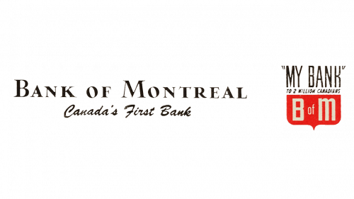
In 1946, the wordmark took on a new serif font. This one had lowercase letters, as well as uppercase ones. The words ‘Canada’s first bank’ were written in cursive letters beneath this main wordmark. In addition, there was an emblem.
It’s basically a shield shape, whose top section is occupied by the ‘my bank’ writing (continued below by a smaller ‘to 2 million Canadians’ inscription. Lastly, the lower half has a proper red background with three white letters – ‘B o M’.
1959 – 1967
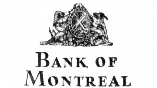
For the 1959 design, the main wordmark was enlarged and moved to the bottom. Above it, they’ve put the coat of arms of the bank. It depicts two Native Canadians supporting between them an oval shape with various Canada’s symbols. On its frame, the words ‘well-being through harmony’ were etched in Latin.
1967 – 1997
This is when the M-Bar logo was introduced. It represented the letter “M” as a zigzag with a thick bar below. The zigzag shape lacked stability, which is an essential theme for any financial institution. And yet, the bar partly made up for this. The result was a clean and unique icon, which was also highly memorable.
The wordmark on the Bank of Montreal logo was set in an unpretentious sans. Its clean lines subtly echoed the minimalist emblem. And yet, the similarity wasn’t enough to make the two parts of the design seamlessly merge.
The logo was created by Hans Kleefeld, a renowned graphic designer who worked for Stewart & Morrison Ltd, Toronto. The list of companies that had their logos drawn by Kleefeld is very long and includes such names as Air Canada, Jonson & Johnson, and Toronto-Dominion Bank, to name just a few.
The BMO logo was supposed to represent the notions of “vitality and service.” At the same time, the interior and exterior of the bank’s offices were also updated, with the introduction of a saturated shade of light blue as the official color.
One of the reasons why the company needed a uniform logo was that it wanted to take a more aggressive and contemporary style. The bank started working in the mortgage market, was massively advertised on radio and TV, not to mention other transformations.
1997 – Today
While the roundel was introduced in 1997, it was only in 2002 that it came into general use and all the parts of the company were brought under a unified BMO Financial Group brand.
The BMO logo now showcased the M-Bar in white. It was placed inside a red circle. The name of the bank was given in a serif typeface, which made it look older than the previous version.
Colors and Font
The combination of blue with red over the white background is one of the most popular color schemes in logo design.
Taking into consideration current design trends, it is easy to criticize the BMO logo for its overly traditional serif type. And yet, it appears that this is one of the rare cases when such a typeface is probably the most appropriate choice. It emphasizes the company’s rich history, its status as the country’s oldest bank, as well as its promise of stability. All these make the logo convey the “reliability” message.


