Bancolombia offers various financial products and services in Colombia, as well as in several other jurisdictions, from Panama and El Salvador to Guatemala and more. It is based in Medellín, Colombia.
Meaning and history
The company in its modern form was established in 1945, but its origins can be traced back to 1874, when its predecessor, Banco de Colombia, started working.
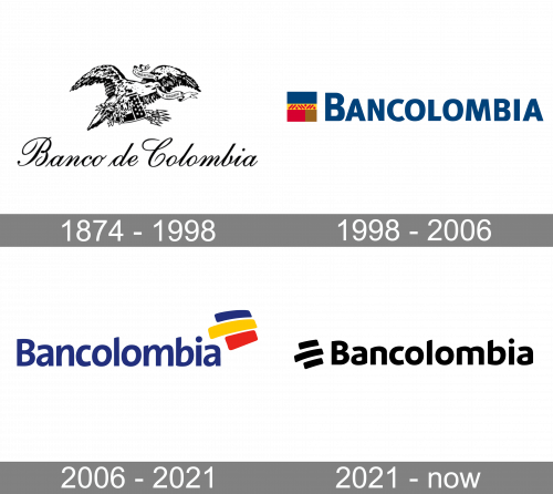
1874 – 1998 (Banco de Colombia)
We can say that the original Bancolombia logo was intricate and highly decorative, but these words can’t describe this elaborate artwork performed with multiple details. This wasn’t very unusual for the time when companies had their emblems created by artists rather than specialized designers.
The centerpiece of the logo is a stylized bird in flight. In its beak, the creature has a banner featuring the text “Libertad y Orden” (“Liberty and Oder” in Spanish), which is the national motto of Colombia. The bird is an Andean condor, which comes from the country’s coat of arms.
In its claws, the condor holds a note with nine stars, several arrows, and a twig (which is apparently the olive branch from the coat of arms of Colombia). Hardly a surprise the poor creature looks somewhat tired.
Below, there is the lettering “Banco de Colombia” set in a decorative cursive script. It is quite legible.
1998 – 2006 (Bancolombia)
The current name was adopted, when the Banco de Colombia merged with Banco Industrial Colombiano.
The version of the logo adopted in 1998 completely lost the anachronistic charm of its predecessor. The design appears to have been heavily inspired by the flag of Colombia, the so-called National tricolor.
The logo is a rectangle broken down into five fields. The top two of them are dark blue and yellow (like in the flag, only the color scheme is reversed). In the yellow field, there are multiple circles and rectangles in red forming a decorative pattern. The two fields below are red (like the flag) and brown.
The name of the brand below is set in dark blue. The type is a clean sans, which is of course by far better legible than the cursive from the previous version.
2006 – 2021
Following the acquisition of Conavi and Corfinsura, Grupo Bancolombia was created.
The updated Bancolombia logo presents the same concept but gives it a more modern, dynamic, and optimistic style. It is cleaner and friendlier, too.
Once again, we can see the name of the brand in dark blue. The glyphs are more rounded, which makes them look smoother and friendlier.
Once again, you can see the national flag above, but now it is represented by three vivid stripes. They are directed upwards, which adds motion and an optimistic touch.
There is also a version, where the full name “Grupo Bancolombia” can be seen. Here, the tricolor is smaller, more compact.
We should also mention a special version, where the tricolor is paired with the word “Colombia” and the tagline “Nos necesita a todos.”
2021 – Today

In 2021, a simplification effort followed. They blackened the whole logo and changed some shapes. The wordmark used the same font, but they basically cut all the tiny bars and strokes that projected from the main bodies, making the letters very round now. As for the flag strokes, they enlarged the gaps between them and put the whole composition on the left of the wordmark.
Font
While the type may look quite traditional (a natural decision for a financial institution), it does have a unique touch. Note, for instance, the diagonal ends of the “L” and “B.” The gently rounded, diagonal strokes echo the elements of the “flag” above.
Colors
While the palette of the Bancolombia logo has been clearly inspired by the national flag, the hues have been slightly modified, to make the design brighter and more eye-catching.


