Maestro is a brand of MasterCard’s product for online use. It was released in 1991 and today is one of the most popular payment systems in the world. There are also prepaid cards, issued under this brand name.
Meaning and history
Being a MasterCard product, Maestro has always used a visual identity based on the mother-brand logo.
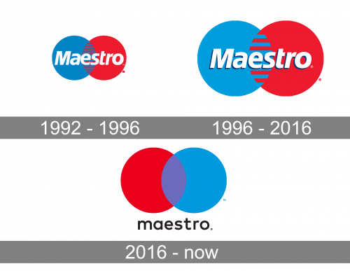
1992 – 1996
In the original Maestro logo, you could already see the two circles (blue and red) that have been the core of the emblem ever since. There were multiple stripes on the patch, where the two circles overlapped.
The word “Maestro” was written in white italics across the circles.
1996 – 2016
The logo looked almost the same, with only a slight shift in the proportions. The stripes grew bolder. The letters now had subtle darker shades.
2016 – Today
The Maestro logo introduced in 2016 is composed of a wordmark and an iconic symbol above it. The wordmark in all the lowercase lettering features a distinct sans-serif font, which is close to Frutiger. The smooth lines of the rounded letters are perfectly balanced and look confident and elegant.
The Maestro emblem is composed of two overlapping circles, executed in blue and red. The color palette of the logo is a symbol of the power and process of the energetic and dynamic label, which is also professional and reliable.
The Maestro logo is instantly recognizable and bright, it shows the brand’s affiliation and is correlated with the high-quality banking product.
The Maestro visual identity is bold and modern, using the iconic MasterCard design pattern, which is a true masterpiece of contemporary branding.


