Although the restaurant chain Baja Fresh is only about 30 years old, its logo has gone through several complete overhauls. This is why the current design hardly bears anything in common with the original one.
Meaning and history
The first location of the chain of fast-casual Tex Mex restaurants opened in Newbury Park, California, in the Conejo Valley. Five years later, franchising began.
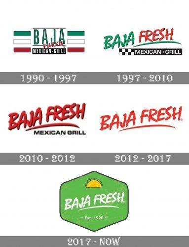
1990
The first Baja Fresh logo was designed to show what type of food is served there. The green, white, and red stripes were borrowed from the Flag of Mexico. The stripes were rotated 90 degrees, and thin black trim was added to them. In between the two sets of stripes, there was the lettering “Baja” (in green) “Fresh” (in red) and a black rectangle housing the words “Mexican Grill.”
1997
As the chain was rapidly growing, the need for a new, more modern and professional brand identity became obvious. The second logo was introduced in 1997 when the chain expanded to 31 outlets.
While the stripes disappeared, the company decided to leave the heritage palette so as to make it easier for the customers to create a visual link between the old and new logos. They left the black rectangle with the words “Mexican Grill” adding a dynamic chessboard design to it. The green stroke behind the word “Fresh” also added some dynamism.
2010
The lettering was colored red and grew somewhat bolder, although the shape remained basically the same. The rectangle behind the lettering “Mexican Grill” disappeared, which made the design look lighter.
2012
The Baja Fresh logo grew even simpler as the text “Mexican Grill” was gone altogether. The shade of red grew lighter.
2017
The writing “Baja Fresh” was now placed in a light green hexagon with rounded corners. The script was left unchanged, except for the color.


