A7X is a short name for the Avenged Sevenfold, a heavy-metal music band from the United States. The group was formed in 1999 and became famous after its debut album, Sounding the Seventh Trumpet. By today the band has released 7 albums and sold more than 8 million copies worldwide.
A & W is the brand of the fast-food chain, which was established in 1923 in the United States. The restaurants of the chain offer mainly burgers and draft beer. There are more than one thousand locations across America and other 15 countries, serving famous fast-food under the A&W name.
Meaning and history
The visual identity of the fast-food chain hasn’t changed much throughout the years. Before the first restaurant was opened, the A & W brand already existed as the label of the root beer, so the first logo was designed for the product, not the restaurant.
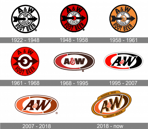
The company used one pattern until 1968 when the first major redesign was held. And since then there were few more modifications, but the current logo is still based on the version from the 1960s, and it was based on the one from the 1940s.
What is A&W?
A&W is the name of the American root beer brand, which was established in 1919. Today the brand is owned by Keurig Dr. Pepper, and I terminational company, which managed to expand the export market of the brand, so it became known not only in the USA and Canada but all over the globe.
1922 – 1948
The original A&W logo was composed of four circles placed inside each other. The wife’s two had a thick outline, while the smallest ones were enclosed in a thin light frame. The lettering “A&W Root Beer” in all capitals was located between the first two circles, around the perimeter.
The “Ice Cold” was placed between two small circles and was also written in the capitals, but using a lighter font.
The thick horizontal arrow was coming through the middle of the emblem, pointing right, symbolizing dynamics, energy, and progress.
1948 – 1958
In 1948 the color was added to the logo, now the space with the main wordmark was colored red, and the small circle in the middle too.
1958 – 1961
The change of 1958 was even a redesign. The color was switched from red to calm dark yellow, close to gold, symbolizing beer. And the mug of beer was now drawn in the middle of the emblem. The logo didn’t stay with the company for long.
1961 – 1968
The red color palette was back and the black outline and arrow turned dark brown. The typeface of both inscriptions was also refined, though the style remained the same, the letters got more space between them, in order to give the logo a more balanced and modern look. The beer image was removed.
1968 – 1995
The prototype of today’s logo was created in 1968. The logo of the fast-food chain now featured a horizontal oval with “A&W” wordmark inside. The oval had a dark brown outline and was composed of two parts, red and brown, resembling the previous version.
As for the lettering, it was written in a bold sans-serif font, with letters in brown and a curved elegant ampersand in red.
1995 – 2007
The color palette and the style of the lettering were changed in 1995. Now the logo features a red, black and white color combination, which is a reflection of professionalism, strength, and reliability. The inscription was enlarged and italicized, the letters gained smoother and sleeker lines and the font was switched to a serif one.
2007 – 2018
The last redesign of the chain’s visual identity was held in 2007. The color palette was changed to three shades of brown, with the darkest one for letters and the oval outline. The ampersand is placed over the letters and is drawn in the lightest shade of brown, balancing the left part of the oval.
On some of the versions, there is the company’s motto written as a tagline in yellow. “All American Food” is executed in a bold sans-serif typeface which is close to Don Family.
2018 – Today
The refined version of the A&W logo, introduced in 2018, keeps the design concept of the previous badge but turns it into somewhat more modern and confident. The oval with a brown frame is now set diagonally, with the framing extended by two banners with additional lettering in bold uppercase. The top banner boasts the “Since 1919” date mark while the bottom one contains the “Root Beer” inscription.
Font and Color
The A&W root beer logo has two different styles of lettering on it. The custom monogram, executed in a thick and sleek typeface with slightly sharpened and curved edges of the letters. The font is elegant and chic, yet has a dynamic and progressive mood due to the lines, pointing in one direction.
As for the inscription, set around the emblem’s frame perimeter, it’s capitalized letters are written in a clean and solid sans-serif typeface with a very confident and masculine character. The font is pretty close to the Eurostile family, which is a modern typeface, widely used in the visual identity design.
The brown and yellow color palette of the A&W logo represents the brand’s products — root beer — at its best. It shows the quality of the ingredients, warm feelings the drink gives you, and evokes a sense of friendliness and comfort.


