Austin is the name of a former automaking brand, which was established in the United Kingdom in 1905 and ceased all operation in 1952. The company was famous not only for their elegant sedans but also for commercial vehicles and even aircraft, built during World War I.
Meaning and history
Austin existed in its original state for 47 years, and merged with Morris Motors in 1952, forming BMC company, which stayed alive until 1967. BMC turned into British Leyland, which was acquired by the world’s famous River Group in 1988. So it was a pretty intense history for a car brand, though it is important, that Austin kept its identity even in the BMC era when some of the brand’s models were still in production.
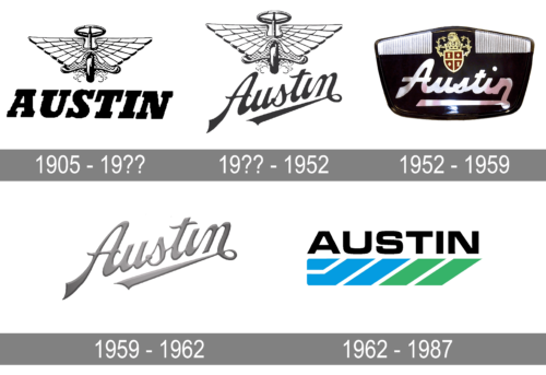
The iconic Austin logo has never been changed since the day of its creation, at the beginning of the 20th century. It was an elegant and memorable badge, composed of a graphical part, set above the italicized lettering in extra-thick lines.
The emblem featured a girl-like image with enlarged triangular wings, executed with lots of details, and a ring above it. It looked pretty much like an aviation badge, which was logical if to remember that the company was producing aircraft during World War I.
The wordmark in a bold Italic font with massive square serifs looked a bit clumsy and heavy under an elegant badge, though the two parts were not always used together. The badge was usually placed on the car bonnet, executed in glossy metal and looking elegant and fine, while the logotype was more for official papers and documents.
Both the emblem and the logotype evoke a sense of speed and movement. Emblem — by its wings and flight spirit, and the inscription by its slanted letters, as inclination always reminds of motion.
1905 – 19??
The very first official logo was adopted by the Austin brand in 1905, and it was an insignia, which fully lived up to its time. It was composed of an emblem, depicting a wheel enclosed between two geometric wings, and a bold uppercase wordmark, written in a slanted serif typeface, and serving as a kind of stabilizer.
19?? – 1952
After the first redesign of the Austin logo, the contours of the emblem were slightly refined and the wordmark was completely changed — the bold uppercase inscription was replaced by a diagonally located script lettering with elegant lines and sharpened flared rails of the bars. This badge was in use by the company till the beginning of the 1950s.
1952 – 1959
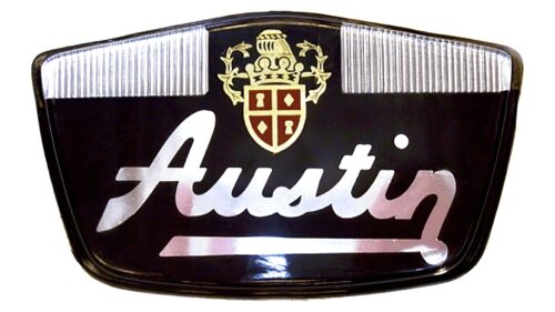
In 1952 the Austin badge completely changed its look, and the delicate winged emblem turned into a bold extended shield in glossy black with a gold and burgundy heraldic crest located above an extra-thick and stable silver wordmark in a stylized script typeface.
1959 – 1962
Another version of the Austin visual identity was introduced in 1952. This time the graphical emblem was completely removed from the composition, and only the wordmark was left. There was some resemblance to the typeface, used in the second logo, yet it was more minimalistic and gained silver gradients, which made it look three-dimensional.
1962 – 1987
The last Austin logo was designed in 1962 and stayed with the company until its closure in 1987. The badge was composed of bold geometric lettering in the uppercase of a modern sans-serif typeface, and a green-and-blue underline, made of slanted parallelograms set at a small distance from each other. It was a strong and progressive badge, which was meant to reflect the transition of the brand to a new level.
Font and color
The massive yet elegant logotype of the British automaking brand was written in all capitals of a bold serif typeface with extra-thick lines and large square serifs on their ends. The type of the Austin visual identity is very similar to such fonts as Karnak Pro Black Italic, Rockwell Nova Extra Bold Italic, and Stanford Serial Heavy Italic, with only some small details modified.
The color palette of the Austin visual identity is very traditional for the automobile industry — silver metallic for the badge, and monochrome for the printable version of the logo. Silver is the best choice for car brands, as it looks stylish and elegant with any color of the car, evoking a sense of balanced beauty and confidence.
As for the monochrome palette used for the logotype and the graphical part of the brand’s identity, it showed the company’s professionalism and expertise, making their customers sure of the high-quality of Austin cars.


