Aussie is a well-known brand specializing in hair care products, including shampoos, conditioners, and styling products. The company was founded by Tom Redmond, who was inspired by the diverse flora of Australia. Aussie primarily operates in the United States, where it has established a significant market presence. The products are widely recognized for their distinctive purple packaging and catchy product names.
Meaning and history
Aussie was founded by Tom Redmond in 1979. Redmond was inspired by a trip to Australia, where he was introduced to a variety of local fruits and nuts, which he then decided to incorporate into his hair care formulations. The company’s initial product, the 3 Minute Miracle, quickly became a sensation due to its effective results and unique Australian botanical ingredients.
Over the years, Aussie expanded its product line and market reach. It became particularly well-known for using Australian botanicals, such as Blue Gum leaves, Australian Custard Apple, Quandong, and Mint Balm, which distinguished its products in the crowded hair care market. Aussie’s innovative approach to hair care and commitment to playful, quirky branding helped it grow a loyal customer base.
Currently, Aussie maintains its reputation as a leading hair care brand. It continues to innovate with new products while staying true to its roots of using Australian botanicals. The brand is a subsidiary of Procter & Gamble, which acquired it in 2003, allowing Aussie to leverage P&G’s vast distribution network to reach a global audience.
What is Aussie?
It’s a dynamic hair care brand known for its unique use of Australian botanicals in products like shampoos and conditioners, catering to various hair needs.
2006 – 2019
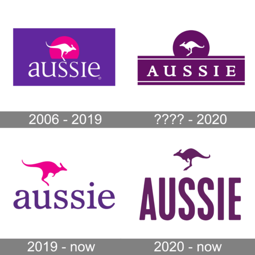
This logo presents a striking combination of colors with a lively pink kangaroo silhouette encased in a circular pink backdrop set against a deep purple field. The kangaroo is mid-leap, suggesting dynamism and natural energy, traits that the company wishes to associate with its brand. Below this symbol, the brand name “aussie” is written in a relaxed, lowercase, serif typeface that adds a personal and approachable touch to the logo. The use of the kangaroo, an animal endemic to Australia, serves as a nod to the company’s origins, while the circle symbolizes unity or a global approach. The “®” symbol indicates a registered trademark, asserting the logo’s protected status and the brand’s professionalism.
???? – 2020
This logo simplifies the color scheme by using various shades of purple, a color often associated with creativity and luxury. The kangaroo, now a lighter shade of purple, is positioned above a darker purple banner containing the brand name “AUSSIE” in bold, capitalized letters. This bannered design gives the impression of a seal or a badge, which may evoke a sense of authority and trust in the brand. The kangaroo is still dynamic, maintaining the brand’s connection to energy and movement. The use of capital letters for the brand name, in this instance, confidence and solidity, aims to convey the brand’s standing and reliability in its market.
2019 – Today
The kangaroo remains in a vivid pink as on the 2006 logo, which pops against the white, ensuring visibility and brand recognition. The font for “aussie” here is consistent with the previous design, maintaining brand continuity. The use of lowercase letters could be an attempt to appear informal and friendly, inviting a sense of trust and community. This logo aims to balance a message of environmental consciousness with a strong brand identity.
2020 – Today
Here, the logo design takes a more minimalistic approach, featuring the silhouette of a kangaroo in purple that matches the color of the brand name “Aussie” written below. The kangaroo is depicted in a single, clean leap, which keeps the dynamic energy associated with the brand. The brand name is in a stylized, lowercase, serif font that adds a touch of elegance and fluidity, implying a brand that is both approachable and high-quality. The uniformity in color suggests a more modern and streamlined branding approach, focusing on clarity and recognizability. The simplicity of this design could be aimed at a wide range of applications, ensuring the logo is versatile and effective across various mediums.


