

![]() Atletico Madrid Logo PNG
Atletico Madrid Logo PNG
The earliest Atletico Madrid logo was introduced during the club’s first season in 1903. It was based on the interlacing letters “A” and “U” inside two blue round frames, which made it look a bit like a target. The logo featured the same two colors, blue and white, as the team’s kits.
Meaning and history
![]()
The visual identity of one of the most famous Spanish football teams has a pretty intense history. It has been a really long and colorful way from the very first logo, designed in 1903, to the one we all know today.
Though for the most part of the times the club has been using the emblem, based on the one, created in 1917, there have been several experiments and redesign throughout the years.
1903 — 1911
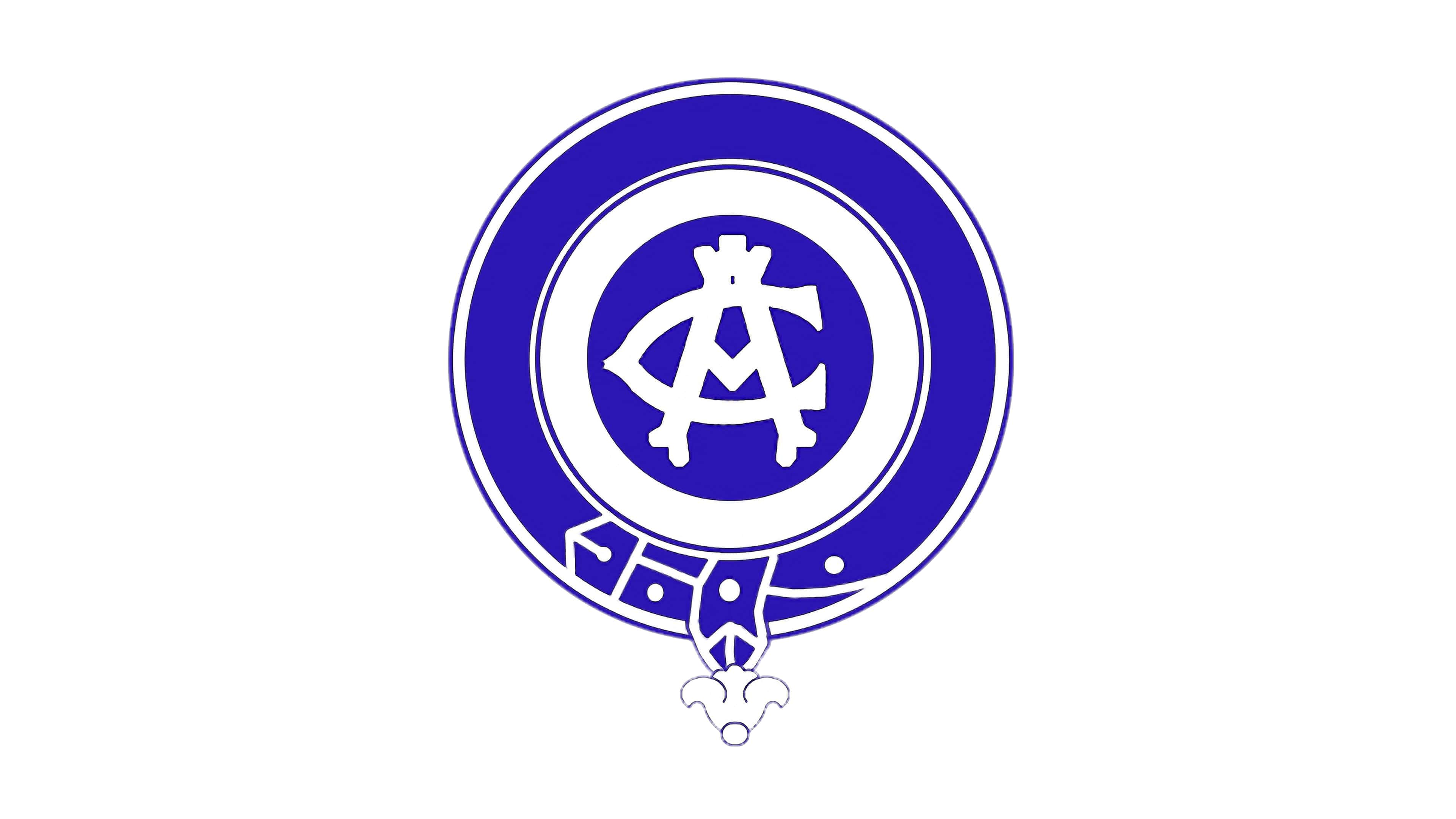
The very first logo of the Atlético Madrid was completely different from all the following versions, both in shape and color palette.
It was a circular badge in blue and white with a wishbone-style white monogram in the middle of the blue ball. The color palette was fresh and bright, representing the professionalism and reliability of the club.
1911 — 1917

The first redesign of the logo was made in 1911, and that is when the red and white palette replaced the blue one. The new logo depicted a brown football and a red and white striped flack with bold “CA” lettering on the upper left corner.
Though this logo didn’t stay with the club for long, the striped pattern started being used on all the following versions of Atlético Madrid’s visual identity designs.
1917 — 1932
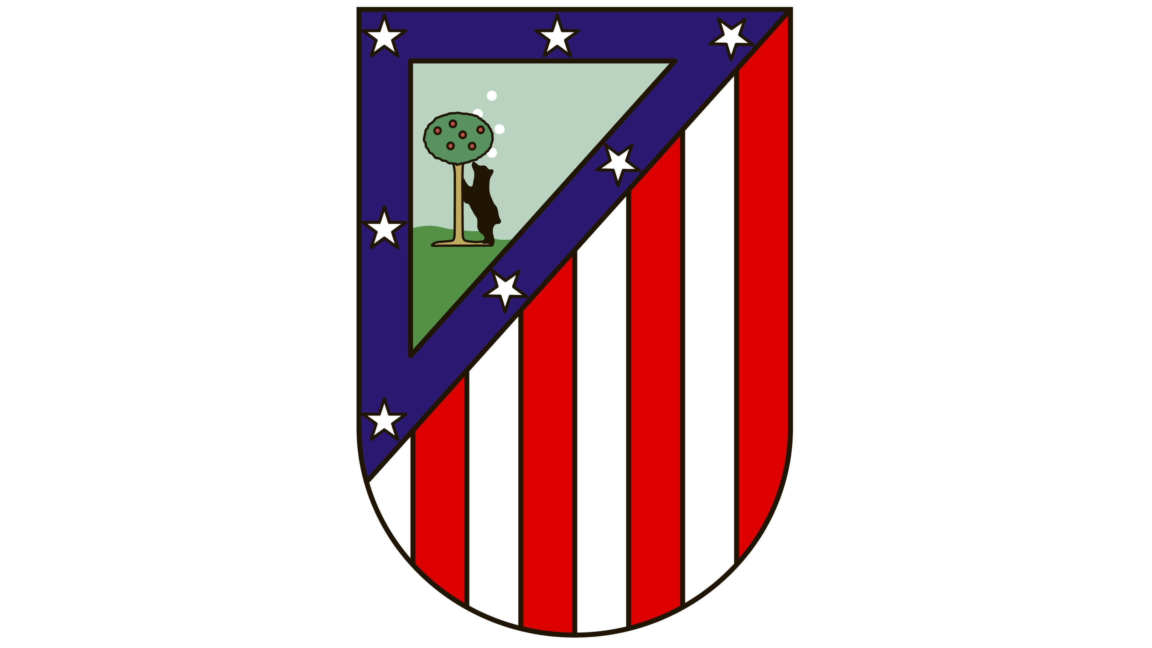
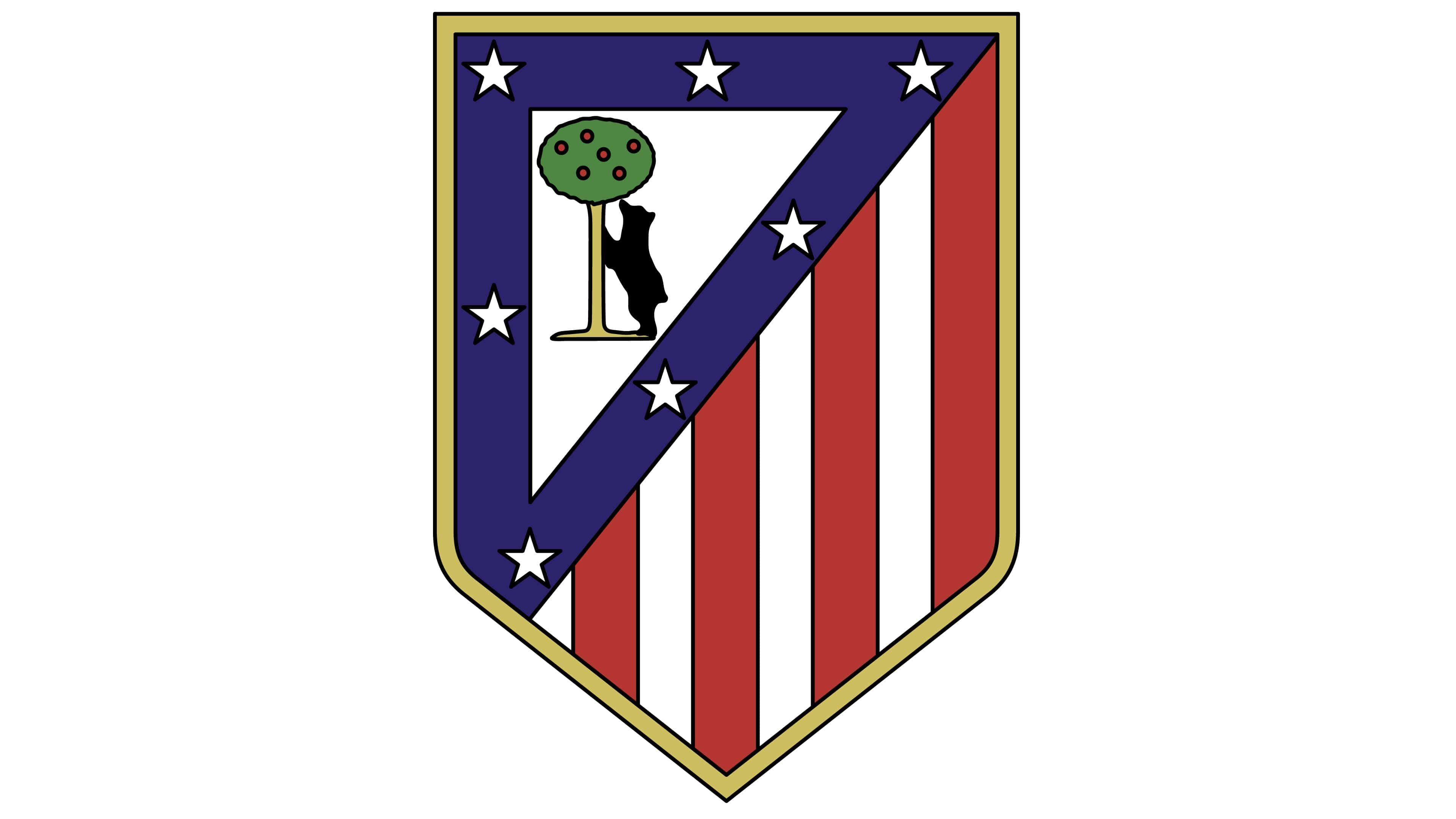
The new era of emblems started for the club in 1917. Now it was a shield-shaped badge with a vertical striped red and white pattern and a triangular segment on the upper left corner. Inside the green triangle, framed in blue with seven white stars, there was a bear standing under the tree.
The bear and the tree are heraldic symbols of Madrid, the homeland of the team.
1932 — 1939
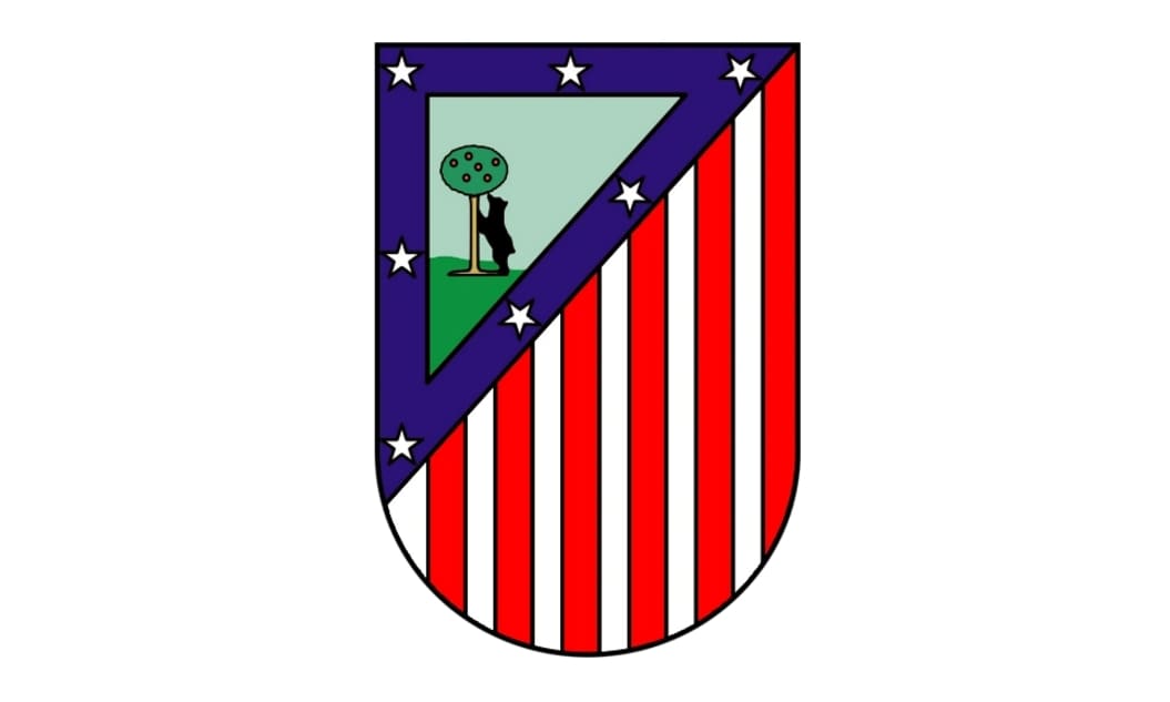
In 1932 the logo was slightly refined by adding more vertical stripes to the shield’s body. In some versions, the emblem was outlined in gold and had a slightly pointed bottom part.
1939 — 1942
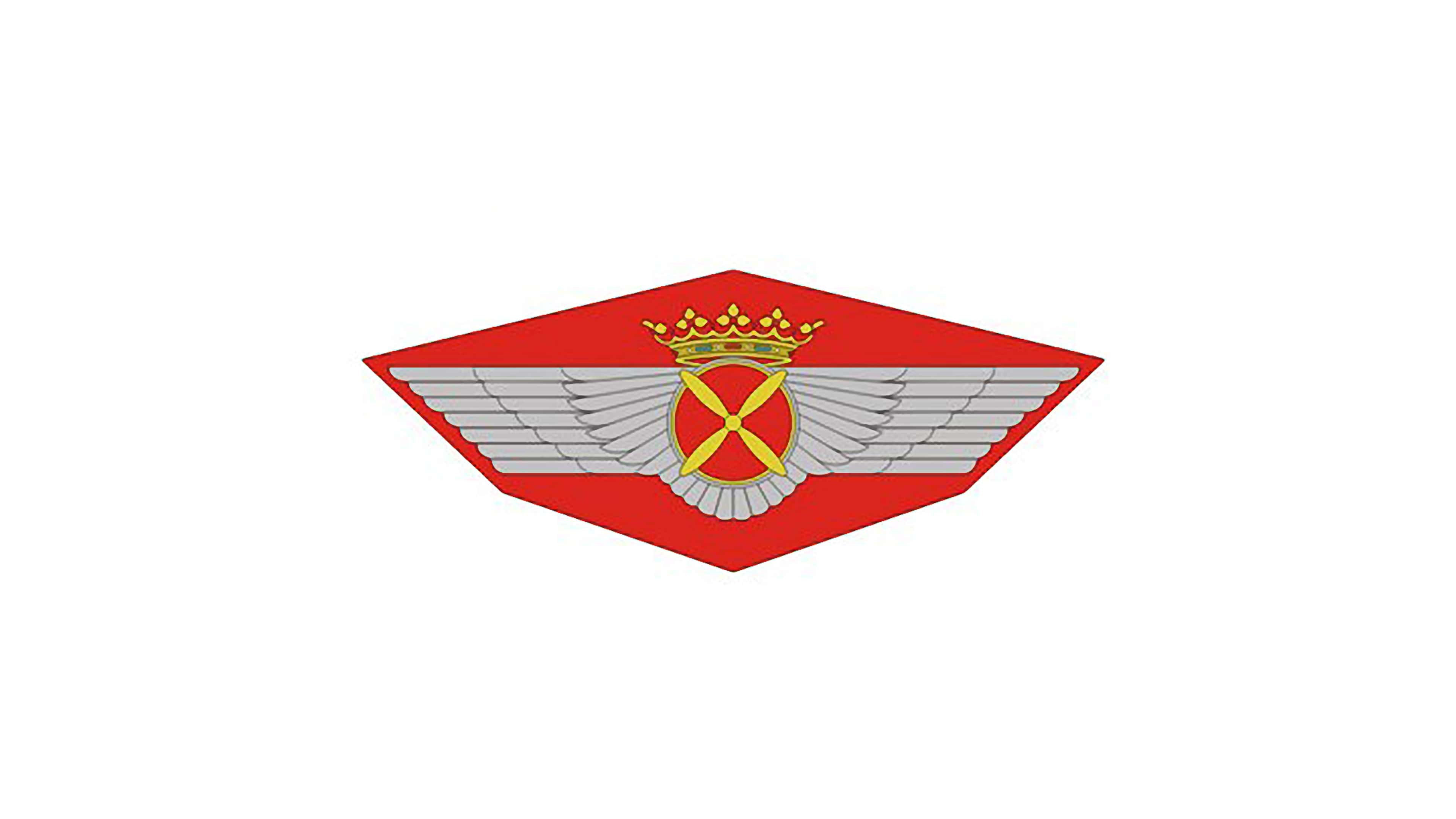
The new visual identity era started for Atlético Madrid in 1939 when the team merged with the National Aviation team after the civil war in Spain. So the new badge depicted the Atletico’s iconic shield, which the blue triangle replaced with red, and its green background simplified to white, placed on a winged gray badge. There was also an ornate gold crown with green and red gems above the shield.
1942 — 1947
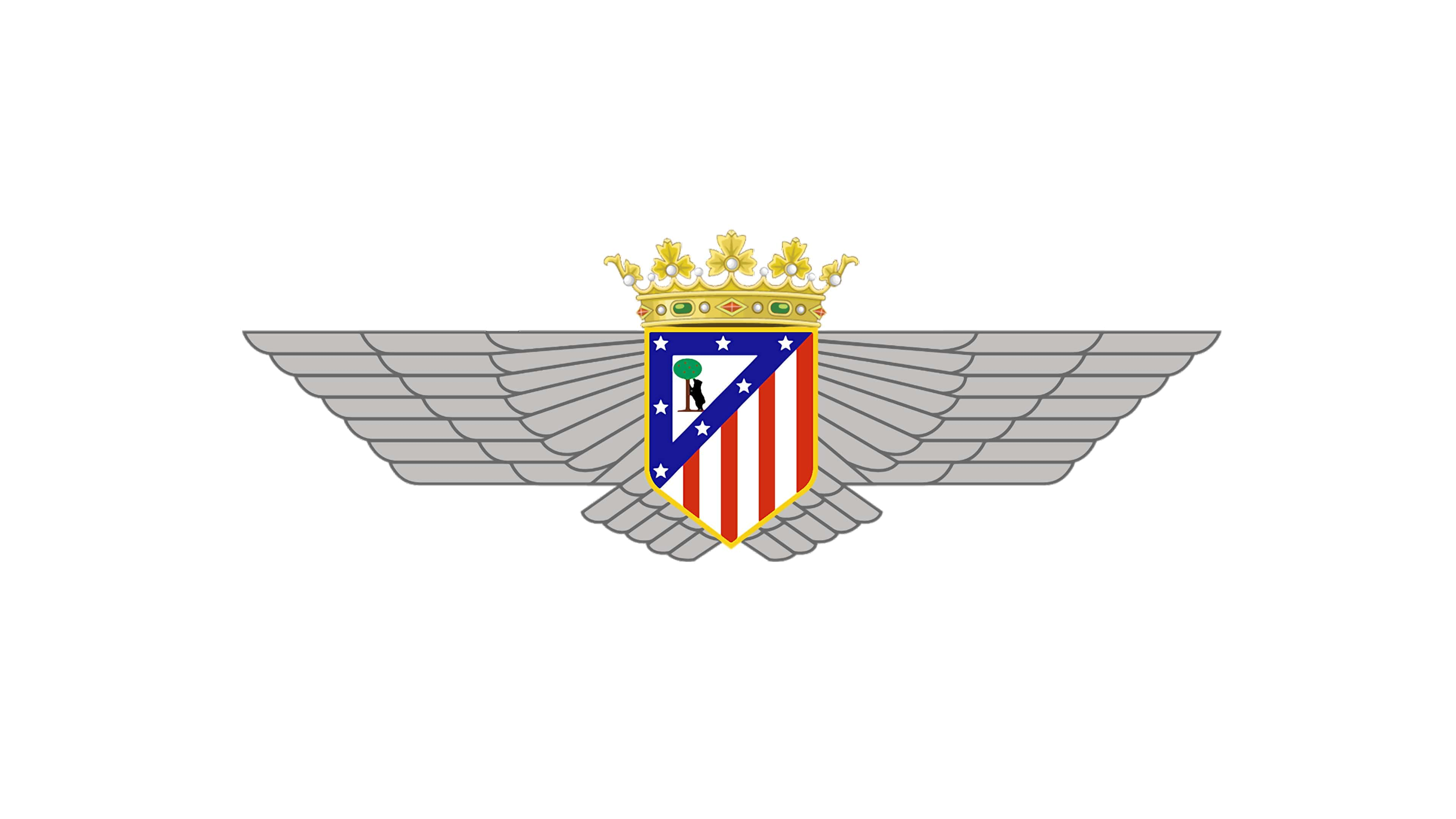
In 1942 the blue triangular outline came back to the logo, and the number of vertical stripes was back to four red and four white ones. The wings and the crown remained untouched.
1947 — 1950

In 1947 Atlético Madrid stopped their relationship with National Aviation and came back to its original logo — a flat shield with stripes, stars, and a bear under the tree. The shield has slightly changed its shape, having its bottom part a bit elongated and narrowed.
1950 — 1970
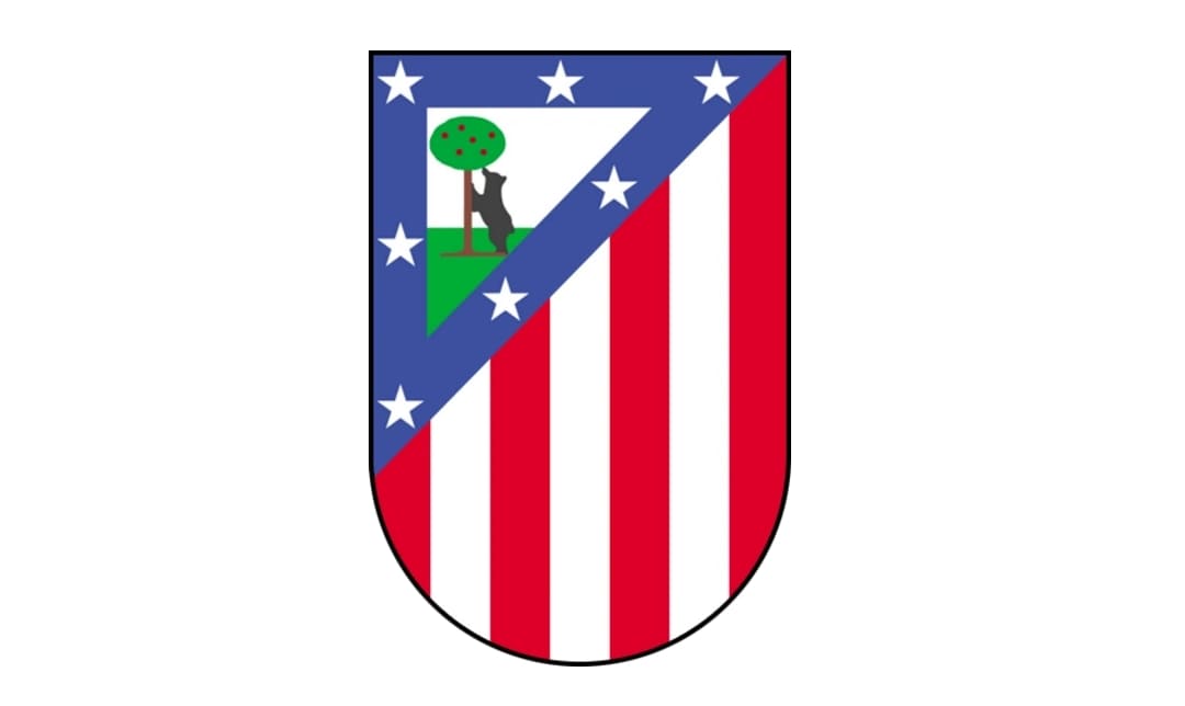
In 1959 the shape of the logo has been changed again, now its shortened and rounded, just like it was before the Civil War.
1970 — 2016
The redesign of 1970 brought a new shape to the Atlético shield — now it was sharp and more triangular, showing the progress and power of the team and its willingness to move and to win. The new shield is outlined in yellow, a color, symbolizing energy, and a positive approach.
2016 — 2017
In 2016 the yellow outline was replaced by a blue one, in order to give the logo a more balanced and professional look. The triangular part with the bear became a bit bigger now, and the geometry of the shield was now sharper and more distinct.
2017 — Today
![]()
The shield was redrawn in a minimalist and modern way in 2017. The color palette was simplified to blue, white, and red, the contours of the shield became a cleaner and smoother, and the upper side — slightly arched.
The main change was done to the “bear and the tree” part. The animal was now placed on the left of the tree, and drawn in a more abstract manner, in blue. The tree was not placed in its whole size anymore, which gave the logo a contemporary and stylish look.
Symbol
If you take a look at the 1917 Atletico Madrid logo, you’ll definitely recognize it – it has a lot in common with the current one. There’s the iconic bear under the apple tree, the white stars on the dark blue background, as well as the red and white stripes that can also be seen on the current shield.
Current emblem
In 1939-1947, the club went through three winged logotypes, and then the era of the bear-under-and—the-apple-tree shields started, once again. In 2017, a new Atletico Madrid logo was adopted. It was designed by Vasava (Barcelona, Spain).
Criticism
![]()
Shortly after the 2017 logo was introduced, it faced fierce criticism, primary from the team’s fans. Moreover, they even took part in live protests organized with the help of the hashtag #ElEscudoNoSeToca (the name of the hashtag can be translated from Italian as “The Emblem can’t be touched”).
True, the 2017 shield looks different from its predecessor, it is way simpler. The bear has definitely lost all of its old-fashioned charm. And yet, there’s another point that probably wasn’t considered by most of the fans as they are far from the world of design. A good logo is a logo that is easy to reproduce on a variety of media, from uniforms and web to print. From this point of view, the old logo with the brown tree was nothing but a catastrophe.
The new logo introduced several improvements. To start with, the color scheme grew simpler. The striking lack of proportion in the sizes of the bear and the tree also disappeared – on the new logo, they are much bigger, which makes the picture easier to discern at smaller sizes. While you could discern them on the old Atletico Madrid logo 512×512, smaller sizes were a challenge.
All the bars are now of the same width – a great step towards the overall visual harmony of the design. Also, the stars seem to be better aligned with the red stripes than on the previous emblem.
While the tree resembles a nuclear blast, we should also take into consideration that trying to fit a tree in that space was definitely a challenging task for the author of the design.
Color
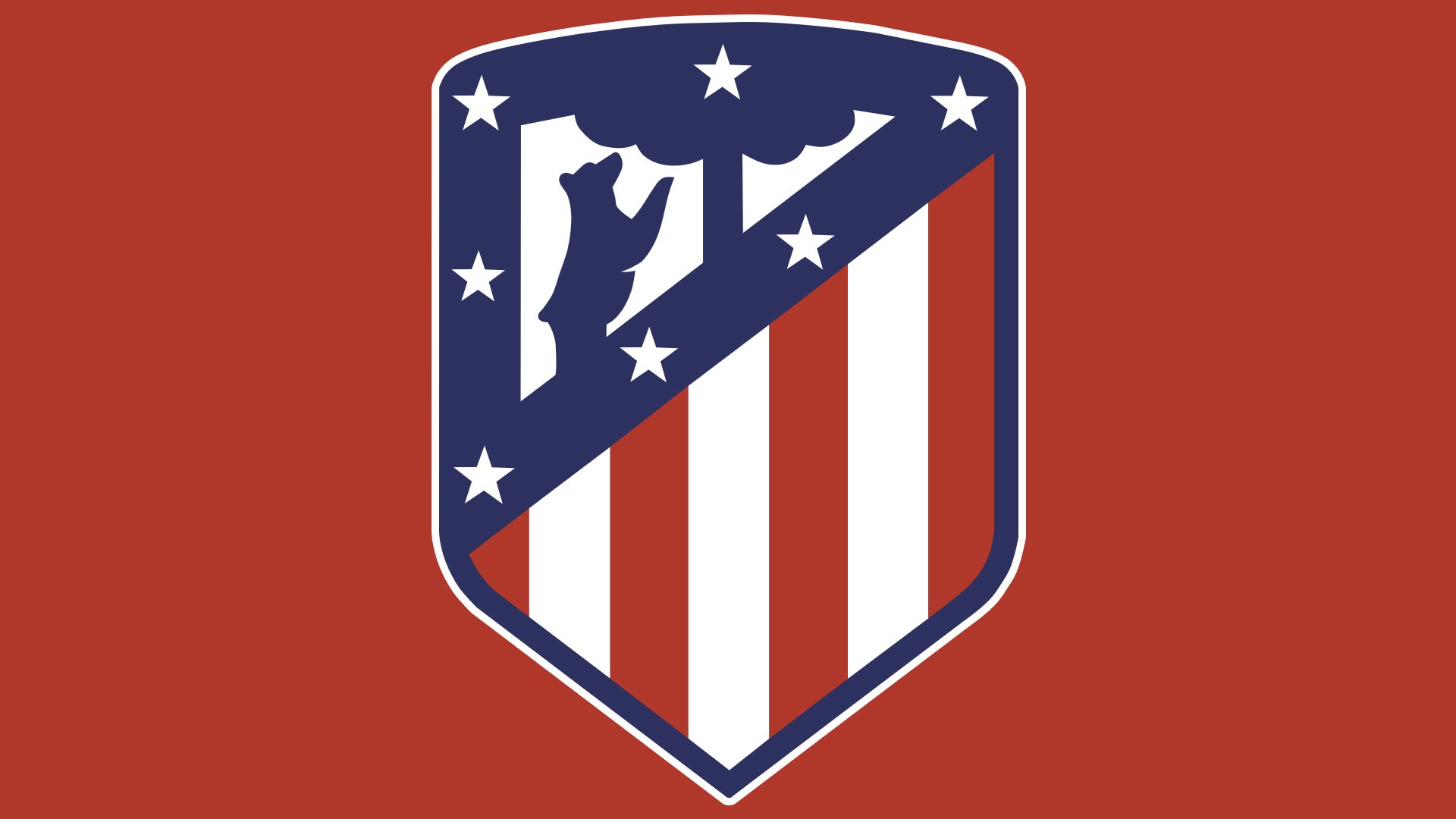
![]()
The current Atletico Madrid logo combines three colors: red (hex: #CB3524) and navy blue (hex: #272E61) for the picture and white for the background. The choice creates a great contrast, which gives the present emblem an advantage in comparison with its predecessors.
The color palette of the previous logos was more complex (it consisted of some six or seven colors) and, therefore, more difficult to reproduce.


