Atkins is a food brand, established at the end of the 1980s in the United States. The brand is specialized in the production and distribution of healthy foods, suitable for the world’s famous Atkins diet.
Meaning and history
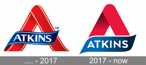
The Atkins logo hasn’t changed much since the day of the brand’s establishment. The concept was designed in the 1980s and is still kept in a slightly modernized way today.
The visual identity of the famous American brand consists of a bright red emblem with a blue ribbon containing a wordmark. The emblem is a stylized letter “A”, which has its horizontal bar replaced by a blue ribbon.
Before 2017
The earlier versions there was a whole letter, but today it is only an upper part, a triangle with a smooth bottom side.
2017 – Today
The wordmark in white is written in a strict and clean sans-serif typeface, perfectly balancing the distinct contours of the whole logo. I was much more ornate before — the inscription was drawn in a classy serif font with a delicate shadow. Today’s style is minimalist and strong.
The red, blue, and white color scheme of the Atkins logo is a celebration of traditions, progress, and confidence. The company values its past, but mover forward, staying strong and stable today.
The Atkins visual identity is laconic yet powerful and says a lot about the brand. It evokes a sense of reliability and loyalty and shows the brand as the one, dedicated to providing its customers with only the best.


