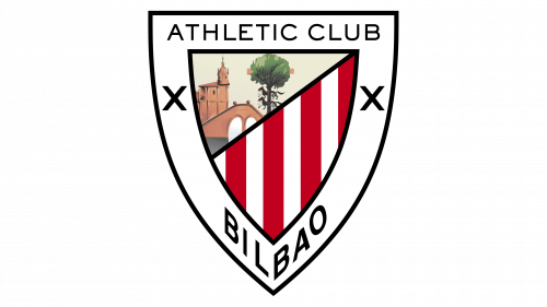
Athletic Bilbao is the name of a professional football club from Spain, which was established in 1898. It is one of three clubs (along with FC Barcelona and Real Madrid) that have never been out of La Liga, since the day of its creation in 1929. Athletic Bilbao is one of the most titled Football clubs in Spain.
Meaning and history
At the end of the nineteenth century, Bilbao was one of the main ports of Spain and had a large number of iron mines and shipyards. Bilbao also had many migrants from the northwest of England. It was they who instilled in the city love of football. As a result, at the end of the 1890s, the Bilbao Football Club has formed thanks to the efforts of the workers.
At the same time, Basque people were going to Britain to study engineering and commerce. As a result, the Basques also became interested in soccer and, after returning to Bilbao, began to play matches against British workers.
In 1898 students from the local gymnasium founded the Athletic Football Club or Athletic Club. The two clubs decided to merge in 1902.
What is Athletic Bilbao?
Athletic Bilbao is one of the strongest Spanish football clubs, which was established in 1898 and is based in Bilbao, Basque Country. The club is the eight-time champion of Spain and has 24 wins in the Copa del Rey cup.
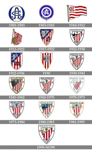
As for the visual identity, the Athletic Bilbao logo was redesigned over a dozen times throughout the club’s history, but almost all of them are built around the same symbols, which show the club’s values, loyalty, and patriotic moods.
1901 — 1903
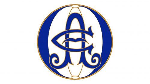
The initial Athletic Bilbao logo, designed at the beginning of the 20th century, featured a beautiful blue and white composition, with the stylized football ball enclosed into a golden frame. The ball was divided into vertical fragments in white and blue, with thin golden separation lines. In the center of the badge, there was an elegant “AC” monogram, standing for “Athletic Club”, written in a wishbone font, with a schematic flying bird in blue, set inside the letter “C”.
1903 — 1910
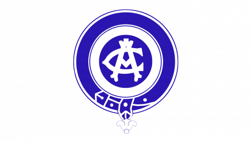
In 1903 elegance of the Athletic logo design gave way to modernity, and all gold elements were removed from the logo, and the contours became bold and heavy. The white monogram was now set on a solid blue circle and enclosed into a thick white and blue frame, the outer part of which was stylized as a belt, with its buckle part placed on the bottom of the logo.
1910 — 1912
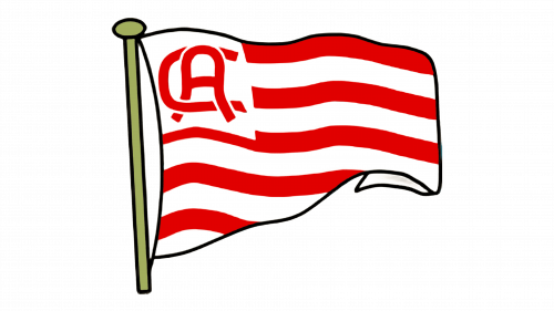
A completely new concept of the logo was introduced in 1910 after the coach of the club came back from his trip to England, where he saw the uniform of the Southampton FC, with white and red stripes, and decided to adopt the style for the Athletic visual identity. So the badge now featured a waving flag with a horizontal striped pattern in red and white, and a bold “AC” monogram in red, placed on the upper left corner of the flag. The flagpole was drawn in gold.
1912 — 1922
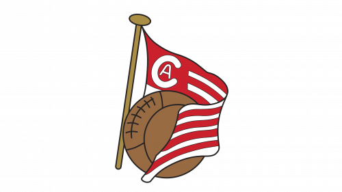
The redesign of 1912 slightly changed the composition of the logo. Now the glad about the brown flagpole was “embracing” a brown soccer ball. The “AC” monogram was redrawn, and now the small “A” was placed inside a bold and massive “C”. The letters were set in white on a solid red square in the upper left corner of the pennant.
1917 — 1922
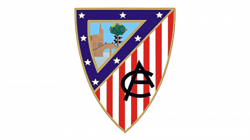
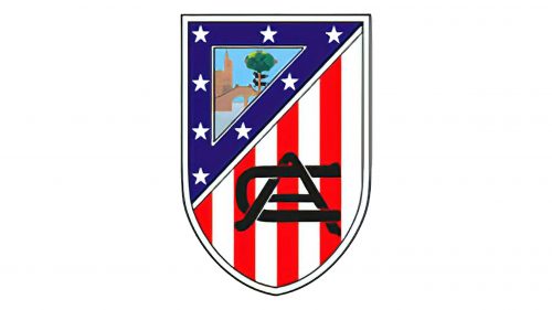
The prototype of the current Athletic Bilbao crest was introduced in 1917. Since that time the shape of the logo has never changed, but the composition and colors had different versions throughout the years. The funny thing about the Athletic logo from 1917 is that looks exactly like the national flag of the United States of America. The upper left part of the crest featured a triangular segment in a thick blue frame decorated with eight white five-pointed stars, and the rest part of the crest was colored in red and white stripes.
Inside the blue frame, there was a beautiful image in tender and bright colors, depicting the main symbols of Bilbao: the Church of St. Anton, the St. Anton’s Bridge, the Guernica Oak, and two wolves, placed one under another.
As for the striped part of the logo, it only featured a bold black “AC” monogram, with the uppercase intertwined letters drawn in a sharp and modern sans-serif typeface.
1922 — 1930
The redesign of 1922 introduced a modern version of the Athletico badge in a white, red and black color palette. The crest got a wide white framing, where now the “Athletic Club” was written along the upper part, and “Bilbao” — at the bottom. The triangular fragment with the church, the bridge, the wolves, and the oak got its frame removed, and was now set in a black-and-white monochrome, while the striped part of the logo remained untouched, although the monogram was gone. On the side part of the white frame, there were two black X-crosses.
1922 — 1936
The colorful version of the Athletic Club logo came back in 1922, and the blue frame with white stars too. Although the crest itself became narrower and got its bottom part rounded, the monogram on the red and white part got enlarged and was now set in two smooth extended intertwined letters in solid black.
1930
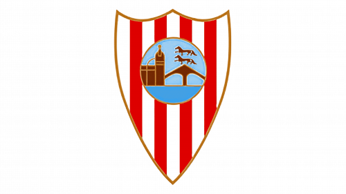
In 1930 the design concept of the Athletic Bilbao football club was rethought. The crest was narrow and sharp at the bottom, with three peaks at the top, and the triangle with the Bilbao symbols turned into a circle, which was now set in the middle of the shield. No additional lettering or monograms were present on the badge, just a thin dark gold outline, which elevated the sense of elegance and sophistication.
1930 — 1941
A few months later the colored version of the badge, designed in 1922 was brought back as the primary logo of the Athletic Bilbao club. The framing and the striped parts remained untouched, but the Bilbao symbols from the triangular fragment in the upper left corner of the crest were now set in their original palette. Apart from the wolves, which were set in black. This version of the logo stayed with the tram for more than ten years.
1941 — 1942
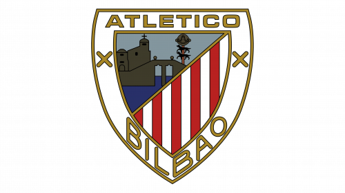
The redesign of 1941 happened for a reason: the “Athletic Club” name was now illegal to use, as Francisco Franco, the dictator in power at the time, forbade the use of foreign names on signs and logos. So the club was forced to change its name to Atletico Bilbao, which was reflected in the new logo. That was not the only change on the badge; it was, actually, fully redrawn. The crest became wider, and the lettering on the white frame became bolder and changed its color to gold, gaining a thin black outline of the letters. The same happened to two crosses. As for the main part of the badge, the part with the church and the bridge was enlarged and changed its color palette to a darker one. Also, the striped on the bottom right segment gained thin black separation lines.
1942 — 1970
In 1942 the logo was redesigned again, bringing back the flat black-and-white design of the framing, and the vivid color palette of the triangular element. The red and white stripes got all black lines between them removed. So, it was almost the logo from 1930, but with the “Athletic Club” inscription replaced by the wide bold “Atletico”. The badge was in use for almost thirty years.
1970 — 1973
The “Athletic Club” lettering came back to the badge of the club in 1970 after the Franco regime fell. But that was not the only change. The logo style was completely new — drawn in thin lines, with schematic symbols in black-and-white, and a widened white frame of the crest. The lettering was rewritten too, and now featured a lightweight sans-serif typeface with capital letters in modern shapes. The striped on the bottom right segment of the badge gained black separation lines again, but in the new logo, they were very appropriate.
1973 — 1980
In 1973 the club returns to the logo, designed in 1942, but changes the Spanish “Atlético” into English “Athletic”, removing the “Club” part. All the other elements were kept as on the version from the 1940s. The design of the primary badge stayed untouched until 1980.
1980 — 1983
The lettering was rewritten in a lighter sans-serif font and the frame of the crest turned to gold after the redesign of 1980. But the most important change was made to the part of the crest with the Basque symbols: they were all redrawn in black silhouettes and got placed on a solid blue background, looking like a nighttime landscape image.
1983 — 1995
The redesign of 1983 introduced the badge, which was a mix of several previous versions. The framing was set in light gold, while the bold black lettering on it comprised the “Athletic Club Bilbao” name, and the crosses were drawn in gold. As for the main part of the logo, it kept the style of the badge from 1930 but was redrawn in a lighter and brighter color palette, which perfectly balanced the new framing, and evoked a sense of happiness and energy. The badge was in use by the club for almost a decade.
1995 — Today
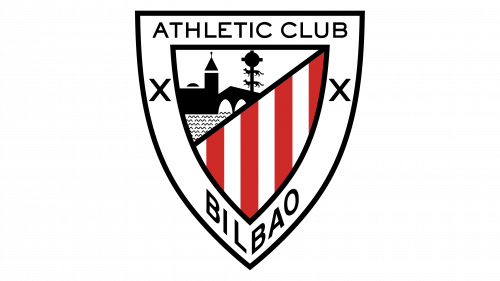
The color palette got darker again in 1995, and the framing came back to black, as well as the lettering is written around it. The upper, “Athletic Club” part is now set in a lightweight sans-serif, with the letters smaller than before, while the “Bilbao” at the bottom is still bold and massive. The main part of the crest was still the same, in the palette from the 1940s, but with a slight refinement of the shades in the upper left corner.


