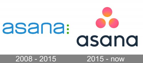
Looking at the logo of Asana, you can hardly figure that it belongs to an app used to coordinate teams. That said, the design does convey the “cooperation” and “synergy” notions, albeit in a subtle way, using the language of symbols. The 2015 logo does it more successfully than the original one.
Meaning and history
While the brand was officially established in 2008, it was only in the spring of 2012 that the commercial launch took place.
What is Asana
Asana a web and mobile application intended to coordinate teams and help them track and manage their work. The app was launched by Dustin Moskovitz, who is known as one of the founders of Facebook, and engineer Justin Rosenstein, ex-Google, ex-Facebook engineer.
2008 — 2015
The earliest Asana logo already featured the two main visual themes that can be noticed in the following version. You could see the name of the brand written in a minimalist sans where letters were rounded and lowercase. Also, there were three circles.
What about the differences? To begin with, the color of the letters was blue. Also, the circles weren’t that prominent. They were very small and placed one above the other. The circles were colored green and positioned to the left of the final “a.”
2015 — present
Here, the circles grew larger and brighter – they now showcase a soft pink color with a warm yellowish tinge. The yellow parts face the center. It looks as if within the space between the three circles new energy and light are born. In other words, this is a symbol of synergy, the additional effectiveness produced by several companies or people working together. In comparison with the previous emblem, this is a definite step forward. It much better conveys the essence of the brand and its core promise by showing what effective collaboration means. According to the authors of the Asana logo, the light symbolizes cooperation and sharing.
To draw attention to this detail, the emblem was moved – it is now seen either to the left of the wordmark or above it.
The overall style of the wordmark looks pretty similar to the previous one. Yet, if you take a closer look, you will notice that the type has become more generic, with the “a’s” and the “n” having all the usual “tails” in place. The “a’s” are now based on the circle shape, which helps create a visual rhythm and merge the wordmark with the emblem dominated by the circular theme.
The redesign was performed by Moving Brands.
Colors and font
When the Asana logo is placed on the white background, the type grows black, whereas the black background requires white letters. The emblem, though, preserves its radiant color.
The typeface is simple and perfectly legible without being overly minimalistic. It still preserves the “tails” on some of the glyphs, which could have been removed without sacrificing the legibility.


