Arctic Monkeys are a rock band created in Sheffield, the UK, in 2002. They have won seven Brit Awards (as of 2020).
Meaning and history

Arctic Monkeys is a British indie rock band that was founded in High Green in 2002. The original lineup consisted of lead vocalist and guitarist Alex Turner, bassist Andy Nicholson, drummer Matt Helders, and guitarist Jess Cook. In 2003, the band began recording material, passing out CDs of their songs at their concerts, and fans exchanged songs over the Internet – the 17 songs were later compiled into the MP3 compilation Beneath The Boardwalk, named after the place where the band handed out their first CDs.
Arctic Monkeys’ debut album, Whatever People Say I Am, That is What I’m Not, topped the charts and became the best-selling debut album in British history. In its first week alone, this album sold more than the rest of the top 20 albums combined; more than 360,000 copies were sold in its first week. The second single from the album, When the Sun Goes Down, was also a number-one hit in the UK.
It was thanks to the idea of promotion through the Internet that Arctic Monkeys earned BRIT Awards in the categories Best British Group and Best British Album and five nominations for the prestigious Grammy Awards. Today the Arctic Monkeys are still one of the best-selling rock bands of this century and certainly one of the best in the UK.
2005
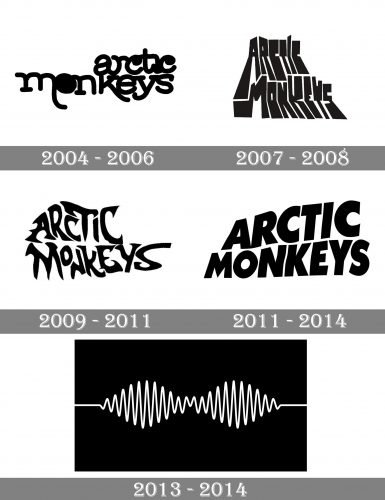
In the fall of 2015, the band finished recording their first album. The record was released in the US in early 2006. The album cover showcased the name of the band in a playful, creative type.
The letters on the original Arctic Monkeys logo were hand-written and resembled wild plants that had grown in an abandoned garden. The ends of some of the glyphs (the “m” and “k,” for instance) were stretched beyond their normal size. The “r” was partly formed by the extended end of the “a.” The links between the letters broke the rules of calligraphy multiple times.
While there was hardly anything “musical” or “arctic” about this logo, its style somehow echoed the music the band played.
2007
The cover of the album Favourite Worst Nightmare showcased a dramatically different wordmark. The rounded and light shapes were replaced by angular and heavy ones. The design preserved its wild character, though.
Also, there was something in this logo that made it more meaningful, in comparison with its predecessor. You can feel its “iciness” – the glyphs could have been the pieces of a broken ice floe. If you take a look at the logos of the Ice Age franchise, you will notice they share much in common. The “icy” theme echoes the word “Arctic” in the name of the band.
2009
This logo was also “icy” but in a different way. This time, the glyphs looked as if they were formed by frozen water. Their whimsical curves, curls, and sharp ends resembled frozen puddles on the earth.
This electrifying visual brand identity was first introduced on the cover of the band’s third album, Humbug.
2011
This version has probably been the most long-lasting of all – it was used until 2017 and could be seen on the covers of two albums, Suck It and See and AM.
Each of the glyphs here had a different height. None of them was aligned properly, so they did not form a single line. The way the letters were distorted brought to mind a flag. If you compare this logo with the one Black Sabbath used, you may see a pretty similar “flag” effect, although it is more obvious in the case of Black Sabbath. The weight and shape of the letters are also somewhat similar.
2013
In addition to the wordmark, the band also used a graphic logo featuring a rounded zigzag shape. The amplitude of the zigzag varied breaking the emblem into two identical parts.
2018
The Arctic Monkeys logo grew lighter – it looked ethereal due to the very thin strokes and the shape of the letters leaving lots of breathing space.


