Ibanez is a Japanese brand of guitars manufacturer and distributor, which was founded in the 1970s in Nagoya and today has production facilities in different countries and offers more than 500 options of guitars.
Meaning and history

The company that owns the Ibanez brand is an entire musical empire, which owns the production of percussion instruments, Tama Hoshino Gakki, which began back in 1908.
In 1926 Hoshino Gakki established the import of Spanish acoustic guitars by the famous master Salvador Ibanez, in whose workshop guitars were made under the brand, respectively, Salvador Ibanez. Soon the Hoshino family, who owned this music store, realized that it was much more profitable to produce their musical instruments than to import them from abroad. So, in 1935 Hoshino Gakki began to produce stringed instruments of its production.
The modern history of the Ibanez brand begins in 1957, as it was the year the first electric guitar was released. In the next decade, Ibanez began to produce copies of famous guitar models and exported these instruments to the United States. As early as 1971, Hoshino’s representative headquarters was opened in Pennsylvania, and Elger Guitars was renamed Ibanez U.S.A.
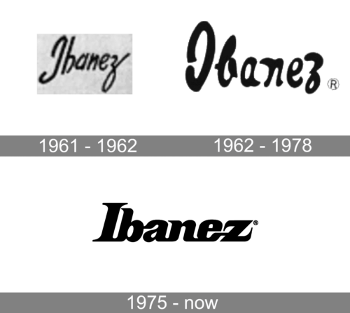
1961 – 1962

The original Ibanez logo, designed in 1961, stayed with the legendary brand for just a few months. It was a bold yet slightly narrowed handwritten inscription in thick black lines with rounded ends. The name of the brand was set in the title case and placed slightly arched, with the barely noticeable diagonal inclination of the wordmark.
1962 – 1978

The first redesign of the Ibanez badge happened already in 1962. It was a straight line with heavy sleek bars of the characters, set in the title case of a fancy designer typeface. There was a slight resemblance to the previous badge, especially in the curved tail of the “Z”, but the overall style and mood have been modernized and started looking confident and professional.
1975 – Today

Ibanez is an iconic brand and its logo hasn’t changed much since the 1970s when it first appeared. It is a timeless and instantly recognizable visual identity, which is composed of a single wordmark.
The monochrome palette of the logo makes its hand-drawn lettering look more distinct and bold.
The thick italicized lettering with rounded angles and elongated tails of “Z” and “N” make the wordmark look sleek and modern.
It is a nice example of a representation of the rich heritage and modernity at the same time. The timeless typeface is unique and is a true brand’s signature, the quality mark and the sign of passion for music.


