A&P, standing for The Great Atlantic & Pacific Tea Company, was the name of the famous grocery retail chain, which was founded in 1959 in the United States. The company, originally called Gilman & Company, was considered to be one of the largest retailers across the country, but closed all operations in 2015, declaring itself as a bankrupt.
Meaning and history
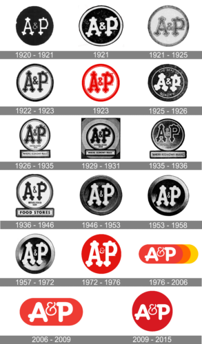
Though A&P was a company with a very rich history, its visual identity timeline is not so intense as it could be. The style and color palette of the retailer’s logo was set in the very beginning, and till the end of its existence, the huge chain kept the simple and minimalist approach to their designs.
1920 – 1921
The AP badge from the beginning of the 1920s featured a solid black roundel with a stylized white monogram, where the two bold capital letters were connected by an elegant l thin ampersand, also in white.
1921
In 2021 the company used one more version of the logo, with the emboldened characters and a thick white outline added to a solid black roundel. In this new execution the badge started looking more confident and bold.
1921 – 1925
The badge of the company got another redesign a few months later, with the color palette switched to a lighter one, and the refined gray lettering placed over a white roundel in a thick gray outline.
1922 – 1923
The contours of the letters got refined in 1922, making up narrower and more elegant contours, and redrawing the monogram in black, keeping the background white, and the thick rounded frame becoming black as well, balancing the look of the medallion.
1923
The badge of 1923 was the first one in the company’s history to adopt a red and white color palette, even though it only stayed active for several months. The contours of the characters got emboldened and gained a thin double outline in red and white.
1925 – 1926
The redesign of 1925 has made the letters on the medallion even bolder, and drew them in white again, which the background turning back black, and the composition getting additional letters, “The Seal of Quality”, executed in the uppercase of a lightweight sans-serif font, also in white.
1926 – 1935
In 1926 the company brought back the badge from 1922, but cleaned up the contours and added one more element — a horizontally-stretched rectangular banner with the “Where Economy Rules” inscription in black sans-serif capitals. The banner had an ornate internal frame, and was placed right under the roundel.
1929 – 1931
The redesign of 1929 has emboldened all the characters of the A&P badge, and it made the black shade look even darker. The lettering on the banner gained small elegant brackets, which added some more elegance to the composition.
1935 – 1936
In 1935 the A&P logo was redesigned again, with the contours of the elements remaining the same, but the color palette switched — the bold black characters were outlined in white and placed on a gradient roundel, colored in a dark shade from gray to black.
1936 – 1946
The redesign of 1936 has modernized the A&P logo, removing all additional outlines, and emboldening the black characters, placed on a plain white background. As for the rectangular banner, it got its frame more geometric now, and the inscription was replaced by the bold uppercase “Food Stores” in a heavy sans-serif font.
1946 – 1953
The redesign of 1946 has instituted a three-dimensional roundel of the A&P company, with the voluminous white characters placed in a gradient gray-to-black medallion with a thick frame. The small white ampersand got even narrower.
1953 – 1958
In 1953 the contours of the elements got cleaner and more distinctive. The white characters gained black shadow, and the voluminous frame of the roundel got more silverish gradients.
1957 – 1972
The redesign of 1957 has enlarged the characters on the A&P roundel and made the color palette of the logo lighter and glossier by adding more silver and white accents both to the background and the frame of the logo.
1972 – 1976
The initial logo for A&P was created in 1859 and comprised a solid scarlet-red circle with a white monogram on it. The lettering was ornate and boasted rounded bold ornaments on the ends of the letters’ bars. The ampersand was executed in slim smooth lines and placed between the upper parts of “A” and “P”, is small and delicate.
The red and white color palette, representing passion, love, and loyalty, was a very good choice for the grocery retailer, whose main aim was to give people high-quality goods and products, which will make their warm cozy evenings at home better and sweeter.
1976 – 2006
The logo was first redesigned in 1976, and that was the only version of the retailer’s visual identity, where not only red and blue colors were used. The red circle got stretched horizontally and gained orange and yellow “elongation” on its right side.
As for the letters, they were also redrawn in a modern way. Now capital “A” and “P” featured a bold rounded sans-serif typeface with clean smooth lines. The ampersand was slightly bigger than on the previous logo, but was still thin and delicate, having an old-school feeling, due to its curved elegant lines.
The logo was nicknamed “Sunrise” due to its new color palette and was used by the company even after the redesign of 2006, in selected locations.
2006 – 2009
The simplicity of shapes and colors comes back to the A&P visual identity in 2006. The orange and yellow parts are removed, and the logo becomes more compact now. As for the lettering, it still uses the same typeface as on the previous version, but the letters a bit bigger now. The red oval is slightly shortened, which makes the whole image balanced and solid.
2009 – 2015
The last brand’s redesign was held in 2009. The company decided to come back to the original circular shape, replacing the oval with an intense red solid circle. The lettering of the new logo keeps the typeface of two previous versions. It was the last logo of the huge reputable American company, making the cycle complete — the A&P started with the circle and finished with it.


