AOA is a South Korean girl group. It was created in 2012 by FNC Entertainment and initially consisted of eight members. By late 2020, though, only four girls remained.
Meaning and history
The group hasn’t been very consistent in its visual brand identity. Each of the three album covers released (as of late 2020) has featured a different wordmark.
Ace of Angels (2015)
Here, the name of the band is given in very small letters, in comparison with the name of the album. The AOA logo does not look like a logo but is rather just a word in a generic type. It is perfectly legible and has classic proportions.
The only unusual elements are the top serifs on the “A’s.” Firstly, the very position of the serifs is uncommon (the top of the letters instead of the ends). Secondly, the serifs are moved to the right thus forming an asymmetric design.
However, the wordmark doesn’t seem to have any meaning or echo the shape of any other elements seen on the cover.
Runway (2016)
This one is already more of a real logo. You can see the name of the group inside a yellow ball, which echoes the bowling balls held by the girls.
In the lettering “AOA,” the “A’s” seem to be positioned behind the “O.” In its turn, the “O” has a circular shape and appears to be moving forward. In other words, it can be interpreted as a bowling ball rolling towards you.
There are three stars above the glyphs. On both sides, you can see three horizontal bars with rounded corners imitating the wings.
While this emblem does not look like a masterpiece of logo design, it at least gives the band something like a distinctive visual brand identity.
Angel’s Knock (2017)
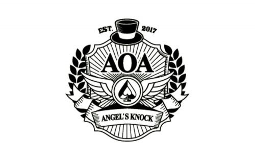
The cover of the Angel’s Knock album goes even further. The image on it is more than a logo, it resembles a seal or a coat-of-arms.
It’s heavy on generic details seen on thousands of coats-of-arms from various cultural and historic backgrounds. We can mention, for instance, the laurel wreath, the wings, the five-pointed star, the shield shape, the sunrays, the banner, and, of course, the lettering “est.” Apparently, the designer decided to use this project to master all the commonplace symbols he could remember.
The palette combining soft beige with a greenish shade of gold does not strike you as unusual, too.
Also, the Ace of Angels logo has been modified multiple times for their LPs and other uses.


