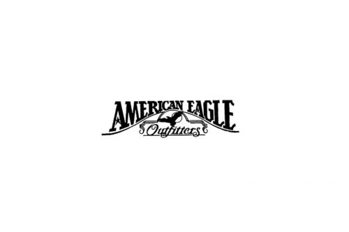
The first shops of the American Eagle Outfitters opened in 1977. The original American Eagle logo was pretty intricate and cluttered. It was dominated by the lettering, while the eagle looked small and overshadowed.
Meaning and history
In 1977, brothers Jerry and Mark Silverman decided to expand their business. At that time they ran Silverman’s Menswear brand. It was a family company that had existed since the beginning of the 20th century. The brothers felt they needed more than one concept, and they wanted to open a chain of stores. That’s how the first American Eagle Outfitters location came about.The emphasis was on things for outdoor activities: hiking, mountaineering and camping. The brand quickly attracted a large number of customers.
By the beginning of the 1990s the American Eagle chain had grown to 153 stores, which did not at all meet the hopes of management, who had planned for much faster growth, which forced the company replace its management. In 1992, under new management, the brand once again began its development in the market. American Eagle was henceforth focused on casual wear for men and women, while at the same time maintaining its focus on the outdoor activities.
The first international American Eagle store opened in 2000 in Canada. And already in 2003, the first boutique outside North America appeared in San Juan, Puerto Rico.There are now American Eagle stores also in Saudi Arabia, Morocco, Poland, Beijing, Shanghai, and Hong Kong.
What is American Eagle?
American Eagle is the name of an American brand, founded by brothers Jerry and Mark Silverman, produces clothes, shoes and accessories. The main emphasis is on clothing for outdoor activities. The brand’s main audience is young active people from 16 to 35.
1977
The majority of the first logo was occupied by the words “American Eagle” in an artistic serif type. The glyphs were bold and pretty heavy. The serifs were heavy, too, and some of them had an unusual shape (the “E’s” and the “L,” for instance).
The line below “American Eagle” formed a hill, so the size of the writing was modified to fit the hill (the letters on the top were smaller). Below, there was a small eagle in flight and a banner. Behind the eagle’s wing, there was a circle representing the sun.
Below the eagle, the lettering “Outfitters” could be seen in a script with fancy swirls. As if to make the design even more cluttered, a long horizontal bar was placed under “Outfitters.”
1985
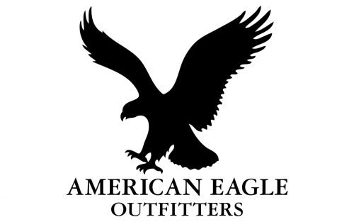
This logo is by far cleaner and more utilitarian than its predecessor. It is easier to grasp due to the simpler letters and larger emblem.
The eagle now dominates the design. It looks different than in the previous version. While the previous eagle seemed to fly without any visible aim, this one seems to have found a victim and is ready to attack.
The full name of the brand in a simpler all-caps serif type can be seen below. It is given in two lines.
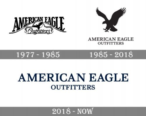
During the period between 1985 and 2018, at least two versions of the logo were used. While their overall look was pretty much the same, they featured slightly different typefaces.
You can clearly see the difference between the older version and the newer one in the way the “E” glyph looks, for instance. The top and bottom bars on the “E” from the Garamond bold type (older version) have different lengths: the top bar is shorter than the bottom bar. In the Newburgh type, they have the same lengths. Also, the serifs on the “E” in Garamond are directed outside (they are positioned diagonally), while on the “E” in Newburgh, they are positioned vertically.
The Newburgh type is a custom type developed by Associated Typographics.
2019
The 2019 American Eagle logo removed the eagle that had been the signature of the brand for decades.
Icon
In addition to the primary logo, the company also has a favicon, which is used when a compact version of the logo is required. The icon is made up of the letters “AE.” Typically, the letters are white and are placed inside a black square. The glyphs look the same as in the primary wordmark.
Font and Color
The bold uppercase lettering from the primary American Eagle logo is set in a classy serif font with bold distinctive contours of the characters and sharp serifs. The closest fonts to the one, used in this insignia, are, probably, Walbaum Pro 06pt Regular or Carot Text Medium, with some slight modifications of the characters’ contours.
As for the color palette of the American Eagle visual identity, it is based on a deep shade of blue, a color of reliability and confidence. This, not very typical for a fashion industry, color is what makes the brand stand out in the list of its competitors.


