Amblin Entertainment, Inc. is a film production company based in the Universal Studios backlot in Universal City, California.
Meaning and history

The Amblin Entertainment logo looks very unusual and certainly unlike the majority of modern logotypes. There are by far more details than on an average logo. Also, the image doesn’t work well at smaller sizes.
Read on to discover the reasons that have made the design team opt for such an original decision.
1983 – 1984
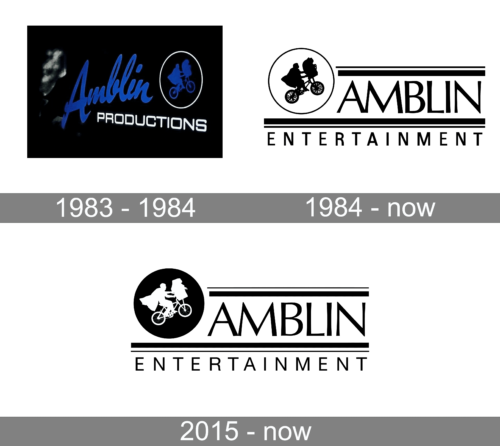
The company was established in 1983 as Amblin Productions, hence the first badge was built around it. Although, it only stayed active for a few months, as already in 1984 the company gets renamed Amblin Entertainment. The initial badge was set in solid black with the bold cursive “Amblin” in blue and an uppercase sans-serif “Productions” in white placed under it. The lettering was accompanied by a blue silhouette of a man on a bicycle, drawn against a black background and enclosed into a thin white circular frame.
1984 – Today
In 1981, director and producer Steven Spielberg established the company together with film producers Kathleen Kennedy and Frank Marshall. They named the company after Spielberg’s first commercially released movie (1968).
Three years later, the iconic logo was introduced. Its pictorial part was inspired by one of the earliest Amblin’s films, E.T. the Extra-Terrestrial. There was a bicycle owned by the film’s main hero, Elliot. In the basket of the bicycle, you could see the extraterrestrial E.T., another hero of the story.
The circle behind them was the moon. Yet, this was not obvious when the logo was just black-and-white – it looked more like a ring that had been added for decorative purposes.
To the left of the emblem, there was the word “Amblin” set in a unique and elegant all-caps sans. While the type was highly legible, it was also unusual due to the varying widths of the strokes. Above and below the word, there was a pair of horizontal bars (a thin and a thick one).
Below the lower bar, there was the word “Entertainment” in a simpler, narrower sans.
2015 – Today
The designers decided to make the “moon” theme more pronounced. They inverted the colors. Now, the silhouette of the bicycle, E.T., and Elliot is white, while the circle is black.
Those who don’t know the story of the movie E.T. the Extra-Terrestrial still won’t guess that this circle is the Moon. And yet, the color at least gives a sort of clue, a hint that it is not just a decorative element but a meaningful detail of the Amblin Entertainment logo.
The icon has been redrawn – you can see several details that look different. Still, it didn’t affect the overall look of the emblem.
Another important modification is the type used for the word “Entertainment” – it has grown a little wider, with more breathing space.
The horizontal bars have grown lighter. You can also notice a couple of barely visible updates in the wordmark.
Wordmark and icon
As of late 2020, the official website of Amblin features a simpler logo. Here, there is only the word “Amblin” with two pairs of horizontal bars (above and below). The typeface is the same as in the main logo described above. The bars are also the same. The only difference is that the wordmark is white on the black background.
The icon on the website was borrowed from the primary Amblin Entertainment logo, too. It showcases Elliott’s bicycle and E.T. riding in the basket. This time, though, the designers had to get rid of the moon because it was hardly possible to squeeze it. Even without the moon, the icon is too cluttered – one can hardly make out what it depicts. You would never have guessed there was a bicycle unless you have already seen the main logo.
And yet, we can’t but mention that this icon and the “cluttered” logo were chosen for a reason. For the creative team, emphasizing the company’s glorious past became more important than obeying the modern design trends.
Colors
The colored version of the Amblin Entertainment logo combines blue and red over the white background. Also, some of the company’s film ending credits showcase the version with a realistic moon with a shining white and gray surface.


