Allegiant Air is the name of a low-cost air carrier, established in 1997 in the United States. The company commenced operations only six months after its foundation, and today it is a top-14 airline in North America, known for one of the lowest prices on the market.
Meaning and history
Allegiant Air is an American low-cost airline, part of the Allegiant Travel Co. The airline is headquartered in Las Vegas.
The route network of Allegiant Air has more than 120 destinations and 11 major hubs. All flights are within and throughout the United States, connecting mostly small regional airports.
What is Allegiant Air?
Allegiant Air is a North American low-coster, which was founded in 1997, and today has its flights scheduled to about 120 destinations, which makes it a number 14 air carrier in the region. The company mainly uses second-hand aircraft, which allows it to reduce costs for customers.
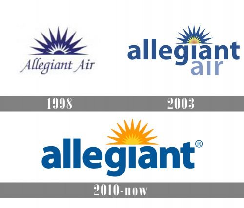
As for the visual identity, the logo of the American air carrier has undergone two major redesigns throughout the years, but the main graphical elements on the emblem have remained almost unchanged since 1998.
1998 – 2003
The original Allegiant Air logo featured the rising sun in blue and white with sharp triangular rays. The lettering “Allegiant Air” in a handwriting-inspired script could be seen below. The accents on the sun emblem were drawn in thin pointed white lines, which added freshness to the badge, making it lighter.
2003 – 2010
The redesign of 2003 changed the color palette of the Allegiant Air logo and added more stability to its wordmark. The small white sun was colored yellow and orange. The company name now featured a better-legible and more generic sans. The word “Allegiant” was bolder and featured a more saturated shade of blue than “Air”. Another important thing about the redesign was in switching the title case to the lowercase, which added a friendly touch to the badge, and better showed the concept and purpose of the air carrier — affordable flights for all.
2010 – Today
In 2010 the Allegiant Air logo was changed again. But this time it was mostly about the colors, not the style. Both the large and small suns have grown yellow. The word “allegiant” grew bolder, while the lettering “Air” disappeared at all. Now the logo looks much more balanced than it used to be and evokes a sense of professionalism and security.


