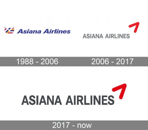
Founded in 1988, Asiana Airlines Inc. is the second-largest airline in South Korea. Over its history, the Asiana Airlines logo has been modified only a couple of times.
Meaning and history
Asiana Airlines, founded in 1988 by Kumho Asiana Group, is a major South Korean airline. Over the years, the company has achieved significant milestones in the aviation industry. Asiana Airlines has been recognized for its high-quality service and commitment to passenger satisfaction, earning it a five-star rating from Skytrax. It has also received numerous awards for its in-flight entertainment, cabin comfort, and on-time performance. The airline expanded its global network, offering flights to over 90 destinations across six continents. Asiana Airlines joined the Star Alliance in 2003, enhancing its connectivity and providing passengers with seamless travel options. In recent years, the company has faced financial challenges, prompting the Korea Development Bank to initiate a corporate restructuring plan in 2020. Despite these difficulties, Asiana Airlines continues to operate, adapting to the changing market conditions and striving to regain its position as a leading carrier in the region.
What is Asiana Airlines?
Asiana Airlines is a South Korean airline that operates both domestic and international flights. It is known for its extensive network, modern fleet, and quality service, serving destinations across Asia, Europe, North America, and Oceania.
1988
The original design showcased a colorful symbol. It was based on a circle shape, combined blue, yellow, red, and white, and made use of negative space. The lettering “Asiana Airlines” seen to the right was blue. It featured an italicized sans with pretty clean glyphs.
2006
The colorful symbol was replaced by a minimalist arrow, which moved to the top right corner. The company name was not italicized any more.
More recently, the company name has been colored in a darker shade of gray.


