

![]() Alibaba Logo PNG
Alibaba Logo PNG
A China e-commerce giant, Alibaba operates in more than 200 countries. Its online sales and profits are higher than those of all US retailers combined. And yet, quite a few designers have criticized the Alibaba logo.
Meaning and history
![]()
The conglomerate was founded in 1999 by a group of 18 co-founders including Jack Ma, the person who came up with the name “Alibaba.”
What is Alibaba?
Alibaba is one of the world’s leading e-commerce platforms; which was established in China in 1999. Today the company operates worldwide and has a comprehensive supplier directory linking directly to suppliers and buyers from all over the world.
1999 – 201?
![]()
The very first Alibaba badge, designed in 1999, featured a calm “dusty” terracotta color palette, with the stylized emblem placed above the title case logotype against a white background. The emblem of the company depicts a lowercase cursive letter “A” with the negative space drawn as a profile of a man.
201? – now
![]()
After the redesign of the 2010s, the color palette of the Alibaba visual identity was switched to a bright orange, which made the whole badge look more energetic and progressive. The emblem was refined, with the black outlines of the profile gone. It was now set on the left from the bold geometric lettering in a modern sans-serif typeface, with the characters slightly narrowed.
Symbol
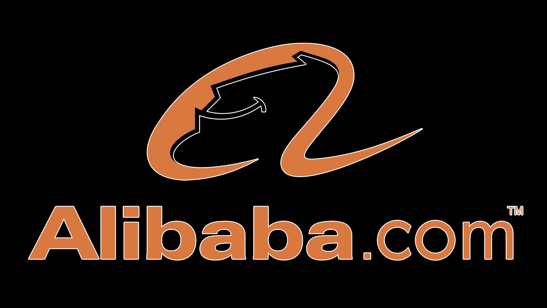
The focal point of the logo is a lowercase letter “a” with a human face inside. Supposedly, it’s the face of a satisfied customer. At least, the person definitely has a broad smile on his face.
Below the emblem, there’s the lettering “Alibaba.com” in smaller letters. The first part of the name of the website is given in bold, while “com” is given in a regular weight font.
Emblem criticism
The Alibaba logo has attracted criticism from the designer community. For one, the typeface, Linotype Univers, was criticized as utterly generic. Also, some designers supposed that the core visual metaphor, a customer’s face inside an “a,” is simply too predictable and was probably the first idea the author of the logo had.
However, what really matters is that Alibaba is often seen on the list of top 10 publicly traded companies in the world by market capitalization. So, after all, the logo has been good enough, taking into consideration the type of business the company has been into. At least, it didn’t prevent it from getting to the top.
Font
The Alibaba logo combines two typefaces, a version of the Univers font for “Alibaba,” and a version of the Pluto Sans font for “com.”
To be precise, the full name of the first type is Linotype Univers Com 740 Extended Heavy. The Lynotype Universe family is based on a reworked version of the original Univers font family developed by Adrian Frutiger more than 70 years ago.
The second font is Pluto Sans Regular. It was developed by Hannes von Döhren in 2012. Although it’s based on the architecture of the Pluto Family, it looks very clear and has a distinctive large x-height (the distance between the baseline and the mean line of lower-case letters), which makes it perfectly legible, even in small sizes.
Colors
![]()
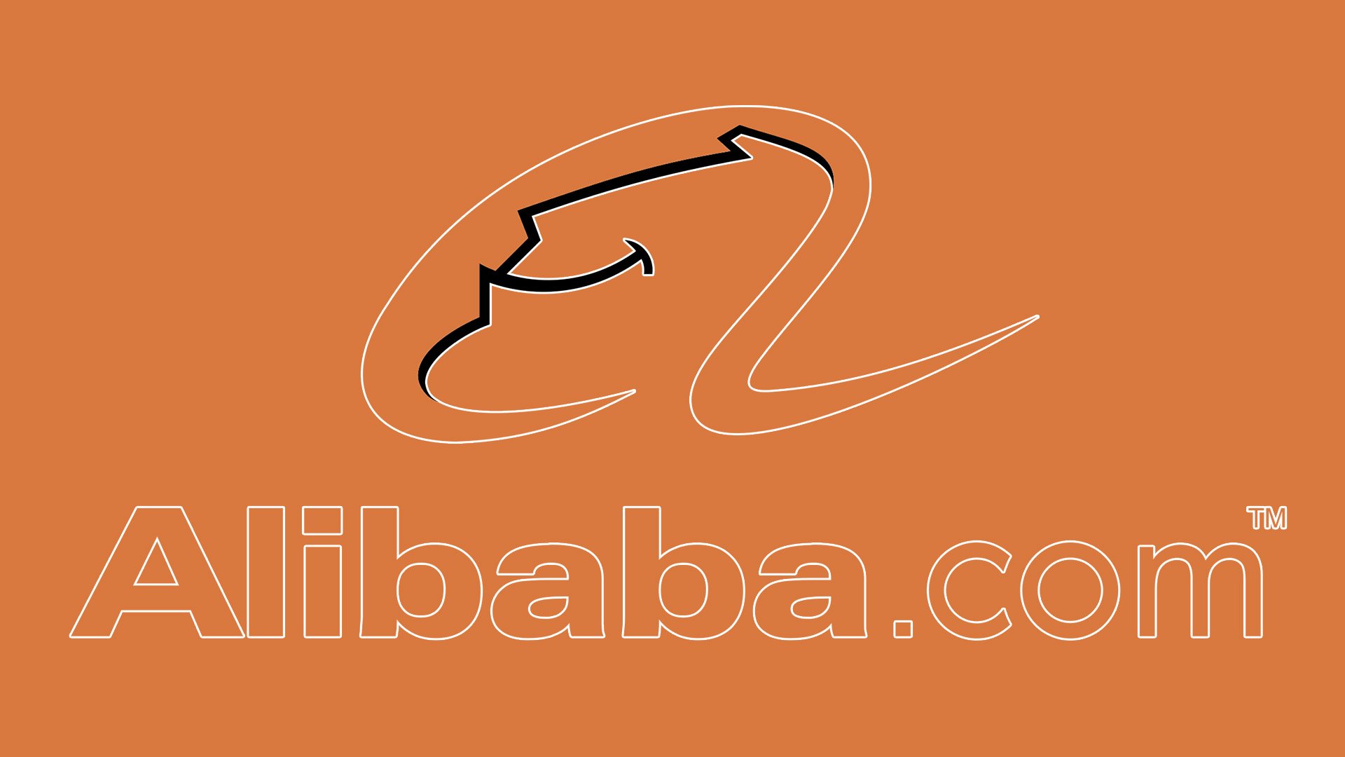
Orange is known as the color most easily seen in dim light or against the water, which is the reason why it’s often used, for instance, for life rafts, life jackets. This particularly refers to the shade called safety orange, which is very close to the one used on the emblem of the Alibaba group.


