In spite of the fact that the airBaltic logo has a pretty austere look, it has a distinctive touch and uses symbolism.
Meaning and history
AirBaltic is the leading air carrier of Latvia, which was established in the middle of the 1990s, and started its flights in 1995. Today the pretty small, but famous airline has its planes flying to more than 80 destinations across the globe. AirBaltic is headquartered in Riga International Airport, with its secondary hubs in Tallin, Vilnius, and Tampere, in all the main cities of the Baltics region.
What is AirBaltic?
AirBaltic is the name of a European air carrier, which was established in Latvia in 1995. Today the company is headquartered in Riga, with its main hub in Riga International Airport. AirBaltic has a fleet of 36 planes, which fly to 80 destinations internationally.
1995

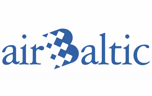
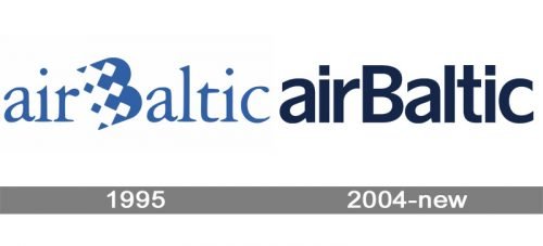
The initial Air Baltic logo was created in 1995 and stayed unchanged until 2005. It was executed in a not very typical for an air carrier style, with some irrational geometry inscribed in the logotype. The badge was composed of a lowercase wordmark in a smooth and elegant serif typeface, written in a calm and tender shade of blue over a plain white background. The first letter of the second word, “B”, was enlarged and stylized, is also capitalized. The letter was set diagonally and featured a blue and white checkered pattern all over its body, with more white elements on the left and more blue — on the right. It was meant to reflect speed and sense of flight, but practically, it made the inscription heavier.
2004 – Today
The dark blue color chosen for the design is the symbol of the night sky. The logo is often placed over the light green background symbolizing nature and having a calming effect (which can be beneficial for the passengers).
What makes the wordmark unusual is the capitalization. To begin with, it is hardly grammatical to capitalize one of the central letters of a word. You may argue that it is currently a popular approach. And yet, when the first letter is lowercase, the central “B” starts to look especially strange and ungrammatical.
On a more positive side, this approach does create an upward motion, which is beneficial for an airline.
Font and Color
The very simple and modest lettering from the primary badge of the main Latvian air carrier is executed in a bold traditional sans-serif typeface with clean and neat contours of the stable letters. The closest fonts to the one, used in this insignia, are, probably, Hamburg TS DemiBold and EconoSans Pro 73 Bold Expanded, but with some modifications.
As for the color palette of the AirBaltic visual identity, it is even more modest than the typeface of the logotype — the lettering is set in a dark and quiet shade of blue, which evokes a calm and confident feeling and shows the company as a trustworthy and reliable one.


