AirAsia X is an airline from Malaysia. This provider is a subsidiary of AirAsia, which is the largest budget airline on the continent. AirAsia X in particular offers long-distance and medium-distance flights across Asia and into Europe. They don’t have as sizeable a fleet as their parent’s, which means there are a smaller variety of destinations.
Meaning and History
The company was started in 2007 as a long-haul branch of the AirAsia conglomerate, which by then has become the largest in Asia. Originally, the name was supposed to be FlyAsianXpress. From it, only the letter ‘X’ survived, and that’s exactly what it means in the name – fast, long-distance flights offered by the company.
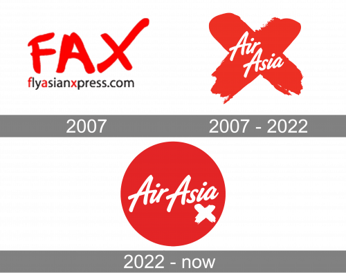
2007 – 2007
The original AirAsia X logo reflects the old name of the company, ‘FlyAsianXpress’ (‘FAX’). The abbreviation is written in a casual way that resembles strokes of paint, designed to look playful and dynamic. There was also the name of their website right below. It was a pretty basic sans-serif, written in mostly black, but with red for the letters that have to be capital (as per the name). This part has the same width as the emblem.
2007 – 2022
As the airline adopted the name ‘AirAsia X’, the need for a new logo emerged. The name is represented by two lines of cursive white writing that say ‘AirAsia’ at the core of the emblem. The emblem itself is a red cross that seems made with paint. It represents the ‘X’ from the name.


