The flag carrier airline of India, Air India is headquartered in the country’s capital city, New Delhi. The company belongs to Air India Limited, which, in its turn, is government-owned. Air India serves slightly more than 100 destinations.
Meaning and history
The company was founded under the name Tata Airlines in 1932. Officially, the name Air India the company received only 30 years later.
The first Air India flight was made only 13 years after the company’s foundation – in 1945. In 1948, the Indian government acquired a 49% stake in the carrier. In the same year, the first long-haul flight in the history of the company was made. In 1962Air India became the first airline in the world with an aircraft fleet consisting only of jets.
In 2004 Air India opened the Air India Express division, the main activity of which is low-cost air transportation.
Today Air India has a fleet of 132 Airbus and Boeing aircraft of various modifications. Each aircraft of the airline is named after some ruler or honorable citizen of India. Moreover, each aircraft has its own individual coloring. The main colors of Air India aircraft are red and beige.
The main Air India hubs are Chhatrapati Shivaji International Airport in Mumbai and Indira Gandhi International Airport in Delhi. Air India has code-share agreements with 12 other international airlines, enabling it to fly to 130 airports worldwide, including 12 Indian airports.
What is Air India?
Air India is an Indian air carrier, founded in 1932 and fully owned by the government. Air India is the second largest airline in India in terms of passenger traffic. Its head office is located in Mumbai, India. The airline is a member of the Star Alliance since 2009.
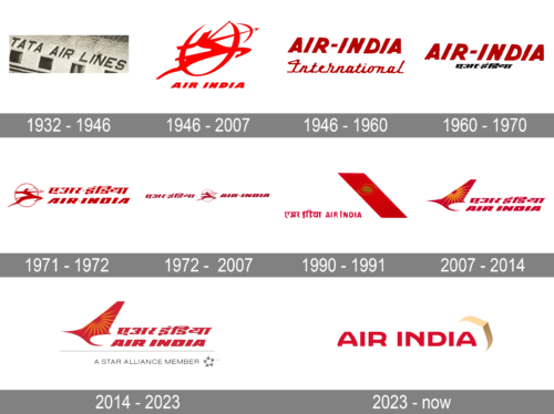
1932 – 1946
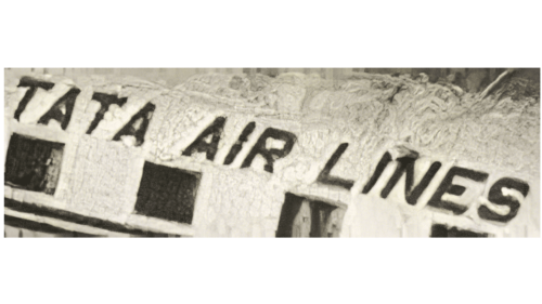
The initial logo was adopted, when the company was still Tata Air Lines. Back then, the logo was a simple line of black text that said these words in thin, leaned letters – all uppercase and sans-serif.
1946 – 2007
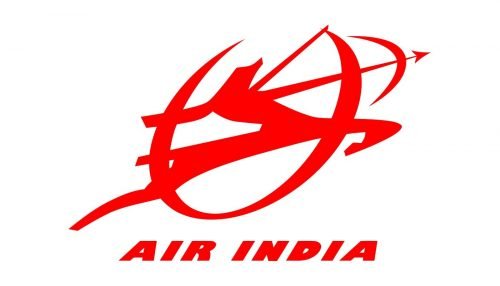
While Air India was officially established in 1946, its roots can be traced back to at least fourteen years earlier, to a company named Tata Air Lines. It was established by businessman J.R.D. Tata. The original name was replaced by the current one in 1946. It was then that the airline got its prominent centaur emblem, which was used for about 60 years.
The centaur on the Air India logo was shooting an arrow in a circle, which symbolized the wheel of Konark (immense stone wheels from Konark Sun Temple).
Both the emblem and the lettering below were given in red over the white background.
According to the official history of the company, the centaur logo was chosen by the founder, J. R. D. Tata.
1946 – 1960
This logo was used alongside the main one for some time. It had ‘Air India’ written in a similar way, but with taller, darker letters. There was also a dash between them. Moreover, ‘International’ was written beneath the word in a thin, twisting signature of the same color. The letters here weren’t all uppercase, like with the top inscription.
1960 – 1970
For the 1960 logo, they removed the ‘International’ bit from underneath the main portion. Instead, they placed there a much smaller, black inscription. It said the same thing as above, but in Hindi.
1971 – 1972
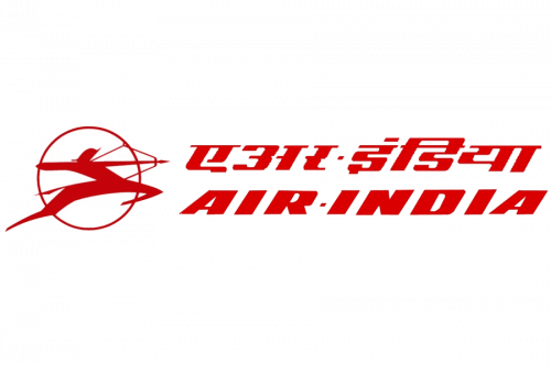
This design used the same emblem as the main logo. They placed in a reduced form on the logotype’s left side. The right was occupied by the names. This time, they wrote them at the same size and width. Moreover, the styles were rather similar to each other and to the one used in the 1946-2007 logo. This time, the Hindi writing was on the top, and the English version – below it. They also added little dots between the words in each version in the place of regular dash lines.
1972 – 2007
They rearranged the elements in the 1972 version by putting the native writing on the left, the English writing on the right and the emblem between them. The coloring in all was also visibly darkened.
1990 – 1991
The 1990 logo has both name versions written side-by-side again, but the style became smoother and simpler. The characters turned straight and less angular, while they also got rid of the dashes of any sort. The emblem was removed, as well. Instead of it, they placed a tilted red stripe on the right of all these letters in the shape of the plane’s stabilizer. On it, a bronze sun was placed inside a ring of the same color.
2007 – 2014
The introduction of the new design followed the merger with the short-haul flag carrier Indian Airlines in 2007.
Ever since, the air carrier has been using the livery combining a Flying Swan and the wheel of Konark. This time, the wheel is smaller and is placed inside the swan’s wing.
While the overall style of the typeface has remained the same, the letters have grown somewhat heavier. There is now less breathing space between them.
2014 – 2023
When the company became part of the Star Alliance at the end of the summer of 2014, its logo was slightly updated. The lettering “A Star Alliance Member” and the circular emblem appeared under the main Air India logo.
2023 – now
The company had a custom font created to print its name it is a sans-serif font that features smooth and slightly arched strokes and straight cuts. The font is known as “Air India Sans” and is similar in style to Babetta Bold. The smooth arches of the letters create a welcoming and elegant feel, while the red color symbolizes energy, confidence, and leadership. To add a luxurious touch, they drew a golden figure in the upper right corner that resembled an abstract drawing of a flying bird. It symbolized the excellent flight one would have on AirIndia planes.
Font and Сolor
The bold italicized lettering from the official Air India logo is set in a massive and stable sans-serif typeface with the characters executed in extra-thick lines. The closest font to the one, used in the Air India insignia is, probably, Loft Extra Bold Italic.
The color palette of Air India’s visual identity is composed of red and orange; the colors, represent passion, energy, and power. The badge looks bright and intense and makes the planes of the air carrier stand unique and recognizable.


