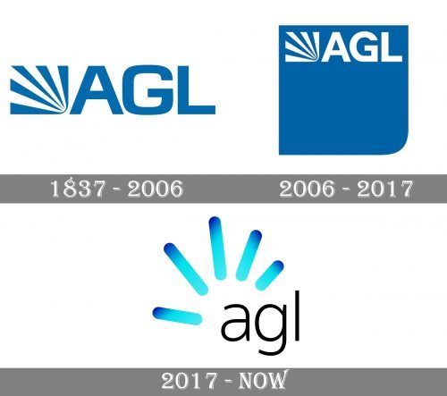
The visual identity of AGL, formerly known as Australian Gas Light Company, has been pretty consistent throughout the long history, dating back to 1937. Its blue and white color palette, reflecting professionalism, safety, and trustworthiness, has never been changed, though with the last redesign it gained a third color, black, which adds a modern feeling and timelessness.
AGL Energy Ltd. is an integrated renewable energy company from Australia that provides natural gas distribution services. The comoany is considered to be the largest electricity and gas provider in its country. AGL operates retail and power trading businesses, generation assets and an oil and gas portfolio.
The company has a power generation portfolio, including baseload, peaking and intermediate power plants, which extends to conventional thermal generation and renewable sources, including hydro, wind, landfill gas and biomass. AGL operates in the following segments: energy markets, group operations, new energy and investments. The energy markets segment consists of three business units: wholesale markets, consumer markets and business customers.
What is AGL?
AGL is the name of the Australia largest electricity generating company , which was established in 1837 as the Australian Gas Light Company. Today the company is engaged into such activities as electricity generation, distribution, and retailing, along with natural gas retailing and distribution.
1837 — 2006
The original logo for AGL was introduced in 1837 and featured a bold sans-serif lettering in a custom font with smooth angles and clean distinct lines, and a geometric abstract emblem on its left. The emblem was composed of five blue rays, coming out from the bottom right corner, and making up a rectangle with an invisible frame. It was a symbol of light and energy, looking powerful and strict.
2006 — 2017
The redesign of 2006 kept the original logo but made several modifications. First of all, the typeface of the wordmark was changed into a more elegant and strong one. Secondly, the emblem was now drawn in white and placed on the upper part of a bright blue square, which had its bottom right corner rounded. The square was accompanied by the “Energy in action” motto, placed in the right in two levels, with its lightweight sans-serif letters creating a friendly and welcoming mood.
2017 — Today
The five rays from the original logo were kept but completely changed their style in 2017. The current AGL logo featured a lowercase inscription in light sans-serif, drawn in black, and five gradient blue lines with rounded angles placed above the lettering. It looks bright, modern, and cool, showing the ability of the company to change with the world, to follow the latest trending but without losing its individuality and legacy.
Font
The unexpected combination of bolder and thinner lines and curves makes this serif typeface radically different from most other fonts, while the shape of the “A” only reinforces this effect.
Font and Color
The delicate lowercase lettering from the primary AGL logo is set in a modern and simple sans-serif font with medium-eight lines. The closest fonts to the one, used in this insignia, are, probably, Abnormal Light, or SST Hebrew Light.
As for the color palette of the AGL visual identity, it is based on bright gradient shades of blue, accompanied by plain and strict black used in the lettering. Blue is a color of professionalism and expertise, a symbol of protection and reliability, which says a lot about the company.


