Agip is a commercial brand of the Italian group Eni S.p.A., one of the largest oil enterprises in the world. Initially, it was the Agip Company founded by the Italian government in 1926. Some 30 years later, in 1953 the firm was merged with several other state-owned oil companies and named Eni. The group enjoyed a period of intensive development, working effectively with partners in many countries of Africa and the Middle East. In 1992, the state-owned Eni was transformed into a joint-stock company that received the name Eni S.p.A. By 2016, the group’s year turnover reached a level of about 55 billion euros.
Meaning and history
The Agip logo is one most famous and most recognizable in the world. It consists of an emblem and the brand name “Agip” written under it. The wordmark “Agip” is an abbreviation meaning “Azienda Generale Italiana Petroli” (Italian Petrol General Company). The font of the wordmark “Agip” is the classical Standard Bold with a white line parting the letters vertically.
What is Agip?
Agip is the name of the brand of Eni, a large Italian company, engaged in the oil and gas industry. The company was established in the middle of the 1920s as Agip, and after numerous merges in the 1950s, changed its name to Eni, keeping the “Agip” label for commercial products.
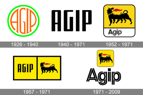
1926 – 1940
The initial Agip logo was composed of a bright yet simple circular badge with a white background and a thick poison-green outline. The stylized wordmark was written in orange and set inside the emblem, repeating the contour of the frame. This logo stayed with the company for more than a decade.
1940 – 1971
The redesign of 1949 simplified the Agip logo, making it strong, stable, and minimalist. The uppercase logotype in black geometric sans-serif was now the only element of the brand’s visual identity.
1952 – 1971
The emblem appeared in September 1952 as a result of a competition that had been held the same year for the best Agip logo design. The author was an Italian sculptor Luigi Broggini. He selected for the oil enterprise a six-legged dog with red flame leaping from its mouth. It is widely recognized that the main meaning of this logo is the “energy” related to the two basic Agip products: oil and natural gas.
Nevertheless, in 1952 it was the general opinion that the image of a six-legged dog symbolized power, energy, and optimism so needed in a country that had just recovered from the devastating world war and was vigorously rebuilding its economy. Today the six-legged dog symbolizes courage, enthusiasm, and innovation. It illustrates the company’s policy evolving its adherence to technological innovation and progress, its strive for integrity, human dignity and environmental protection.
1957 – 1971
The iconic six-legged dog was placed on a yellow background, which made up the upper part of the new Agip badge. The square emblem had its corners rounded and outlined in thin black, with the wordmark set along the bottom part of the badge, which had a white background. The lettering was executed in an outlined black and white sans-serif typeface with the dot above the letter “I” replaced by a solid red square.
1971 – 2009
In 1998 the Agip dog was set on a yellow square with rounded angles and placed above the enlarged “Agip” inscription, executed in the same style as in the previous version, but with the red square colored black now.
Font and Color
 The stylized lowercase lettering from the Eni logo is set in a designer sans-serif typeface with bold characters drawn in lines. The closest fonts to the one, used in this insignia, are, probably, Matondo Pro Outline or Nora Art Stroke, but with some significant modifications of the characters’ contours.
As for the color palette of the Eni visual identity, it is based on a bright intense combination of yellow and red with some black lines added to the composition. The colors here stand for passion and power, for energy and movement, elevated by professionalism and confidence, given by black.


