Afrojack (Nick van de Wall) is a Dutch music producer and DJ.
2010 – 2013
The original Afrojack logo appeared on the covers of his singles, including Take over Control (2010), No Beef (2011), Can’t Stop Me (2012), to name just a few.
The logo can be described as a mind-blowing mix of street art style and classic elegance.
On the one hand, you could see numerous details that made the wordmark similar to things written on the walls (the paint drips and scratches, etc.).
On the other hand, we can’t but mention the refined top of the initial “A” and its curled right end, the decorative “thorns” in the middles of the letters, and the interplay of the varying widths of the strokes.
2013 – now
One of the first appearances of the new logo was on the cover of the single As Your Friend released in 2013. And, of course, it could be seen on the cover of his debut studio album, Forget the World (2014).
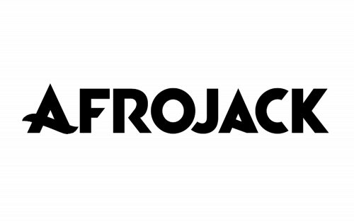
The style of the logo was dramatically different from the original one. It looked more modern and professional.
The lines of the glyphs grew cleaner and more minimalist: gone was the “crown” on the “A” and the intricate curls. And yet, in spite of growing simpler, it didn’t sacrifice the elegance – you can perceive an unobtrusive beauty in the soft curves replacing the middle bars of the “A’s” and in the shape of the curvy part of the “R,” as well as in the way the ends of the glyphs are shaped. The style of Afrojack logo appears to echo his personal appearance.
Alternative old symbols
The DJ did not limit his imagination (or the imagination of the designers of his singles’ covers) and often replaced the primary logo with other ones. Each time, they chose the style depending on the overall look of the cover.
For instance, the cover for the song Rock the House released in the summer of 2012 showcased the DJ’s name in a dynamic yet heavy sans looking nothing like his main logo of the time. On this wordmark, there was a “sports car” or “car race” feel. It came from the sloped glyphs (especially the initial “A,” which resembled a highway).
More often, though, the primary wordmark was replaced by simpler ones. For instance, we can mention the cover of the single Gone (2016), where the word “Afrojack” was written on a “stamp” in a plain sans.
The alternative logo (or the lack of the logo) could often be seen in the works that were the result of collaboration with other artists. We can mention, for instance, Selecta (2011, with Quintino) or Dirty Sexy Money (2017, with David Guetta).
Yet, there have been quite a few shared songs, where the cover featured the main logo. Used to Have It All released in 2017 in collaboration with David Guetta can be an example.


