Aeroméxico is a major airline based in Mexico. The company is primarily engaged in providing air transportation services to various domestic and international destinations. It is owned by Grupo Aeroméxico, a Mexican airline holding company. Aeroméxico operates flights from its main hub at Mexico City International Airport, offering a wide range of routes throughout the Americas, Europe, Asia, and the Caribbean. The airline has a strong presence in the Mexican market and is recognized for its extensive network and commitment to customer satisfaction.
Meaning and History
Aeroméxico is a leading Mexican airline that offers domestic and international flights to various destinations. With a commitment to safety, reliability, and customer satisfaction, Aeroméxico provides a seamless travel experience for passengers. The airline boasts a modern fleet of aircraft equipped with state-of-the-art amenities, including comfortable seating, in-flight entertainment, and complimentary onboard services. Aeroméxico’s extensive route network connects travelers to major cities in North, Central, and South America, as well as Europe and Asia, facilitating business and leisure travel. The airline prides itself on its friendly and professional cabin crew who ensure a pleasant journey for passengers. As a member of the SkyTeam alliance, Aeroméxico offers additional benefits and seamless connections for travelers. With a rich history and a focus on excellence, Aeroméxico continues to be a preferred choice for both domestic and international travel.
What is Aeroméxico?
Aeroméxico is the flag carrier airline of Mexico. It is one of the largest airlines in Latin America and operates a vast network of domestic and international flights. With a history dating back to 1934, Aeroméxico offers passenger and cargo services, and is known for its commitment to safety, customer service, and connectivity.
1934 – 1953
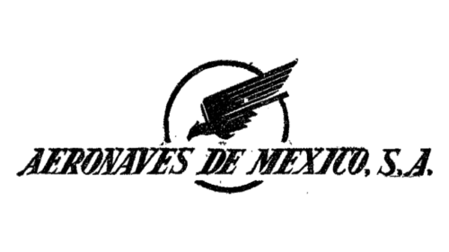
AeroMexico was established in the 1930s as Aeronaves de Mexico, and this wordmark was one of the two elements on its original logo. The inscription was set in the uppercase of a slanted serif typeface, and accompanied by a modest emblem with a stylized bird inscribed into a circular frame. Both parts of the logo were set in a black-and-white color palette.
1953 – 1960
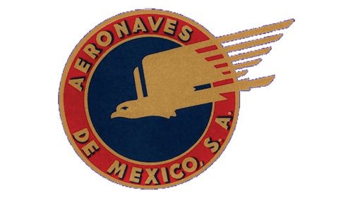
The redesign of 1953 added color to the original emblem of the air carrier and strengthened its contours. Now the bird was set in gold, over a solid blue background of the roundel, enclosed into a thick burgundy frame with the golden lettering around its perimeter. The inscription was set in the uppercase of a bold geometric sans-serif font.
1960 – 1972
The version of the logo, used in 1960, had more national uniqueness in it. The bird was replaced by a portrait of an Indian man in a bird mask. It was drawn in black contours over a solid red roundel, with a yellow frame. The lettering in the uppercase of a modern sans-serif font was written around the left part of the roundel’s frame, in black.
1972 – 1980
The redesign of 1972 introduced the first AeroMexico logo, and it looked very strong and professional. The Indian man in a bird’s mask was redrawn in a geometric way and was now executed in gray and black, being placed on a plain white background and accompanied by bold uppercase lettering in orange and black.
1980 – 1989

In 1980 the AeroMexico logo gets another redesign. Now the wordmark becomes the main hero of the composition. Written in the lowercase of a geometric sans-serif typeface, it is set in plain black on the left from a small abstract emblem, repeating the contours of the previous version, but executed in black and white now.
1989 – 1998
The redesign of 1989 has refined the contours of the emblem, adding a striped pattern to its bottom part. The man’s portrait was enlarged again and placed above the lettering, which was also rewritten. The new wordmark has its first lowercase part in horizontally-striped characters, while the lowercase “Mexico” was set in flat black.
1998 – 2024
The color palette of the AeroMexico logo was changed to blue and white in 1998. The emblem was slightly refined again and placed on the left from the lettering, which was now set in the uppercase, with the “A” and the “M” larger than the other characters. The font of the inscription looks very modern and stylish.
2000 – 2024
The redesign of 2000 has introduced another version of the Aeromexico badge, which has been used along with the previous one. It is a complete copy of the version from 1998 but with the SkyTeam Alliance emblem on the right and a delicate red ribbon underlining the second part of the wordmark.
2024 – Today
In 2024 the Aeromexico logo was refined, with more sophistication brought to it. The lettering was rewritten in a smoother font, with all characters set in one size, making up a great balanced composition. As for the graphical part of the logo, its contours were softened and some of the lines — elongated and slightly curved, supporting the new shapes of the letters. The red underline was completely removed, so the Aeromexico badge became clean, laconic, and minimalistic.
Font and color
The bold uppercase lettering from the primary logo of the Aeromexico carrier is set in a very elegant yet quite modern typeface, which has something in common with such commercial fonts as Rave or Supra Demiserif. Both of these types have very distinctive Aztec features, which are softened in the Aeromexico inscription.
As for the color palette of the Aeromexico visual identity, after the redesign of 2024, it was minimized to just one shade of blue, which is usually used in combination with white, representing the reliability of the company and the high level of its service.


