

![]() Australian Airlines Logo PNG
Australian Airlines Logo PNG
Australian Airlines was one of the major airlines of the country, which was formed in 2001. The company operated various flights to Australian and Asian airports until it ceased all operations in 2006.
Meaning and history
![]()
The small air carrier was established by Qantas Airways in 2001, starting its operation in 2002. The idea behind its creation was in founding the main low cost airline in the country. The carrier operated a fleet of only 5 aircraft, which flew to 13 locations across the country.
All operations of Australian Airlines were ceased in 2006, as the mother brand decided to put more efforts in developing another lowcost airline, Jetstar Airways.
What is Australian Airlines?
Australian Airlines is the name of a former air carrier from Australia, which was established in 2002, and ceased all operations in 2006. It was a sun-brand of Qantas Airways, the largest airline in the country, founded in 1920, and and having a fleet of 133 aircraft, flying to more than 80 locations worldwide.
1946 – 1960
![]()
The very first Australian Airlines logo was introduced in 1946 and stayed with the air carrier for almost fifteen years. And the symbol, created for it, stayed in the following versions. It was a stylized red kangaroo silhouette, facing to the left. The animal was placed on a white background with the solid yellow Australia map contouring on it, enclosed into a thin black circular frame. The “Trans Australia Airlines” inscription was arched along the upper part of the frame, written in black capitals of a clean and bold sans-serif typeface. The bottom part of the badge featured a wide elongated banner in black and brown, with the white “TAA” abbreviation on it.
1960 – 1969
![]()
The redesign of 1960 kept the red kangaroo and a thin red arrow from the previous version but made the whole badge more modern and sleek. Now the animal above the arrow was placed over a bold navy-blue “TAA” abbreviation in solid geometric sans-serif. Both elements were set on a white background and featured a thick white outline, which allowed placing it on any possible background without losing visibility and individuality. That minimalist yet intense and powerful badge stayed with the air carrier for more than eight years.
1980 – 1986
![]()
The logo, created for Australian Airlines in 1980 was something completely different. Abstract, bold, and laconic, it was only a stylized abbreviation executed in bold blue and orange lines. The badge was horizontally split into two levels, with the upper one featuring three elements with rounded angles, and the bottom level all solid, just a plain horizontally stretched rectangular in bright blue. It was something truly unique and very interesting, even though no graphical elements or whole lettering was present on the logo, it still became recognizable and associated with the air carrier in literally no time.
1986 – 1993
![]()
The kangaroo was brought back to the Australian Airlines logo in 1986, but the animal’s contours were refined and its intense red color switched to deep blue. Now the kangaroo was placed under a stylized triangular element, standing for the air plain wing, executed in the same shade of blue and underlined by two wide ribbons — green and dark yellow. The element was set in the upper right corner of the badge and was not accompanied by any text elements, just bold graphics in a strict and masculine color palette. That was an outstanding badge, evoking a sense of confidence, reliability, and extreme professionalism.
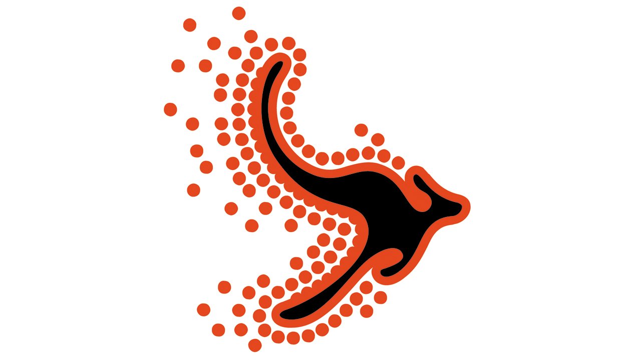
2001 – 2006
![]()
Australian Airlines has a unique colorful visual identity, which was a celebration of the Australian culture and lifestyle. The Australian Airlines logo is composed of a bright arty emblem with a wordmark underneath it.
The wordmark is handwritten in bold elegant lines, with elongated and curved horizontal bars of “A” and “T”, which create a sense of movement. The lettering is airy and fresh.
The Australian Airlines emblem is a contemporary stylized image of a kangaroo in black with a thick dark orange outline and numerous solid orange dots around its perimeter. The kangaroo looks like an abstract arrow, pointing right, which symbolizes the future-centric approach.
There is also a tagline “Catch The Holiday Spirit” in the bottom of the logo, executed in all the lowercase sans-serif typeface.
The Australian Airlines logo is remarkable and eye-catching. It looks bright when placed on the white wing of the plane, and is instantly recognizable.
Font and Color
The unusual handwritten lettering from the official badge of Australian Airlines was set in a custom font with smooth lines and rounded angles. The closest commercial fonts to the one, used in this insignia, are, probably, Another Monday Italic, or Combustible Italic, with some modifications of the characters’ contours.
As for the color palette of the Australian Airlines visual identity, it was based on a combination of orange and black, which looked very dynamic and bright, evoking a sense of energy, confidence and progressiveness.


