 Aerolíneas Argentinas Logo PNG
Aerolíneas Argentinas is a major airline based in Argentina. The company offers domestic and international flights, catering to both business and leisure travelers. It is owned by the Argentine government. With its headquarters in Buenos Aires, Aerolíneas Argentinas operates from multiple airports across the country, including Ezeiza International Airport and Aeroparque Jorge Newbery. The airline serves numerous destinations worldwide, providing a reliable and efficient travel experience for passengers.
Meaning and history
Aerolíneas Argentinas is Argentina’s flagship airline, serving as the country’s primary carrier for both domestic and international flights. With a rich history dating back to 1950, the airline has played a crucial role in connecting Argentina with the rest of the world. It operates a modern fleet of aircraft, offering a range of services and amenities to ensure a comfortable journey for passengers. Aerolíneas Argentinas has an extensive route network, covering destinations across South America, North America, Europe, and Oceania. The airline is committed to providing quality service, prioritizing passenger safety and satisfaction. It has received recognition for its operational excellence, punctuality, and customer care. Through strategic partnerships and alliances, Aerolíneas Argentinas continues to expand its global reach and strengthen its position in the aviation industry.
What is Aerolíneas Argentinas?
Aerolíneas Argentinas is the national airline of Argentina. It is a major carrier that operates both domestic and international flights. With a history dating back to 1950, Aerolíneas Argentinas is known for its extensive network, fleet of aircraft, and commitment to providing air transportation services to passengers in Argentina and beyond.
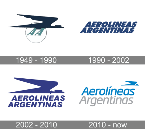
1949 – 1990
The original logo of the company looks dynamic and bold. It features mint-colored brand name initials on a white background with a thin ring serving as a frame. Although italicized font adds to the dynamics, it is the abstract drawing of a flying bird with sharp, pointed elements that creates this feeling of speed and movement. The bird is done in black and resembles an airplane. This symbolism has been used by many airlines in one way or another.
1990 – 2002
The first logo of Aerolineas Argentinas was based on just a stylized two-leveled lettering. The name of the air carrier was written in a bold slanted geometric sans-serif typeface with heavy and stable characters having straight cuts and distinctive contours. The whole composition was set in a blue-and-white color palette.
2002 – 2010
The redesign of 2002 has switched the typeface of the wordmark, bringing more air between the characters and refining the contours. The blue changed its shade to a brighter one, and the wordmark was now placed under a graphical emblem with a stylized minimalistic image of a bird, set in the same color.
2010 – Today
The emblem got smaller and was placed in the upper right corner of the logo in 2010. The color palette of the composition got switched to light blue and gray, with the typeface of the lettering switched to a smooth contemporary one, with the top line in blue, and the bottom one in gray.


