

![]() Aer Lingus Logo PNG
Aer Lingus Logo PNG
Aer Lingus is one of the main Irish airlines, which was established in 1936. Today the label is owned by International Airlines Group, which is considered to be one of the most reputable and popular corporations in the European airlines’ segment.
Meaning and history
![]()
The visual identity of one of the most well-known and reliable Irish air carriers, Aer Lingus, has a very intense and colorful history, which includes seven redesigns of the logo and numerous experiments with the style of its wordmark.
1936 – 1945
![]()
The very first logo for Aer Lingus was introduced in 1936 and stayed with the company for almost ten years. It was arched blue lettering on a white background, with its title-case lettering executed in a custom elegant typeface with smooth curved lines in a gothic-style. The blue and white color palette of the logotype made it look professional and bright.
1945 – 1947
![]()
The blue and white color palette was kept with the complete change of style in 1945. The new logotype was written in white capitals of an italicized sans-serif typeface with narrowed shapes, and placed on an intense blue background. It was an elegant and bright badge, which only stayed with the company for a couple of years.
1947 – 1951
![]()
The redesign of 1947 switched the color palette of the logo and its typeface. The new visual identity of Aer Lingus was based on a dark red and white color scheme, where the capitalized logotype was written in a typewriter-style font with bold and confident lines and elongated serifs.
1951 – 1965
![]()
The logo gets thickened and italicized in 1951. Along with the change of the color palette from red into black, the typeface was also replaced by a bolder and more traditional one, having its extended inclined lines confident and progressive, which was perfectly balanced by a new palette.
1965 – 1981
![]()
The graphical symbol, which has become iconic by today, first appears on the Aer Lingus logo in 1965. The green shamrock leaf placed inside a light solid circle was located on the left from the wordmark, on the striped green square. The wordmark in two levels was executed in two shades of green, with the “Aer Lingus” in dark, repeating the shade of the square, and the “Irish” in a lighter tone, the same as in the shamrock leaf.
1981 – 1996
![]()
The Aer Lingus logo was simplified and strengthened in 1981, by placing a bold white logotype in was-serif on a black background, on the left from the green shamrock with no framing or outline. The new palette made the badge look more powerful and professional, making the air carriers logo stand out in the list of its competitors.
1996 – 2019
![]()
The redesign of 1996 brought the logo version, which became a basis for the badge we all can see today. The sea-green logotype in the title-case was placed on a white background and had a green shamrock on its right. The shade of the leaf was bright and vivid, reflecting growth, wellbeing, and success. The smooth serif lettering made the colony look trustworthy and reliable.
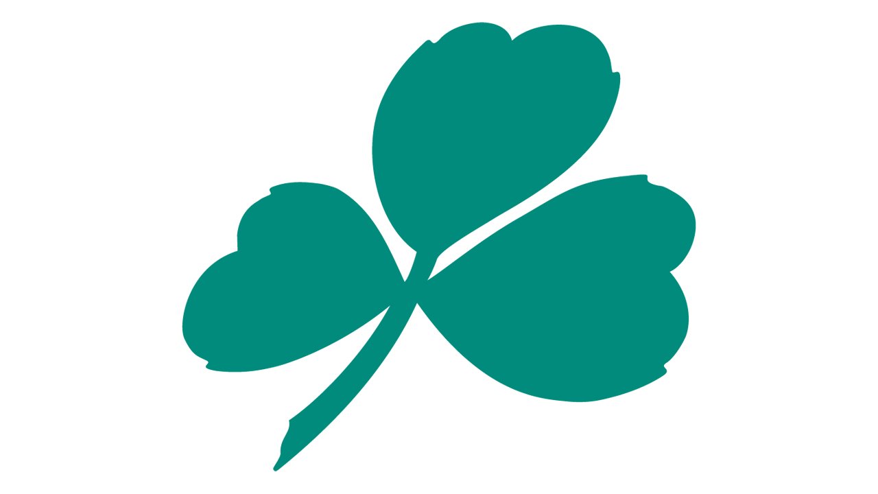
2019 – Today
![]() The current Aer Lingus logo was designed in 2019, changing the sophisticated serif inscription to a modern sans-serif one, and its color to a darker shade of green, looking more confident and sleek. As for the emblem, it’s contouring we’re refined and cleaned and now looks light and fresh.
The current Aer Lingus logo was designed in 2019, changing the sophisticated serif inscription to a modern sans-serif one, and its color to a darker shade of green, looking more confident and sleek. As for the emblem, it’s contouring we’re refined and cleaned and now looks light and fresh.

Font and color
The Aer Lingus logotype, which is usually placed on the left from the emblem, is written in a title case of a modern yet elegant sans-serif typeface, where wide and neat letters feature their lines smooth and bold. The typeface of the brand’s visual
Identity is very close to such fonts as Artnoova Regular and Constellation Medium, with some of the lines modified.
As for the color palette of the airline’s visual identity, the combination of sea/blue and bright green represents the stability, confidence, and safety of the company, along with success, growth, and progress.


