Aerojet Rocketdyne is a rocket and missile propulsion manufacturer based in Sacramento, California, US.
The Aerojet Rocketdyne logo has gone through around ten modifications so far, which is only natural taking into consideration the company’s rather long history.
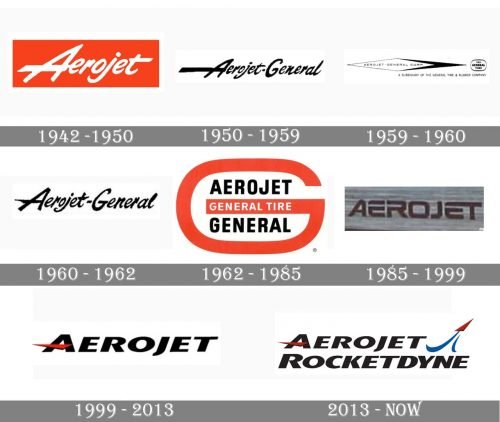
1942 (Aerojet Engineering)
While the current company was formed in 2013, the history of its predecessor goes back to 1942.
The original logo featured the name of the brand in white inside a bright red rectangle. While there were no pictorial elements, the very shape of the letters was somehow reminiscent of the dynamism of the rockets and missiles and even echoed their shapes and trajectories.
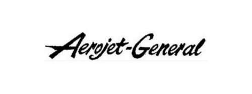
1950s (Aerojet General)
The overall style of the type remained the same, and you could even think the design did not change (except for the addition of the word “General,” of course).
And yet, if you compared the two wordmarks side by side, you would have noticed the shape of the letters slightly changed. The middle bar of the “A” became even longer, which made the similarity to the rocket’s trace even more obvious. On the whole, the writing grew lighter and more carefree.
1959
This time, by contrast, a more formal typeface was chosen. There was not a single trace of the casualness of its predecessor. Yet, there was still some dynamism due to the black “trace” the white rhombus “left behind.”
This logo contained the writing “A subsidiary of the General Tire & Rubber Company.”
1960
After just a year, the company returned to a casual wordmark looking very much like the one used before 1959. While the shape of the glyphs was slightly modified, the overall style was pretty much the same.
1962
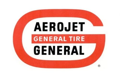
Once again, the design team opted for a more formal logo. This time, they put the writing “Aerojet General Tire General” inside a large red “G.” Both the typefaces used in this version were generic sans serif ones.
1985
The word “General” was dropped both from the name of the company and its emblem. Now, the Aerojet logo featured a comparatively more unique and dynamic type. The implied motion appeared due to the white gaps on the “E’s” and “R,” as well as the streamlined shape of some of the letters and their rounded corners.
1999
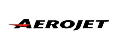
The font grew somewhat heavier, although the red “rocket” bar on the “A” added some dynamism.
2013 (current company)
The word “Rocketdyne” appeared below the previous wordmark. Also, a stylized rocket was added making the company’s specialization more apparent.


