The flag carrier airline of Greece, Aegean Airlines S.A. was founded in 1987. It has been part of the Star Alliance since June 2010.
Meaning and history
The year of the founding of Aegean Airlines is 1987. The original name of the airline was Aegean Aviation. Five years later the airline received a certificate indicating that it was a private company. At that time it was the first private airline in Greece.
In the 1990s, the company was actively growing: the fleet was renewed, cooperation with other airlines was opened. The company’s name was also changed to Aegean Airlines.
In the early 2000s the company signed a merger agreement with another Greek carrier, Cronus Airlines. This led to the expansion of the airline’s route network and an increase in passenger traffic. On October 21, 2012, Aegean Airlines officially acquires its main competitor Olympic Air for 72 million euros.
Today the route network of Aegean Airlines has 145 destinations. Most of them are in European countries.
What is Aegean Airlines?
Aegean Airlines is the name of the largest airline in Greece. The main airport or the air carrier is Eleftherios Venizelos Airport in Athens. It is a member of Star Alliance. Aegean Airlines is one of the most successful European scheduled airlines.
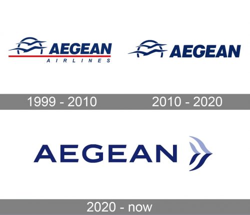
1999 – 2010
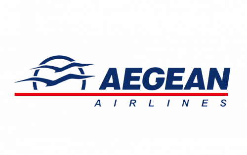
The Aegean Airlines logo, designed in 1999, featured a very elegant yet strong composition, formed by a graphical emblem, a two-leveled inscription, and a thick bright line as the central element. The emblem of the air carrier featured blue silhouettes of two birds enclosed into a circular frame. It was set in the left from the upper inscription line, the “Aegean” in bold slanted capitals executed in a fancy sans-serif typeface. The upper line of the logotype was separated from the thin and clean “Airlines” by a thick red horizontal line, which was coming through the whole badge.
2010 – 2020
The redesign of 2010 simplified the composition and the color palette of the Aegean Airlines visual identity. The red line was removed from the logo, as well as the “Airlines” part of the inscription, so how it was only a two-bird emblem, with the bottom part of its circular frame erased, placed in the left from the bold and stylish “Aegean” logotype in blue italicized capitals. A minimalistic approach worked just fine for the badge, making it look sophisticated, sleek, and timeless. This badge stayed with the air carrier for almost ten years.
2020 – Today
While the Aegean Airlines logo does not feature a plane or another manmade flying object, the “flying” and “sky” themes are very obvious here, as well as the marine theme. You can see two birds (apparently, seagulls), one above the other. In the background, there is a large arch (or an open circle). It symbolizes the rising or setting sun with its lowest part covered by the sea.
The marine theme, which has been inspired by the name of the airlines, appears in the logo due to seagulls and the deep blue color. The blue was also used as the color of the flag of Greece.
Font and Color
The stable and clean uppercase lettering from the primary Aegean Airlines logo is set in a modern sans-serif typeface with distinctive contours of the characters. The closest fonts to the one, used in this insignia, are, probably, LP Horizont Caps Regular, or Kinetica Bold with some minor modifications.
As for the color palette of the Aegean Airlines visual identity, it is based on two shades of blue — a deep, navy tone, and a smooth light one, closer to purple. This palette stands both for the sea and the sky, and evokes a sense of reliability and trustworthiness.


