Adobe Systems, Incorporated is a software developing company from the USA, headquartered in San Jose, California. The company has created a family of graphic design applications.
Meaning and history
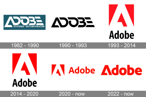
Adobe Systems, Inc. has changed logo only once. It was designed by Marva Warnock, the company cofounder’s wife, and was in use from 1892 until 1990. The logo consisted of “Adobe” written in caps on a slate gray quadrangle with “Systems incorporated” underneath. The current logo is the white “A” derived from the original 1982 logo on a red background and “Adobe” written below in black. Both logos are simple and memorable. The latest one has set a standard for those of the company’s numerous products (Adobe Illustrator, Adobe Photoshop, etc.)
What is Adobe?
Adobe is a major software manufacturer founded in the United States in 1982.Today the company has about 40 software products in its arsenal. Adobe’s most popular product is Photoshop, accounting for 27% of the company’s sales.
1982 – 1990
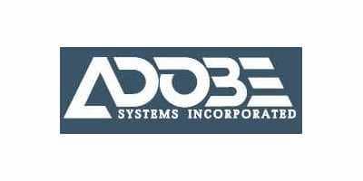
The original Adobe logo was strict and bold. The thickened wordmark was placed into a rectangle with rounded angles. The custom typeface of the capital lettering looked strong and futuristic.
The first “A” featured an open triangular shape, and the last “E” was composed of three horizontal bars, with a diagonally cut right side.
The “Systems Incorporated” tagline in capitalized serif lettering was placed under the wordmark.
The white and gray color palette of the original Adobe logo was a representation of a stable and reliable company, evoking a sense of professionalism and authority.
1990 – 1993
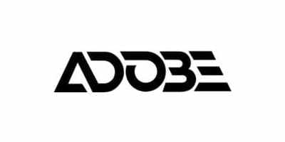
In 1990 Adobe changed its logo to a more minimalist. Now the color palette is black and white and there was nothing but the company’s name on it.
The logo was simple but with a modern feeling and looked really powerful and confident.
1993 – 2017
The new color palette was first used in the Adobe visual identity in 1993. Red, white and black combination reflects the company’s progressive approach and its energy.
The white signature “A” is placed into a red square and the “Adobe” lettering in black is located under the emblem.
2017 – 2020
The redesign of 2017 kept the emblem untouched but made the sans-serif typeface of the wordmark refined and more contemporary. The wordmark is now placed on the right from the emblem and looks stylish and bold with its rounded playful “D” and “B”, which are mirroring each other.
2020 – Today
The redesign of 2020 has refined the color palette of the Adobe logo, making red brighter and removing the black. The new logo of the company is composed of the same red and white emblem, placed on the left from the title case lettering, which is now set in the same shade of red, and uses the same typeface, as on the previous version, but with the lines of the characters getting a hit bolder.
2022 – Today
In a refreshing twist, Adobe sheds part of its name, opting for a unique symbol that complements a simplified brand mark. This creates a strong, organic identity with a balanced composition.
The iconic “A” makes way for a solid square, a departure that sparks memorability without losing familiarity. Previously unbalanced, the logo now boasts a bolder typeface, harmonizing with the symbol’s size for a cohesive visual.
The new triangle subtly echoes the “A” while twisting the traditional form. The shifted, open-ended crossbar subtly references the original design by Marva Warnock, a nod to Adobe’s heritage.
A vibrant red color scheme injects energy and reinforces brand recognition. This strategic redesign strikes a balance between distinctiveness and legacy, preserving core elements while embracing a modern aesthetic. The logo embodies Adobe’s commitment to innovation, solidifying its position in a dynamic tech landscape.
Illustrator logo
Adobe Illustrator is a vector graphics editor developed by Adobe Systems, Inc. Like most Adobe logos, this one is highly minimalistic and is actually an acronym of the product’s name: a uppercase “A” and a lowercase “i”. The designers colored the logo in orange.
Photoshop logo
Adobe Photoshop is a popular and advanced raster graphics editor designed by Adobe Systems, Inc. Its logo follows the two-letter Adobe logo concept set by the company’s graphic design team. If is presented by an uppercase “P” and a lowercase “s”.
Flash logo
Adobe Flash is a platform intended for creating animated elements and a range of applications and games. The logo design uses the same old minimalistic two-letter pattern featuring a capital “F” and a lowercase “f”. The logo is performed in different
Symbol
The Adobe Symbol is not a particular logo pertaining to its particular software product. More likely, it is the uniformly simplistic approach to logo design, which is observable throughout the company’s products’ logos.
Font and color
The bold title case lettering from the primary Adobe badge is set in a modern and stylish sans-serif typeface with interesting contours of the letters “D” and “B”. The closest fonts to the one, used for the Adobe insignia, are, probably, FF Pastoral Bold and Diodrum SemiBold.
As for the color palette of the Adobe visual identity, it is set in red and white, with the lettering part sometimes set in black. This is one of the strongest and most timeless color combinations, which stands for confidence, power, and constant development.


