Adobe Acrobat is a PDF file managing software, developed by Adobe in 1993. The program enables preview and conversation of files, alongside their editing and exporting. Adobe Acrobat has its versions available for Windows, macOS, Linux, and Android.
Meaning and history
One of the most popular document formats is PDF. Objects of this type are not opened with standard operating system tools but can be created, viewed, and edited using special software. One of the most popular software for working with PDF files for several decades is Adobe Acrobat.
Adobe Acrobat is a universal product for working with PDF files, and it is not just a reader, but a multifunctional software solution. Acrobat Reader was created by Adobe, which is known for such products for working with graphics as Photoshop and Premiere Pro. It was this firm that developed the PDF format back in 1993. Adobe Reader is free, but some of the additional features are opened by purchasing a paid subscription on the developer’s website.
This product from Adobe allows users not only to view documents but also to print, sign, and add comments to them. The advanced version of the software, available by subscription, offers the ability to create, convert, and edit objects, as well as provide data protection with a password. The program is suitable for any operating system.
Adobe Acrobat family products enable anyone in the world of business, finance, technology, and creativity to communicate and collaborate, fill out and process electronic forms, and create documents. Anyone will be able to view a PDF document without loss of formatting and appearance of the original document regardless of the operating system used and even on cell phones, trusting each other (encryption, electronic signature, document password) thanks to Adobe PDF – the standard for the exchange of electronic documents.
What is Adobe Acrobat?
Adobe Acrobat is the name of a program created by Adobe in 1993 to work with PDF files. The Acrobat family consists of several software products, each of which covers a different function, connected with PDF format. This software is installed on millions of computers worldwide.
1993 – 1994

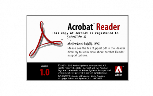
The very first logo for Adobe Acrobat was introduced in 1993 and boasted the iconic red emblem, which we still can see on the soft are’s logo today. The red stylized “A” was placed on a white and black background with a lot of additional lettering and the enlarged “Acrobat Reader” wordmark in black and Ted sans-serif, written in bold slightly narrowed contours.
1994 – 1996

The redesign of 1994 added some colorful elements to the Acrobat Reader logo. It was placed horizontally on a white background, in the upper part of the emblem. This version stayed with the software for two years, until the 3.0 version of the Acrobat was released.
1996 – 1999

The logo from 1996 featured another “extended” version of the Acrobat visual identity. The graphical part here was replaced by a new image in a blue, yellow, and Ted color palette, and the 2.0 version was changed to “3.0”. As for the iconic “A”, on this insignia, it was thinner and smaller, placed right over the image, and is not very visible.
1999 – 2001

The horizontal element of the logo with the image of the running man switched its color palette to gradient blue, with some black and beige elements. The main “Adobe Acrobat” lettering was now written in red and blue and executed in a classy and elegant serif typeface with traditional sleek contours of the letters. This was the only version without any red “A” symbol on it.
2001 – 2003

The new era of the Acrobat visual identity started in 2001, and this is when the first minimalist logo was introduced. The red “A” with loops on the angles was placed slightly diagonally over a silver-gray square, enclosed intro a red square frame. The dark gray and silver Adobe emblem was placed in the bottom left corner of the logo.
2003 – 2005

The light gray background of the logo was switched to gradient purple and silver. All other elements remained untouched, but the whole logo in the new color scheme started looking brighter and more delightful.
2005 – 2006

In 2005 the square gets its angles softened and the framing removed. The purple background became smoother and lighter and the whole image gained gloss and volume, looking more professional and confident than ever before.
2006 – 2010

The redesign of 2006 makes the logo minimalist and strong by switching the purple background to a silver one, sharpening the angles of the square, and embossing the red iconic symbol in the middle of the square icon. The logo looked clean and neat and at the same time strong and professional.
2010 – 2012

The flat square gained some volume in 2010 and the shape of the logo started resembling a book with red details around the perimeter. The main elements remained untouched as well as the color palette of the Adobe Acrobat logo.
2012 – 2015

In 2012 the logo becomes flat again and the silver background becomes lighter. Now it’s a gradient white square that becomes light gray at the bottom. As for the main element, the Acrobat red stylized “A” is refined and emboldened, and on this version, it is not engraved, but just drawn on the light gray square.
2015 – 2020

The redesign of 2015 switched the color palette of the Acrobat visual identity and the light gray square is being replaced by a dark brown one in a red square frame. As for the stylized “A”, in this version of the logo is it executed in smooth white lines. The new color scheme made the visual identity of the software brighter and more confident.
2020 – Today

In 2020 the new Acrobat logo was introduced. The square got its corners smoothened and rounded and its brown framed background was replaced by a plain black one. The Acrobat icon is still executed in white but it thicker and sleeker lines, which made the whole look of the logo more modern and cool.
Font and color
The iconic Adobe Acrobat logo has no lettering on it, apart from the stylized letter “A”, which is executed as a graphical triangular element with three delicate loops in the peaks. No commercial typeface is used for this emblem.
As for the color palette of the Adobe Acrobat visual identity, for decades it has been using the combination of red and white, sometimes with additional shades. But with the redesign of 2020, the software’s emblem turned black and white. This minimalistic palette looks very stylish and strict at the same time, showing the confidence of the company and the professionalism of the product.


