Adobe illustrator Logo PNG
Illustrator is a graphics editor created by Adobe in 1985. As the most part of the company’s programs, Adobe illustrator is at the top of the list of the best vector design and art software in the world.
Meaning and history
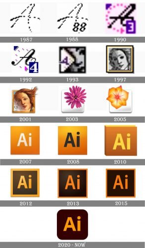
The visual identity history of Adobe Illustrator is very intense and bright, as the fresh icon was created for the software after each update and the new version release. Thus, the Adobe product has undergone more than a dozen redesigns by today.
1987
The original emblem for the software was created in 1987 and featured a very simple and laconic badge, composed of a white square with a cursive capitalized “A” on it, written in black with a pixel pattern.
1988
In 1988 the “88” datemark was added to the bottom right part of the black “A”. This was the only change made to the original version of the logo.
1990
With the software version 3.0, the logo was refined and its color palette gained new shades. Now it was a more italicized and bold black “A”, enclosed in a fuchsia circle, composed of numerous solid dots, a bold purple rectangle with the white “3” in the bottom right corner, and a purple triangle, placed in the upper left corner, to balance the image.
1992
The lines of the icon became stronger in 1992. The purple was switched to deep blue, and the bold white “4” replaced the “3”, celebrating the new version of the software. The dots in the sickle around the letter “A” turned into square pixels and got their gray shadows.
1993
The icon was redesigned again in 1993. Now it was an image of the lady’s face, overlapped by a white banner with the purple letter “A” on it. The image was executed in a monochrome palette and looked elegant and timeless.
1997
The logo from 1997 introduced a portrait of the Venus from the famous Botticelli painting, as the main symbol of the software. The portrait was executed in monochrome and enclosed in a double yellow and black square frame.
2001
The Venus becomes colored and gets its contours defined in 2001. The hair of the goddess is now spread upright and come out of the square frame of the icon. The Adobe logotype in light gray was placed in the bottom left corner of the emblem.
2003
The portrait was replaced by a flower in 2003. The new Illustrator emblem featured a plain white square with a fuchsia three-dimensional flower placed on its upper-right part. It was a bright, tender, and elegant image, which reflected the purpose of the software.
2005
The pink flower was changed to a yellow and orange one in 2005. It was also moved from right to the left, taking more space from the white square. The new color palette aimed to represent the creativity and the artistic side of the software.
2007
The redesign of 2007 introduced a laconic and contemporary version of the Illustrator logo, composed of a gradient orange square with a white sand-serif “Ai” lettering on it.
2008
The white lettering was replaced by black in 28. The typeface was also refined, and now the inscription featured bolder lines, a small playful tail of the “A” and a massive solid dot above the “I”.
2010
The square turned into the book in 2010. The orange gradient became a little darker, while the lettering gained a new honey shade, keeping the typeface almost unchanged, just the vertical bar of the lowercase “I” was slightly emboldened.
2012
The flat icon was back in 2012. Now the “Ai” wordmark in gradient orange was placed in a dark brown square in a thick frame, which repeated the colors of the inscription.
2013
The frame became thinner as well as the lines of the letters in 2013. The color palette got darker and now it was composed of an intense orange and black, with a slight gradient on the upper left part of the square.
2015
All gradients were gone and the emblem became absolutely flat in 2015. The black and orange palette of the framed square with a simple yet elegant inscription looked bright and powerful showing the professionalism and expertise of the software.
2020
The lines of the “Ai” lettering became bolder in 2020. The frame was removed and the square got its angles rounded, while the color palette became one shade lighter again — the background became dark brown, and the wordmark — light orange.


