Adobe InDesign is a software, developed for creating various publications, such as e-books, posters, and presentations. The program was released in 1999 and today is available in more than 20 languages and has its versions for Windows and macOS.
Meaning and history
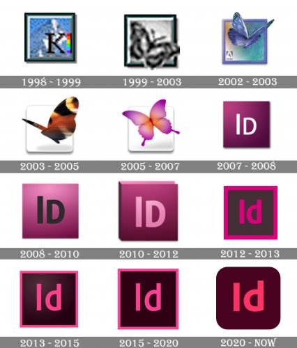
The Adobe InDesign logo’s history can be divided into two stages: the graphical one and the text-based. However, the very first logo of the software, which was created in 1998 and stayed with the program for only one year, was completely different.
What is Adobe InDesign?
Adobe InDesign is the name of the software, created for helping users from all over the world design digital publications (articles, electronic books, magazines, and posters). Today the software is used for all kinds of publications, which can stay in digital format, or be printed.
1998 – 1999
 Composed of a letter “K”, placed on the background with the image of a mountain, it was just a fiat try for InDesign. The new concept was created in 1998.
1999 – 2003
Adobe adopted a butterfly as the symbol for InDesign in 1999. The first version was executed in a gray color palette with a sea-blue square framing.
2002 – 2003
 In 2002 the logo became more detailed and gained a new blue and purple color scheme, it was fresh and very artsy.
2003 – 2005
In 2003 the brown and yellow butterfly, placed on a simple white background replaces the elegant blue symbol and stays for two years.
2005 – 2007
The last logo from the Butterfly era was designed in 2005 and depicted an elegant pink image, which was light and almost transparent.
2007 – 2012
In 2007 Adobe InDesign switched to a minimalist visual identity concept. The color palette is taken from the last butterfly logo and now the icon is a dark pink square with white “Id” lettering in a neat sans-serif typeface.
2008 – 2010
 In 2008 the pink becomes lighter when the lettering gains black color and bolder lines.
2010 – 2012
 In 2010 the logo becomes more three-dimensional and now the light pink letters are engraved on a book cover.
2012 – 2013
The logo we all know today was designed in 2012. The smooth sans-serif “Id” inscription in fuchsia is placed inside a black square with a thick fuchsia outline.
2013 – 2015
 In 2013 the lines become thinner and the fuchsia is replaced by a lighter shade of pink.
2015 – 2020
 The Adobe InDesign logo version from 2015 is a balance between the two previous versions — the lines are thin and elegant and the pink is bright but not very intense.
2020 – Today
The redesign of the Adobe InDesign visual identity, meld in 2020, refined and simplified the icon of the software. The main color scheme remained the same — pink and burgundy, but both shades were elevated and became calmer and a bit darker, which made the whole look more elegant and strong. As for the overall concept — the square framing was gone and the angles got rounded, thus the badge became softer and more friendly.


