Being a paraphrase of the “parent” Honda logo, the Acura Logo is also restrained, aristocratic, original and recognizable. The element in the center of the emblem is not at all a “compass” or a modified “A”, but a stylized letter “N”.
The classic Acura Logo is characterized by a laconic restraint and recognizability. The main thing is that it fully meets the objectives set for it ‒ to reflect the style and the image of a relatively new but easily recognizable premium class brand. The brand and the logo were designed to bring luxury and high power cars from Acura, a subsidiary of Honda, to the US market. That is why the American market became the yardstick which experts in the field of naming and design, both industrial and graphic, focused on.
Meaning and history
Acura was created by Honda for the American market in 1986, and for the first few years of its existence, it only sold cars in the United States and Canada. Although, the cars of the company had a huge success, as they looked very stylish, and their technical characteristics were super good. Thus, Acura started its expansion to the international market already in the 1990s. By the middle of the 2000s, the brand was already present on all continents.
Today Acura operates all over the globe and has four models in its current portfolio. As for the whole period, the company has had almost twenty various car models released throughout the years.
What is Acura?
Acura is a luxury automaking brand, launched by the Japanese Honda in the middle of the 1980s. The company was established in North America, and today operates all over the globe, exporting high-end sedans and SUVs to all continents.
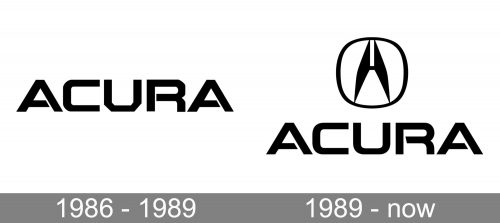
1986 – 1989
The Acura brand was created on a specific day ‒ March 27, 1986. But it was not until 1990 that the brand acquired its logo. Such a long time between the establishment of the brand (and the start of car sales!) and the appearance of the now-familiar logo on the radiator grilles is extremely uncommon, if not outrageous.
The Acura brand was created in the NameLab studio headed by Ira Bechrech. The basis for the logo ideology was the Latin word “acu”. In English it means “thoroughness, accuracy, meticulousness”. A dozen of languages based on Latin still preserve this word either as a separate word or as a morpheme, retaining its original meaning.
The campaign promoting Acura in the American market makes use of this linguistic symbolism. In addition to the basic symbolism, there appeared a “people’s” one. Thus, one of the automobile magazines held a competition in interpreting the names of well-known brands. People were to imagine that they were abbreviations and unscramble them. The winner in the category “Acura” was the phrase “Asia’s Curse Upon Rural America”.
1989 – Today
The redesign of 1989 has kept the futuristic uppercase logotype of the Acura brand untouched but added a sleek and sharp emblem above it. The Acura emblem features a stylized letter “A”, formed by two bold elements with sharpened angles, connected by a thin and short horizontal bar, enclosed into a circular frame, which softened the ashy and brutal style of the clean lines in both the emblem and the lettering.
Symbol
The Acura brand and logo appeared due to their creator’s (the Honda company) global plans. Entering the American market was a difficult task. The brand had great ambitions and the desire to win the premium class segment. The appearance of the symbol which was initially positioned as a stylized “A” improved the situation.
The peculiarity of the Acura symbol is the doubleness of its interpretation. A person who is aware of the existence of the Acura brand will see the letter “A”, even despite the obvious gap in the upper part of the letter. No wonder, there are two letters “A” in the name of the brand ‒ at the beginning and at the end of the word. But even those who are already familiar with the history of the logo will note that the legs of the symbol touch the circle with both upper and lower ends. So, if desired, the mark can be perceived as “A”.
Laconic and at the same time bright and recognizable, the Acura symbol acquired its unofficial name ‒ a “caliper”. Though, of course, the brand had nothing to do with drafting. Yet, the caliper is also a symbol of accuracy and thoroughness of elaboration. In short, everything the Japanese technology including the automotive one is famous for.
Emblem
The Acura logo looks like a square with smoothed corners, which is almost a circle. The contours of the “parent” logo (Honda) are less rounded. There is also a non-obvious, but traceable continuity in it.
Later a similar logo appeared on the cars of the Chinese brand Changan. To use the borrowed image in the markets of the world, the Chinese brand simply turned this stylized letter in the Acura emblem over.
The Acura emblem also adorns the branded products such as key rings, magnets, bags and so on. For consumers of these promotional products the emblem is a symbol of elegance, accuracy and trouble-free operation. It also demonstrates the responsibility of the car maker team, from designers to production engineers and workers.
Font
The Acura logo features the original font which was specifically designed for the brand. The horizontal bars in the letters “A” and “R” are not attached on both sides of the vertical lines. They are fixed with slight carelessness only on one side. Partly, this feature of the font emphasizes a dignified manner of driving, when the driver keeps only one hand on the steering wheel. And, of course, it means confidence in steering. Indeed, the logo emphasizes the reliability of Acura cars, their steerability, maneuverability and responsiveness to the driver’s movements.
What makes the font peculiar is the specific shape of each letter. The angles in each letter are smoothed out, but still they are preserved and tangible. Due to this feature the font gives the impression of confidence and reliability. Accordingly, similar qualities are extrapolated to the brand as well as to those who use the brand products in their everyday life.
Colour
The colour scheme of the Acura logo is simple. The emblem is in silvery color. It is monochrome, although with some effects ‒ contour, indentation, gradient. This color solution is optimal for reproduction. Besides, it makes the logo look decent. And if we take into account the colour symbolism, we can also add aristocratic, dignified and restrained luxury to the symbolic interpretation of the logo.
Font and Color
The modern uppercase logotype from the primary Acura badge is set in a bold futuristic sans-serif typeface with thick sleek bars and sharp diagonal cuts of some lines. The closest font to the one, used in this insignia, is, probably, Aspire SmallCaps, but with some minor modifications.
As for the color palette of the Acura visual identity, it is set in black-and-white, a timeless color scheme, which always looks professional and stylish. When placed directly on the cars of the brand, the emblem and logotype turn silver metallic.
What does the Acura logo mean?
The stylish modern emblem of the Japanese car brand Acura is, first of all, the first letter of the brand’s name, “A”. The letter is executed in a sharp geometric style, resembling a caliper, which also makes sense, since the “Acu” in “Acura” can be taken for the “Accuracy”. The clean lines and pointed angles of the central element are softened by the rounded frame of the logo.
How did Acura get its logo?
The current Acura badge was introduced in 1989. The redesign of the logo was held to celebrate the release of the Acura NSX car, which was a sensational event. The badge was based on the previous version of the logo, and the additional emblem was designed in the corporate Honda style.
Is Acura a luxury car?
Acura was founded as a part of the Honda company, responsible for the production of luxury cars. Since the date of the brand’s establishment, it has been creating exceptional vehicles, which definitely belong to the luxury class, even though they are much more affordable than the sports cars of famous European brands.
Is Acura owned by Honda?
Even though the first period of Acura’s history is connected to the North American region; it is a Japanese company, which was founded by the famous and reputable Honda Group, and is still owned by it.


