Ace Hardware is an American chain of hardware stores. Although originally a Chicago-based supplier, it now grew to be an international brand of retail hardware stores. You can find these stores in over 70 countries. They sell all sorts of tools, instruments, parts, utility appliances and generally helpful items.
Meaning and History
The first Ace store appeared in 1924 in Chicago, USA. The company was named this way because back then the word ‘ace’ (as in ‘proficient WW1 pilot’) was a patriotic, powerful word. The contemporary version of this company’s full name, Ace Hardware, was adopted in the early 30s.
What is Ace?
Ace Hardware, formerly Ace Stores, is a chain of utility products from USA. It’s currently present all across the world and is considered America’s biggest hardware, tool and appliances retail store.
1929 – 1930
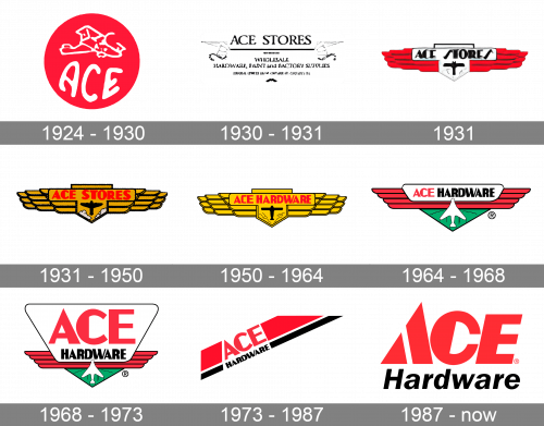
The original logo was a red circle with the word ‘Ace’ written in white along the bottom edge and a WW1-era bomber plane drawn in the same color above.
1930 – 1931
This wordmark was in use until 1931. It’s basically the name of the company (‘Ace Stores’, back then), followed by a long black line with two wings on the sides, and then a description of what they sell and do at length.
1931
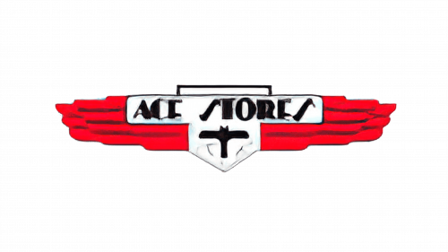
The 1931 logo is instead a pair of red wings with two other elements in the middle. One is a long nameplate with the words ‘Ace Stores’ on it, and the other is a shield right below with a black plane on it.
1931 – 1950
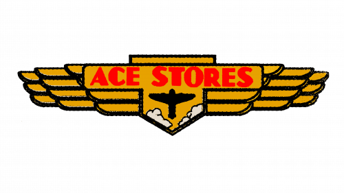
It’s the same design, but recolored almost completely into gold, save only for black rims, a black plane and red letters in the center.
1950 – 1964
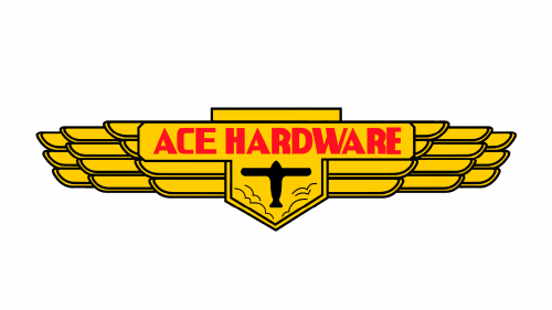
In 1950, they basically replaced ‘Ace Stores’ on the emblem with ‘Ace Hardware’ to keep up with the new name.
1964 – 1968
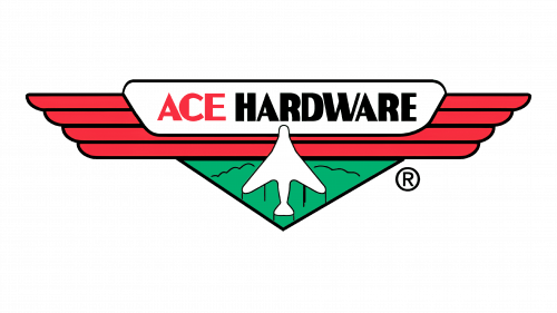
Another modernizing effort happened in 1964. This time, the wings were colored red again, while the wordmark was placed onto a white nameplate, now colored red for ‘Ace’ and black for ‘Hardware’. The shield was replaced with a green triangle sticking out from the bottom with a white plane silhouette on it.
1968 – 1973
The nameplate from before got extended up into a giant trapezoid. The new free space was now occupied by the word ‘Ace’, but ‘Hardware’ stayed below. Nothing else changed.
1973 – 1987
The 1973 design looks like two stripes of red and black. The latter is thinner and right beneath the former. They are arranged diagonally, and each of their tips is cropped so it looks like they are inside an invisible rectangular frame. The words ‘Ace’ and ‘Hardware’ respectively are placed inside these stripes with corresponding styles.
1987 – today
The logo they adopted in 1987 is just the name, written in two lines of red and black text. The first line is still bigger than the other, and it also uses a different font. The first word uses a geometric, futuristic style. The second word is in simple sans-serif.


