Accor is a brand of Europe’s largest hotel operator with more than 3,700 hotels operated under several brands, including Ibis, Sofitel, Pullman, and the main Accor brand. It was founded in 1967 and by now Accor operates in 100 countries, with more than 4,800 hotels and 280,000 employees worldwide. Its total capacity is approximately 704,000 rooms.
Meaning and history
Accor is one of the largest and most reputable hotel chains in the world, which was established in 1967 in France. The history of the company began when Paul Dubrul and Gerard Pelisson created the company SIEH and opened the first hotel under the Novotel name in Lille, France. Even though the first hotel of the company was quite small, with only 62 rooms, it provided service at a level noticeably higher than what was considered acceptable for those years.
In 1980, the company bought the French chain Sofitel, which included 43 hotels and 2 spas. Two years later, the founder of Accor continued to buy hotels and expanded to the restaurants’ segment. In 1983, the Novotel SIEH Group and Jacques Borel International merged. This is how the Accor Group appears.In 1990 the Accor Group enters the world market. It happened after the acquisition of the Motel 6 chain in the United States.
Today Accor manages around 5 thousand hotels under 23 brands of the group, which operate in the range from economy to premium segment in 95 countries worldwide.
Among the largest and most popular AccorHotels brands are Mercure, Novotel, Ibis, Pullman, Sofitel, Hotel F1, and others. Sofitel hotels refer to the luxury segment, Pullman — to the upper class, and Novoteland Mercury — to the middle class. At the same time, Ibisis divided into economy class (Ibis and Ibis Styles) and budget (Ibis Budget and Formule 1). And the company still owns the American Motel 6 motels.
A quarter of all hotels in the group are concentrated in France, together with the rest of the European countries, and it is more than half of the total room stock of AccorHotels. But the company keeps expanding, with a fast and active development going in APAC countries, the Middle East and Africa, as well as in South America. AccorHotels still has great potential in North America, where it came rather late and has a huge field to explore.
What is Accor?
Accor is the name of the largest hotel group in Europe. Today the company, established in 1967, owns around five thousand hotels across more than 100 countries on all continents. Accor is a group of companies, which manages such large hospitality brands as Novotel, Ibis, Sofitel, and others.
1983 – 1992
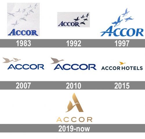
The iconic Bernache Goose has been the symbol of the hotel chain since the very beginning, being depicted on the initial logo, created in 1983, and never leaving the insignia since then. The first logo for Accor had the intense blue wordmark in a smooth serif typeface with the bold letters outlined in black and accompanied by the image of nine light-gray flying geese.
1992 – 1997
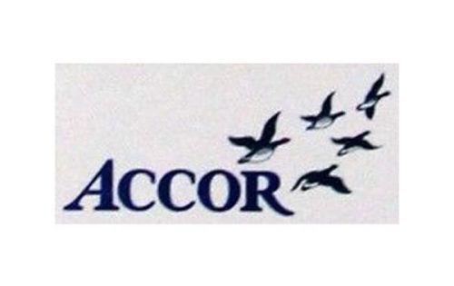
The redesign of 1992 slightly stretched the badge horizontally and intensified the color palette of the Accor Badge. The lettering now got dark blue and the outline was gone, as it was not needed anymore. As for the school of geese, it now contained only five birds, which also got the colors darkened up and became more visible. The new badge stayed with the company for another five years and was representing the reliability and professionalism of the hotel management group.
1997 – 2007
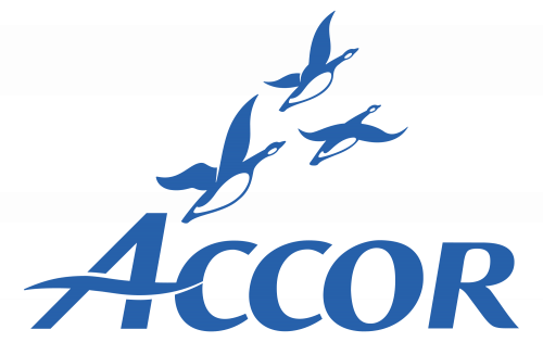
The number of geese on the Accor logo was reduced to three with the redesign of 1997. This is when the logotype was also rewritten and the color palette refined and lightened up. The new inscription was set in a smooth and sleek sans-serif typeface with the horizontal bar of the enlarged capital “A” replaced by a horizontally stretched blue and white wave. The birds now featured the same color palette as the lettering and were shifted to the left part of the logo, starting their flight right above the top point of the “A”.
2007 – 2010
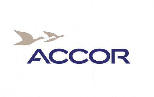
The modern and chic badge was created for the hotel chain in 2007. The number of the geese was reduced to two and the birds were now drawn more abstractly and schematically. Two gold medals geese were flying to the right, above the letter “A” of the logotype. As for the wordmark, it was set in the uppercase, with all letters featuring the same size. The inscription was set in a stable contemporary sans-serif typeface, with clean contours, and just one designer element — the shortened horizontal bar of the letter “A”.
2010 – 2015
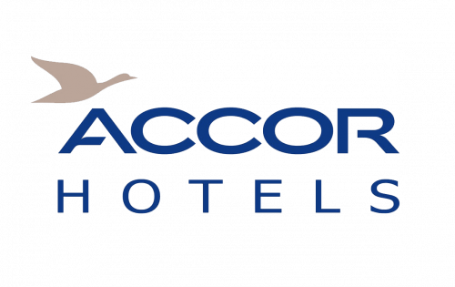
Only one goose was left on the Accor logo after the redesign of 2010. The main idea and style of the badge remained unchanged though, just the second bird was removed and the “Hotels” tagline was added to the logo. The tagline was executed in all capitals of a lightweight sans-serif typeface, with all letters placed pretty far from each other, bringing air and volume to the bottom line of the insignia. Another slight change of the redesign was about the color palette, as the shade of blue, used for the lettering was enlightened, thus the whole logo became brighter and more welcoming.
2015 – 2019
In 2014 the Accor logo is being refined again. This time the style was significantly changed. The goose was redrawn and placed above the central part of the logotype, in a bright and intense shade of yellow. As for the inscription; it now featured “Accor Hotels” in the uppercase set in one horizontal line and executed in a simple modern sans-serif typeface, in dark blue. The main wordmark was underlined by the “Feel Welcome” tagline in the title case of a lightweight sans-serif font.
2019 – Today
The AccorHotels logo is statutory and balanced logotype, it demonstrates the company’s leadership and robustness. The logo showcases the Group’s symbol – honey-colored bernache goose. This bird symbolizes group spirit, determination and travel. And when the goose is in flight it represents constant attention to others.
Accor’s goose icon is centrally located above the wordmark in white (or blue, depending on where it is used) serious and confident sans serif font.
The tagline, “Feel Welcome”, is a simple, striking and universal signature, that encapsulates the generosity and the very essence of hospitality. It’s a promise addressed to all the audiences: customers, employees and partners.
The elegant AccorHotels logo plays a vital role by embodying an emblematic sense of service.
Font and Color
The distinctive uppercase lettering from the elegant badge of the Accor hotel group is set in a clean and bold sans-serif typeface, which looks very direct and strong. The closest fonts to the one used for this insignia are, probably, ITC Blair Pro Medium or Bristone Thin, but in this badge, the inscription looks fresher and more progressive due to a lot of space between the characters.
As for the color palette of the Accor visual identity, it is based on gradient shades of gold, the color of nobility, gracefulness, and chic. The logo in this color scheme looks sophisticated and confident, evoking a sense of reliability and care.


