Part of the New York–Penn League, the Aberdeen IronBirds franchise is located in the city of Aberdeen in Harford County, Maryland. The club was established in 1977 under the name Utica Blue Jays, turning into the Utica Blue Sox in 1981. The current name was adopted by the club only in 2002, however, it is already the most long-lasting one in the history of the IronBirds. The Minor League Baseball team is known for its affiliation with the Baltimore Orioles club and is currently owned by the ex-Orioles player, Cal Ripken Jr. And it was Cal who offered the name IronBirds and moved the team to Aberdeen at the beginning of the 2000s.
Meaning and history
While the history of the franchise can be traced back to 1977, it was only in 2002 that it adopted its current name. The Aberdeen IronBirds are affiliated with the Baltimore Orioles and play as a Short-Season A classification team.
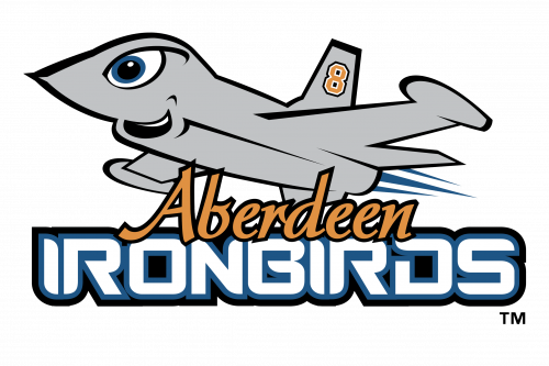
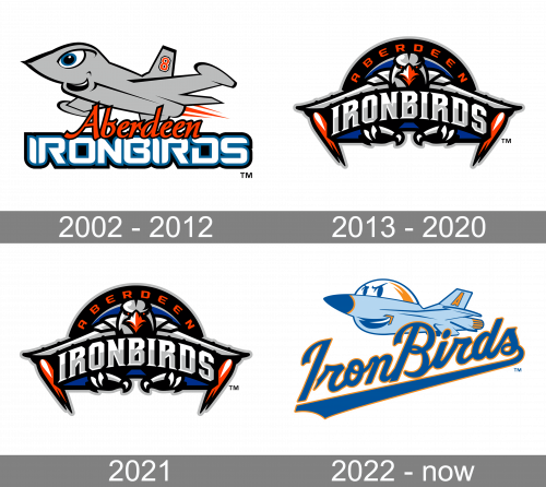
2002 — 2012
The old Aberdeen IronBirds logo depicted a silver airplane on which the number “8” could be seen. While it’s the number of the team owner, the retired Oriole Cal Ripken, Jr., it’s also connected with the Aberdeen Proving Ground U.S. Army installation located not far from the franchise’s hometown. The logo has a generally cartoonish stile with smooth, simple shapes. The plane even has an eye and a mouth.
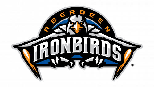
2013 — 2020
By 2013, they replaced the plane with a sort of fusion between a jet and an eagle, both rather realistic. This time, the image is facing the viewer, seemingly flying towards them. They added flames to the tips of its wings, which look straight and mechanical here. The joints between the wings and the head look like shoulder plates of a knight armor. The eagle’s head itself looks malicious – they gave it a darkened tone and made the eyes into orange dots. Above, ‘Aberdeen’ is written in orange across a black arch, while beneath, the word ‘Ironbirds’ has a rougher, metallic style.
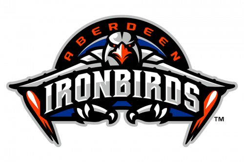
2021
In 2021, they recolored all the orange bits (beak, eyes and flames) into dark red, and that’s it.
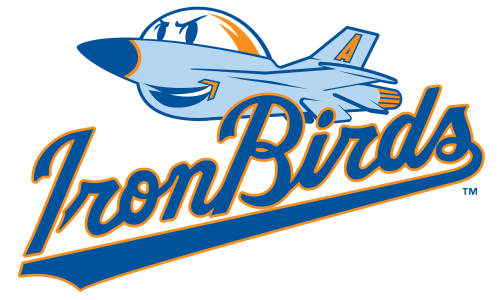
2022 – Today
The 2022 logo depicts another cartoonish plane mascot, but not entirely like the original one. This one is depicted in the same pose, but the color scheme is mostly turquoise with a touch of orange and dark blue. They gave it a determined smile and two simplistic eyes (just two big pupils). A letter ‘A’ is now seen on a tail. Beneath, the name ‘Iron Birds’ is written in a cursive blue font with a thick underline.
Colors
The five-color palette comprises black, orange, white, blue, and silver.


