Aardman is the name of the animation studio, which was established in 1972 in the United Kingdom. By today the studio has produced many famous cartoons and series, along with animated advertising. The company has eight sub-divisions, covering all the possible areas of the animating segment.
Meaning and history
Aardman is not just another studio, it is a true legend in the history of animated cinema. The studio is the premier producer of plasticine animation in the world. Aardman Animations was founded by British animators Peter Lord and David Sproxton in 1972, and the studio became world famous with a series of projects about inventor Wallace and his clever dog Gromit.
However, for the first few years, the studio existed solely on orders from British channels, part of the BBC holding company. The creators of Aardman started their way with animated spin-offs for the children’s show Vision On. One of the miniseries created for this program told about an unusual superhero named Aardman, which translates from Dutch as “Earth Man”. Lorkey and Sproxton liked the name so much that they decided to name their new company after him.
The history of Aardman is full of interesting moments. Thus, in the mid-1980s, the studio was engaged in the fact that it invented plots for advertising and even participated in the creation of music videos. Their most famous project in this area was the video for Peter Gabriel’s song Sledgehammer. The work, created with the help of plasticine and frame-by-frame animation, was a triumphant winner of the 1987 MTV Video Music Awards and won nine awards, which to this day remains a record among music videos.
The studio’s first feature film was 2000’s Chicken House Escape, in which a group of chickens attempt to escape from a prison-like farmhouse. Full production of “Chicken House Escape” began in January 1998 and lasted 18 months. In total, the cartoon was engaged in about 250 people. And in total, at the time of 2024, the studio has released 9 full-length cartoons, including “Lamb Sean”, “Wild Ancestors” and a sequel to “Escape from the Hen House”.
However, plasticine animation isn’t the only form Aardman is pursuing. The company has previously experimented with CG-animated projects, including the films “Get Out” and “The Secret Service of Santa Claus.” And, since the 2000s, many of Aardman’s products have had game adaptations for PCs, consoles, and mobile devices.
Over its 50-year history, Aardman has transformed from a small studio into one of the largest and most important figures in the world of animation. The company has long been an asset to the UK, and its characters are idols of millions of children around the world and across generations.
The current visual identity of the famous studio is based on the earliest version but is simpler and more minimalist. The logo with an emblem in red color is instantly recognizable across the globe and looks powerful and solid.
1989 – 1998
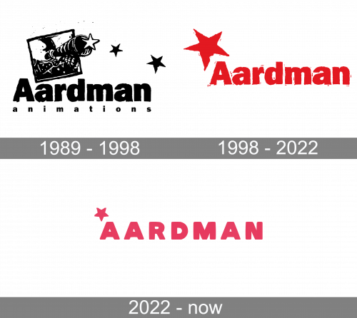
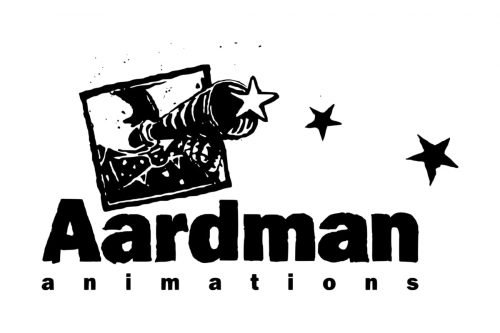
The logo, designed in 1989 features a monochrome composition of a detailed emblem and a bold wordmark under it. The emblem depicted a square, which was slightly inclined, with a telescope, coming out of it. The telescope also resembles a gun barrel, but three stars near it, make the image complete and bring a sense into it. The start is drawn in different sizes and colors — the one that is the closest to the telescope is white, while the two others are black.
The bold black nameplate is complemented by a delicate “Animations” tagline, written in the lowercase with a lot of space between the letters.
1998 – 2022
The logo was redesigned in 1998. Now the studio’s name is the main part of the emblem, with no tagline and with just one graphical element above it.
The telescope with three stars was replaced by a big red star with raw edges. It looks like it is in motion, perfectly representing the profile and nature of the studio.
The red and white color palette of the visual identity is a reflection of power and passion. It makes the logo unique and memorable, representing progress and creativity.
2022 – Today
The 2022 design uses the same concept, but the reimagined the execution. The letters are now calm, bold sans-serifs, written solely in uppercase. There’s also a bit more room between the characters, and the color became a slightly paler hue. The star turned smoother and smaller, and it’s now evenly proportioned.
Font
The solid and bold inscription is executed in the same typeface as the one from the previous logo. The modern sans-serif font looks very similar to Franklin Gothic, a grotesque typeface, which was designed in 1902 by Morris Fuller Benton.
The only difference in two versions is that on the new logo the raw edges of the letters look more uneven and have some small red impurities around, as it is was erased and drawn all over.


