

![]() San Francisco 49ers Logo PNG
San Francisco 49ers Logo PNG
“The 49ers” is the short name of one of the best-known American football teams in the US, the San Francisco 49ers. Also known as the Niners, they compete in the NFL as a member of the NFC West division.
Brand Overview
The San Francisco 49ers are one of the most popular and titled teams in the NFL. The club has a very rich history. In the 1980s, the 49ers were the most successful team, winning four Super Bowls in 1981, 1984, 1988, and 1989. And the San Francisco team won its fifth Super Bowl in 1994. The team is named after the immigrants to Northern California to search for gold during the Gold Rush of 1849.
The San Francisco Forty Niners were founded in 1946 by Tony Morabito, a successful logging businessman. Morabito tried for several years to get the NFL to allow him to establish a West Coast franchise. After another unsuccessful attempt in 1944, Tony despaired and struck a deal with Arch Ward, who formed the AAFC. Sometime later, Tony Morabito, his younger brother Victor, and his two business partners formed a legal entity called the San Francisco Forty Niners. Lawrence Shaw, then at the University of California at Berkeley, was called in to coach the new team.
Their first match Forty Niners was played on August 24, 1946. The game ended in a victory for the 49ers. The first official match was played on September 8 of the same year. In it, San Francisco lost to the New York Yankees.
The team showed its best results in the 1980s, winning one Super Bowl after another. Throughout its history, the San Francisco 49ers club has had many star players who have become NFL legends.
Meaning and history
![]()
Established in 1946 as a charter member of the All-America Football Conference, the club became part of the NFL just three years later. The team’s first home stadium was Kezar Stadium in San Francisco. In 1971, the club moved to Candlestick Park, in 2014 – to Levi’s Stadium. The 49ers are known among the most successful NFL teams owing to the fact that they have been division champions 22 times in 1970-2023 and that they won five Super Bowl championships in 1981-1994.
What are the 49ers?
The San Francisco Forty-Niners are the sixth most valuable team in the National Football League, valued at $6.8 billion as of 2024, according to Forbes.
1946 — 1967
![]()
The initial logotype heavily alludes to the 1849 California Gold Rush, which inspired the club’s name. In the emblem, we can see a mustached 49er gold miner wearing checked trousers, a red shirt, and black boots. A hat is present, too, but the character isn’t actually wearing it – it has fallen off due to his wild leap. And there’s a firing pistol, too – no self-respecting gold miner would go without one, for sure.
While the character looks unkempt and in no way athletic, he does express the fierce spirit of the Gold Rush. Yet, a professional team did deserve a professional emblem – and this is what it eventually got.
1968 — 1988
![]()
In 1962, an elliptical logo featuring the letters “S” and “F” was first used on the helmets, but it wasn’t until six years later that it became the club’s primary logo. The ellipse has a red filling and a black outline, while the letters are white. The serif letters might look mildly dated, and you’ll hardly find anything sporty about them. Still, they work certainly better than the previous logo.
The 49ers have been loyal to this design ever since, although minor tweaks have been introduced occasionally.
1989 — 1995
![]()
Most notably, the red has grown brighter and more vibrant. It has also become a little lighter, so, to maintain the contrast, the designers have given the letters “SF” a thin black outline.
1996 — 2008
![]()
There’s much more depth now. This effect is partly due to the dark shades that have appeared around the letters. The outline of the ellipse has a varying thickness, which also adds depth. The introduction of a golden ellipse serves the same purpose. Additionally, it alludes to the Gold Rush theme, which is essential for the club. The almost electric red is gone – a darker, nobler hue is used instead.
2009 — Today
![]()
The red and gold colors have grown a little more muted. However, the difference is quite subtle – one has to compare the versions side by side to notice it. The shape of the black and gold outline has been modified, too, giving the design a thicker border.
Shape and Colors
The latest 49ers logo is simple yet full of sense. The letters “SF” for San Francisco are situated inside a red oval with black outline and a gold line on the inside of the logo. This logo has quickly became iconic and world famous. It reflects 49ers passion for winning, their endless energy and optimism for life and sport.
Helmet
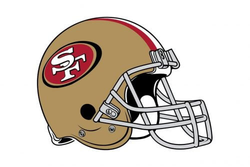
The helmets of the San Francisco 49ers club are colored in a smooth and elegant shade of gold, which makes the players stand out on the field. The helmets are decorated by a thin red stripe in the center and the enlarged logos of the club on the sides. The shade of the stripe supports the main color of the logo, and the design of the helmet looks very balanced and sleek.
Uniform
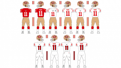
San Francisco 49ers have four types of uniforms, executed in the official color palette of the club, composed of red, gold, and white shades. The primary style consists of a red jersey with white stripes on the sleeves and golden pants with red stripes on the sides. The secondary uniform has a white jersey with red stripes and the same style of pants. The first alternate uniform comprises a red jersey and white pants with no golden details. And the last, fourth, style of the uniform features a white jersey and pants with red accents.
Home ground
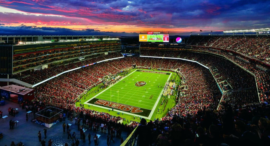
In terms of locations, the 49ers are a very stable team. It has only played in three arenas, and had four games in other stadiums, due to force-majeur. Since 2014 the club is based at Levi’s Stadium, located 70 km from San Francisco, in Santa Clara. The arena has a capacity of 68,500 seats and had a record attendance of 76,976 in 2015. Before Levi’s Stadium, the 49ers played in Candlestick Park (from 1971), and in Kezar Stadium from 1946 to 1970.
Font and Color
The red used in the logo is deep and saturated (hex: #AA0000, RGB: (170, 0, 0)). The gold (hex: #B3995D, RGB: (173, 153, 93)) adds to the rich and refined impression. The serif type has a traditional feel and looks rather elegant. While elegance might not work that well for a sports club, this font is probably used to pay homage to the team’s history.
49ERS RED
HEX COLOR: #AA0000;
RGB: (170, 0, 0)
CMYK: (7, 100, 82, 26)
PANTONE: PMS 187 C
GOLD
HEX COLOR: #B3995D;
RGB: (173, 153, 93)
CMYK: (0, 25, 56, 51)
PANTONE: PMS 872 C
What was the 49ers’ first logo?
The very first logo of the San Francisco 49ers’ is considered one of the most recognizable badges in the sport’s history. The drink miner with a shooting gun in one hand and a bottle in the other was executed in a red, white, and black color palette, and looked very cool. The man was moving, and this dynamic made the badge special. It is believed, that this logo was created by one of the club’s owners, Allen Sorrel.
When did the 49ers change their logo?
The professional football club from San Francisco, known as the 49ers, has had several redesigns of its badge throughout the years, but there was only one significant change, which took place in 1969 when the iconic drunk miner was replaced by a minimalistic yet powerful oval medallion with the heavy serif “SF” abbreviation on it. Since then the badge was refined and cleaned up, with the last redesign held in 2009.


