Xerox Company originated in 1906 as The Haloid Photographic Company, and it was in 1961 that it got its current name. It is one of the world’s biggest document management companies.
What is the symbol of Xerox Corporation?
The symbol of Xerox Corporation is a red sphere with a stylized letter “X” drawn on it in a gradient white-to-gray color palette. The bars of the letter are elongated and softened, surrounding the red globe like wide orbits. And the thin silver lines along the bars only elevate this “globe” style, pointing to the international expansion of the company, which happened really fast.
Meaning and history
Xerox as a separate brand appeared on the international market only in 1960, but its history dates back to the beginning of the 20th century when the Haloid company was established. So the visual identity history of the today-famous brand would not be complete without the first Haloid and Haloid Xerox era, which boasts five different emblem designs.
1906 — 1938
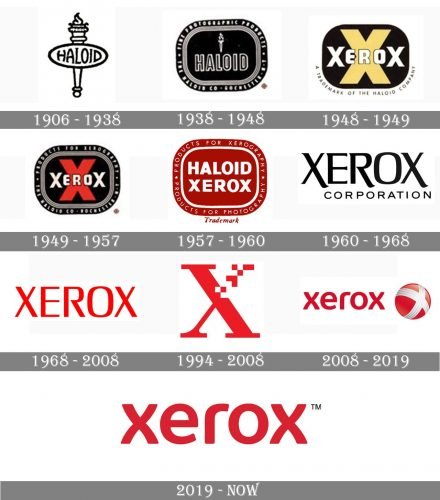
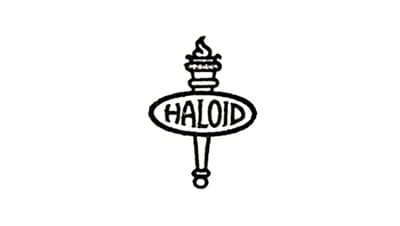
The initial logo for Haloid featured a monochrome composition where the horizontally stretched oval with a wordmark was placed over a classy torch. The lettering was executed in all capitals of a custom handwritten typeface with small sharp serifs on the thick lines.
1938 — 1948
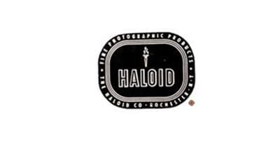
The redesign of 1938 brought a new composition to the Haloid visual identity, placing and tied above the wordmark and putting it on a black background of a rectangular badge in a wide rounded frame. The white additional lettering was written around the perimeter of the badge.
The main wordmark was now written in all-caps of a straight and clean sans-serif typeface, with black bodies and distinct white outlines of its contours.
1948 — 1949
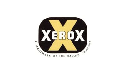
The shape of the badge remained untouched even after the company renames to Haloid Xerox. The bold white lettering was placed over a yellow “X” on a black background, looking serious and bright. No additional elements or framing was needed for the badge to be powerful and eye-catching.
1949 — 1957
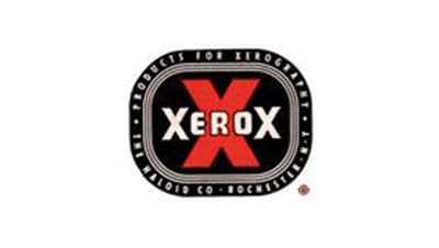
The redesign of 1949 brought a wide framing back to the badge and changed the yellow color of the “X” into the red. The main wordmark was slightly refined, getting the contours of its letters thinner and more elegant.
1957 — 1960
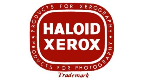
In 1957 the color palette of the logo was switched to burgundy and white, and the “Xerox” wordmark over the bold “X” was replaced by a delicate and professional “Haloid Xerox” inscription on two levels with its white capital letters executed in a bold and strict sans-serif typeface. The white lettering on the frame, composed of two parts “Products for Xerography” and “Products for Photography” were written in all caps of a light-weight sans-serif font.
1960 — 1968
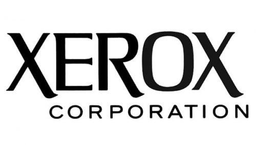
The birth of the Xerox brand was followed by the introduction of the new logo, created by Lippincott in 1960. It was a stylish and modern black logotype in a custom serif typeface. Where the lines of both “X” were elongated and slightly curved in their bottom parts. The “Corporation” tagline was written under the nameplate in all capitals of a simple yet confident sans-serif font.
1968 — 2008
In 1968 the Xerox logo is being redesigned by Geismar & Chermayeff. The agency switched the color palette of the visual identity into red and white and rewrote its wordmark using a custom serif typeface with slightly narrowed contours of the letters and an open “R”.
1994 — 2008
In 1994 the brand starts using an icon as its primary logo. It was a stylized red “X@ which its upper right part split into red and white pixels. No additional lettering or graphics was needed to make the logo recognizable and unique.
2008 — 2019
In 2008 the Xerox visual identity was redesigned by the famous Interbrand bureau, which kept the red and white color palette of the logo but added some gray gradients to it. The new logo was composed of a lowercase logotype in red, placed on the left from an emblem, boasting a red sphere with a white and gray stylized “X” on it.
2019 — Today
In 2019 the company decided to simplify its logo to a single logotype, keeping the style and color palette of the previous version, but removing the emblem. The red lowercase logotypes placed on a white background looks contemporary and strong and evokes a sense of expertise and professionalism.
Symbol
The new logo symbolizes the company’s transition to the changing technological standards. Also, it reflects the company’s effort to build and retain a solid connection with every customer and make its products flexible, versatile, and user-friendly. Finally, the new Xerox logo design emphasizes that Xerox is no longer a company whose mission is to just provide document and photography equipment. Now it is an information technology whale.
Emblem
The new emblem’s sleek appearance is to reflect the rapidly evolving technology and transition to manufacturing versatile high-tech products that feature cutting-edge solutions.
Color
The red color used in the new logo symbolizes the corporation’s passionate effort, excellence, integrity, and courage.
Font
The new logo sports a lowercase Albert FS typerface to emphasize flexibility and growing versatility of the company’s products.


